HOME | DD
 ahmedelzahra — IT Vision Logos Design
by-nc-nd
ahmedelzahra — IT Vision Logos Design
by-nc-nd

Published: 2011-02-21 16:40:38 +0000 UTC; Views: 11499; Favourites: 50; Downloads: 466
Redirect to original
Description
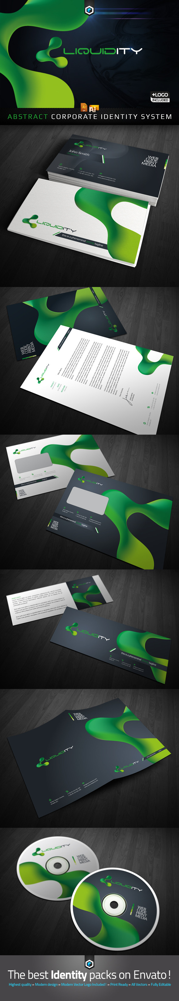
IT Vision Company Logos DesignTwo options
Related content


Comments: 35

I love both designs. I do hope that they decide on the first on though. The second one might have a sizing issue, if you try and scale it up. However, the first one would look great in any size.
I could just see that second one shrinking up and losing some of that great detail in the brain.
 (Smile)")
 (Wink)")
👍: 0 ⏩: 0


Very nicely done, do you create your logos in Photoshop, or do you use another program, or more than one to design them? I made my logo, I never released logos made for others yet. I may decide to soon. I have thought about it a lot.
You are very good at this, they're simple, yet creative and stylish, good looking business appeal. This inspires me, thank you for sharing. My favorite one is the one with Orange, very nicely done.
👍: 0 ⏩: 1

yes i made logos with photoshop and illustrator , you should use adobe programs (photoshop, illustrator) and i thank you very much for comment and appreciate
👍: 0 ⏩: 1
I do use Photoshop, I'll just give Illustrator a try. You're welcome, I appreciate you sharing your skill with everyone. Very good inspiration for designers to get better at what they do.
👍: 0 ⏩: 0

Thanks Bihen
I appreciate that
👍: 0 ⏩: 0


very thanks it's a little thing behind your logos
")
👍: 0 ⏩: 1


shokran ya gad nice to see you
👍: 0 ⏩: 1

Thanks you have amazing advertising
👍: 0 ⏩: 1

الاتنين حلوين بس اعتقد الاول ممكن يبقى باين اكتر لو على شغل طباعة
وبرضه التانى تحفة
👍: 0 ⏩: 1
تمام يا حبي الاول اوضح في الالوان والشكل وتنفيذ الفكرة
👍: 0 ⏩: 1


Great Work! Personally I like the simplicity of the left one better.
👍: 0 ⏩: 1


wow, your logos are so incredible! The first one looks like the man in tie, doesn't it? Yet still it has the letters and...gaah! amazing work!
I admire your skills. Where do you get the ideas from?
👍: 0 ⏩: 1
first i thank you very much about your comments it like your explain the letters and the man in tie .
second before i start i make analysis , researching for idea in my mind , i search with the first letters and i make it in one logo like i want
searching in deviant and google pictures
i pleasure your amazing
👍: 0 ⏩: 1
nice! Sounds simple but it's brilliant

👍: 0 ⏩: 1