HOME | DD
 Aiiga — [Video] Fei | Contest prize
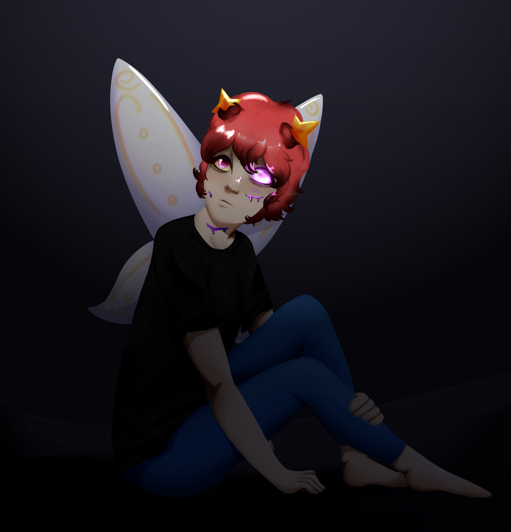
#fairy #girl #redhair #wings
Published: 2018-10-03 11:19:28 +0000 UTC; Views: 228; Favourites: 22; Downloads: 0
Redirect to original
Description
Speedpaint: youtu.be/TRKahLYxGosHo lee fucc am I proud of this one
A first part of a prize for Hope ya like it <3
1/3 done, I guess~
YOUTUBE | ISNTAGRAM
Related content


Comments: 12

my instinct says moth, but the wings say butterfly...

i like the paradox, though. However, i'd color the wings differently or add more white/gold to the rest of the pic. Something else needs to have those colors in it if only to make everything blend together.
I love the definition you give the eyes, you can tell they're the same size, but because one is different, it makes it seem larger and i love it. the horns/antenna, well, its a little unclear what they are, and is that a base to it or just the hair? Instead of making where the horns meet the hair so solid, make it more realistic where the hair just goes past it or if its supposed to have a base like that, add a little more detail.
can i ask if the purple stuff is supposed to be blood or "cracks in the skin"? I love the effect, but perhaps add more detail there as well.
your proportions are great and i love the mood you've set in this piece. the only thing i see that truly needs the most work is detail detail detail! i would LOVE to see this pic again if you decide to revamp it. This has so much amazing potential!
👍: 0 ⏩: 1

Thanks for the comment ^-^ Unfortunately, I couldn't change the design of the character, because it wasn't mine. Thanks for the compliment, too. It's an old piece, but I still like it~
👍: 0 ⏩: 1
of course hon, and i enjoy it as well. some pics, no matter how old they are, occupy a special place in your heart~*^^*
👍: 0 ⏩: 1

ProjectComment:
Love the amazing transition from lighter to darker coloring and the awesomely placed pose!!! The deetails are really nice and i love how well the body shades are placed and bring depth!!!
👍: 0 ⏩: 1
It's an old piece, but still thanks for your kind words~
👍: 0 ⏩: 0

Hi there I'm from ProjectComment and decided to drop by because I was attracted to your awesome art that was viewed in More Exposure #80 in Project comment. I hope to give you my insight as a viewer to what I think of this drawing and how you could even improve it
Some of the strongest parts to this drawing defiantly has to be the hair, wings, eyes, line work and shading. The Hair has a nice smooth flow to it and the white dots of highlight help me to focus on the facial area of this character. The wings colour scheme and general look all balance well and also have some nice dots of pure white highlights similar to the hair keep a consistent design to the parts most exposed to light. As for the eyes, even though they are small you added a lot of detail to the normal eye and the glowing one, even adding highlights of purple since it's giving off a small sum of light. While there is not a lot of thick and bold lines in this drawing, the shading of lines you added to the hands and parts in the dark really helps to keep them from all meshing together and getting lost in the darker parts of the image so that was a good call on your part! Finally, the shading on this piece is very well and logically done. there is little to no highlights or shadows out of place from the assumed and shown light sources. Everything looks like it should be there so awesome job!
While this drawing is spectacular I hope to shed some light on the little things I noticed that could possibly be changed, improved or looked at for future drawings that I hope will be insightful to you.
1.) The hands:
The hands are always nightmares to draw for a lot for people which I can't call out if that would be you however, I noticed some proportioning on the hands are a bit off. The one on the ground seems much smaller then the one wrapped around the legs, while they are a bit further apart making one larger than the other due to prospective is good for logical reasoning. But, I would make the hand on the ground just a bit larger, and keep the other one as is. Or, you can make the one on the leg smaller which might be easier but I am not quiet sure on that since it is behind something while the other is sticking out more.
While I had little luck finding exact positions to help with your hand work I hope these few references could help
(not mine)
2.) I noticed that in between the crevice of the wrist area of the hand on the ground and the thigh there is a random mark. Maybe It's not random if so please correct me
Just in case it's not, I would either make it more obvious what it is/could be or get rid of it. Again I am not sure what it is and I might just be dumb
Those were the most important thing I hoped to point out to you. I hope you continue to grow, improve and enjoy in the art you make. Keep it up and continue to draw art as great and better than this ")
👍: 0 ⏩: 1
Thank you so much for the comment. Though this piece is a little old, I still can benefit from your advice. Have a great day~
👍: 0 ⏩: 1
Yeah I did notice that but I hoped it would still help you out
👍: 0 ⏩: 1
It certainly did~ Thanks a lot <3
👍: 0 ⏩: 0
