HOME | DD
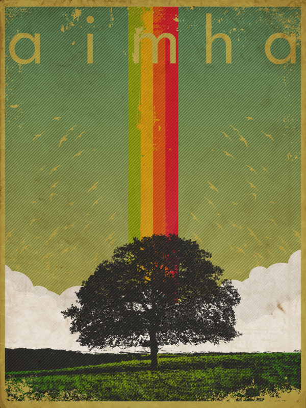
 AimhaDesign — The Source
Published: 2007-11-20 11:49:31 +0000 UTC; Views: 2387; Favourites: 63; Downloads: 0
Redirect to original
Description
Submission for the contest "retro".I tried to recreate the feel of the vintage posters mainly playing with colors and with the worn out look. I wanted to add a paper texture too, but they are not allowed in the vector gallery. So i traced this one [link] by and used it like a vector ( I know, I'm a lamer
") ).
).All done in Illustrator cs3,hope you like it!
Related content


Comments: 20


featured in this collection << [link] >>
check it out see if you like it
👍: 0 ⏩: 0

awesome, love the retro feel.
Love the fact that U traced the paper texture, fantastic idea and worked out great
👍: 0 ⏩: 0

I really like this one. It indeed does have a very retro feeling about it, plus I love the colors and how it is a bit grunge-ish 

👍: 0 ⏩: 1


It's a direct rip off of ISO50's stuff. Scott Hansen. You pretty much took an existing design of his and recreated it, and don't think I'm attacking the 'retro style'; Sticking a tree in the middle with a rainbow coming out and birds fluttering about..
Jesus Christ.. Be a little bit more original.
👍: 0 ⏩: 0


I do like it. And now it's my turn to say something ")
Try making an opacity mask on that layer with the diagonal lines. Make it transparent over the tree and grass so the colors and contrast can be more lively!
just an idea...
")
👍: 0 ⏩: 1

thank you for the advice!
👍: 0 ⏩: 0


thank you for the kind words!
👍: 0 ⏩: 0


Wow,bello,non mi piace solo il pattern troppo evidente  (Smile)")

👍: 0 ⏩: 1
mah, in teoria non doveva essere così...è che illustrator fa quello che vuole a volte...il layer dovrebbe essere all'40% in overlay, ma quando renderizzo me lo mette come se fosse 100% su normal...mah...
👍: 0 ⏩: 0