HOME | DD
 aingeal — When the chips are down...

Published: 2010-05-22 18:17:13 +0000 UTC; Views: 2426; Favourites: 102; Downloads: 28
Redirect to original
Description
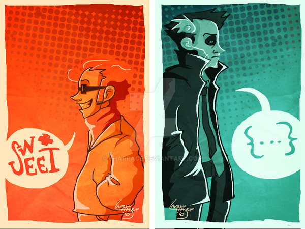
Moar old Hanna Is Not a Boy's Name fanarts. i usually do them before starting work on weekday mornings, since i get to the office early.Sketched in SAI, and text added in Photoshop. One of the relatively few things that i don't like about SAI is the lack of text tools. But it is a drawing programme and i like how lightweight it is, so it's certainly bearable.
Lamont's too small to be really back to back with Doc Worth, and Worth just looks weird. Oh well

Worth & Lamont property of
Related content


Comments: 23


 (Smile)")
")

If that isn't a goodlooking Worth, I don't know what is
👍: 0 ⏩: 1

i'm glad you like him! i was so "D< NOT GOOD ENOUGH" at how he turned out, but had no time to redo because it was time to start work T__T
👍: 0 ⏩: 1
I think he's more than good enough
 (Wink)")
👍: 0 ⏩: 0


aaa the way you've interpreted their faces! you've totally made them your own but they're still themselves. and I love the subtlety with which you've pushed the linework further with little hints of tone. got a sweet spot for sketchiness.
and in fact I quite like that Lamont's smaller compared to Worth even though you say it wasn't intentional; kind of brings a different depth and meaning to the way they're set up!

👍: 0 ⏩: 1
Wah, thank you so much! i'm really honoured you like them, because i think you draw the hottest Lamont ever. Ever. <3 And i'll stop being weird and creepy now, and just say thanks again!
👍: 0 ⏩: 1
haha you're kidding me! I'm so flattered. especially cos your Lamont is so damn fine, I gotta say.
and you're very welcome, your art all over is fabulous!
👍: 0 ⏩: 0


Maybe it's just me but Worth looks a bit like James Woods... which is awesome...
They both look really cool.
👍: 0 ⏩: 1
Lol, he does! The facial proportions, i think, and the chin.
Thankies XD
👍: 0 ⏩: 1


Loving the sketchy style, it really suits them :3
👍: 0 ⏩: 1
Thankies! They are men of sketchy character indeed, hurhurhur *bricked for lameness*
👍: 0 ⏩: 1
Haha, makes it all the more appropriate, right? XD
👍: 0 ⏩: 1
It does indeed! XD
i told someone that i want to try drawing Worth in a sparkly shoujo style, just for the crack and sheer unWorth-iness of it 8D;;
👍: 0 ⏩: 1