HOME | DD
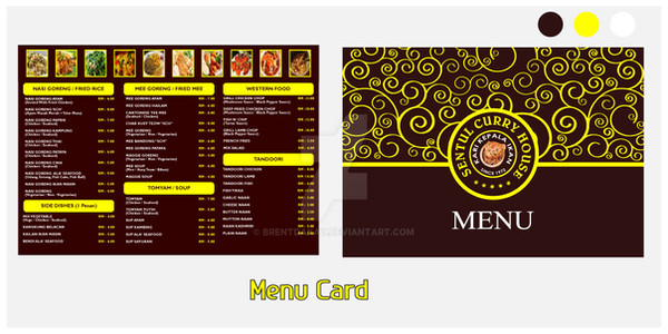
 akkasone — Logo ReDesign-VOI
by-nc-nd
akkasone — Logo ReDesign-VOI
by-nc-nd
Published: 2007-09-25 02:42:05 +0000 UTC; Views: 12742; Favourites: 77; Downloads: 532
Redirect to original
Description
Logo RedesignJust wanted to know your comments friends
 (Wink)")
Visit my website .
Related content


Comments: 21


this is one artistic and beautifully crafted logo, loving it!
👍: 0 ⏩: 0


ive seen this in logopond, looks amazing, keep up the good work
👍: 0 ⏩: 0


I like this mate. Looks great.
Simple & class, just well done for a restaurant.
.....but maybe that the color , in bottom, would be better in a little more shining ?
Anyway it's very nice.

👍: 0 ⏩: 0

I think it worked out well, the color choices are good and the design formal yet understated.
Good job.
👍: 0 ⏩: 0


this definitely has a beautiful elegance about it.
stunning really.
👍: 0 ⏩: 0


stunning, and the red is perfect to reflect the Indian style
👍: 0 ⏩: 0


amazingly simple logo and very nice choice of colour scheme!! ")
👍: 0 ⏩: 0


Very warm, beautiful palette. I enjoy your clean design aesthetic in this and other works.
Constructive criticism:
- I think you could texture or fill with a pattern on one or both of the bottom stripes to break up the flat color fills. (Something simple like a diagonal stripe pattern?)
- Personally I would change the hue of at least one of the three main elements at the top (crown, co. name, description) for better contrast/to generate more interest. Maybe the description text in white or eggshell.
Nice work, +watch.
 (Smile)")
👍: 0 ⏩: 1

Thanks Buddy!
Adding texture/pattern is a nice idea which will work well with the theme.
I will try a variation regarding changing the hue of at least one.
👍: 0 ⏩: 0
