HOME | DD
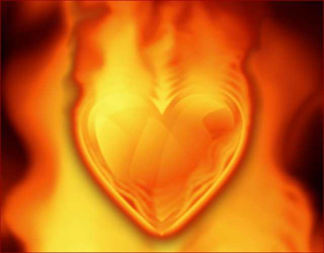
 al-xx — Burning Heart Rising
by-nc-sa
al-xx — Burning Heart Rising
by-nc-sa

Published: 2007-03-05 13:37:16 +0000 UTC; Views: 10372; Favourites: 41; Downloads: 338
Redirect to original
Description
My first deviation in a long time. It's based on my Burning Heart . Like it or hate it? Let me know what you think! (Smile)")
Resolutions:
1600x1200
1280x1024
1280x720
1024x768
/al-xx
Related content


Comments: 14

Hey al-xx can i use this for my book cover and poster for a story i'm writing?
I would like to purchase the license to use this accordingly.
Let me know by messaging me on here.
Good luck,
Adrie
👍: 0 ⏩: 1

Hi!
You are welcome to use this for the purposes stated in your message as long as you give me credit (al-xx.deviantart.com). The PSD is lost in time so I can only provide you with the resolutions that's in the zip-file.
👍: 0 ⏩: 0
Than-xx! BTW: What does the asian signs in your avatar mean?
👍: 0 ⏩: 1

Sonic heroes! ")
👍: 0 ⏩: 1

wow! great work :]
I'm putting it on my desktop
Thx a lot :*
👍: 0 ⏩: 1
Click on the monitor icon next to the deviation.
👍: 0 ⏩: 1

oh. lol. i never knew we can use it to upload different resolutions
thanks a lot
")
")
👍: 0 ⏩: 0

I like this. The only thing I would suggest is making the outlines of the heart just a tad sharper. Right now it looks very soft against the strict outlines of the background, which works fine otherwise. I would just make the edges slightly more accented so it would blend in a bit more with the background style.
👍: 0 ⏩: 1
Hmm... Do you mean that I should tone down the fire round the edges? I realize that this kind of a mix between styles with the photographed texture, the artificial photoshopped fire and the vektor like beams. Maybe I should blur the beams a bit? Wadda'ya think?
👍: 0 ⏩: 1
I don't think you need to do anything with the fire, just make the outlines of the heart a little more accented. I mean adding a slightly thicker, either white or nearly white outline around the heart. There's no need to blur or sharpen anything, just isolate the soft heart from the sharp background by giving it some thicker boundaries.
If this still makes no sense, I might be able to whip up a quick preview example of what I mean.
👍: 0 ⏩: 0