HOME | DD
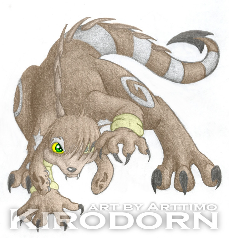
 albinoshadow — Kiro - Graphite+PSP
Published: 2005-05-29 23:33:28 +0000 UTC; Views: 1099; Favourites: 25; Downloads: 243
Redirect to original
Description
Just a sketch that went further than a sketch... I didn't intend to finish this on paper. I couldn't get his wings to work... so he doesn't have wings today.I used psp to add a light layer of color to this version... which do you prefer between this one and the original? I'm not sure which to enter in the BC.
Related content


Comments: 27

Enter this one, enter this one! xD People always like colored things better.
👍: 0 ⏩: 0

that is so kool very nice detale and i luv the tail!!!!
👍: 0 ⏩: 0

I like this style of coloring compared to your usual, it just looks more natural. And I pefer this one to the black and white.
👍: 0 ⏩: 0

I pefer the first one, since if you think about it, the first one shows that the artist didn't need to use a computer program to make the picture super spiffy.
👍: 0 ⏩: 0


I just don't know why but Digital pics, look better when you scan them with shadow made by pencil, that without it.
Great picture!
👍: 0 ⏩: 0

I like the original better because the eyes look kinda scary in this one...
👍: 0 ⏩: 0

Ooo I love the pose! Makes me want to go all tiger...-rawr-
👍: 0 ⏩: 0


I think I like the original one much better because it was kinda a bit off your style, and its nice to change!
👍: 0 ⏩: 0

... You know what's scary? I did the same thing with the fanart for Praedius. Pencil work first and color on PSP7. Only mine has more color than pencil, but... I see this pic of Kiro AFTER, having no idea you did the same. O_o
Great job, by the way. You didn't have to follow your sister's idea, 'cause the difference in coloring kinda... ... +can't find the words+ But it's cool anyways. :3
👍: 0 ⏩: 0

I personally like the original more. But that's just me.
👍: 0 ⏩: 0


the left eye looks out of place =/ use the only pencil one
👍: 0 ⏩: 0


Try making both eyes pencilly. X3 Then I'd like this better then the B&W version... Though, black and white is cool. X3
👍: 0 ⏩: 0

")

I kinda like the first one better. His eye just seems... out of place in this one because his other eye is pencily and the big eye is solid and looksd like it doesn't belong in the picture... sort of.
👍: 0 ⏩: 0

i think this one is the one you should send in...just finish the other eye..n you'll be ready to rock their SOX!!! 8D ~auto vote from moi~ XDD
👍: 0 ⏩: 0


OMG!! They're both so awesome!! ;__; Hmmm...maybe you shouldn't have recolored his right eye that way though. ...it looks a bit strange in context with the rest of the coloring.

👍: 0 ⏩: 2

The eye was my sister's idea. :3
👍: 0 ⏩: 0
true..but it sticks out more..no?..i find it quite intree'ging(sp)..like..the eyes are to be the first thing you see..-shrugs- maybe its just me 8J
👍: 0 ⏩: 1
Yeah...if both eyes were colored the same way it'd be pretty cool. 83 Oh oh!! Arttimo, perhaps you should add that kind of faded-double-image-background sort of thing to this, and make the eyes the most obvious part in the background. ^__^
👍: 0 ⏩: 0
