HOME | DD
 alessandelpho — Future gohan, adv cell shading
Published: 2008-04-25 09:55:06 +0000 UTC; Views: 33181; Favourites: 150; Downloads: 10491
Redirect to original
Description
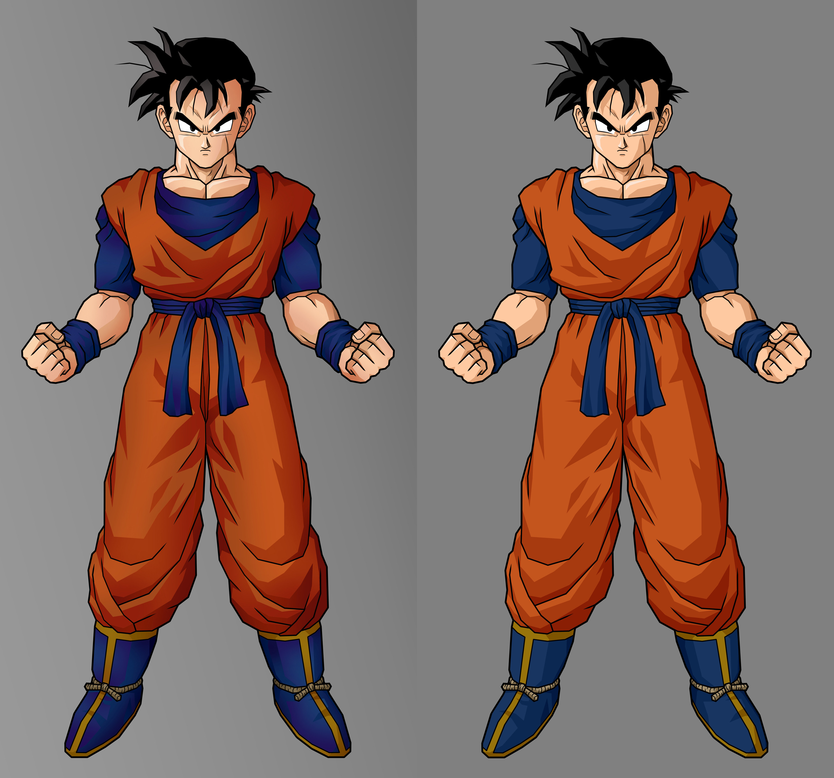
in this image, i did only a recolour work, NOT in cell shading, but in ADV cell shading, using soft round brush in every shade.this type of coloring give to gohan a strange, real look, impossible with the normal cell shading recolour.
maybe this can be my new style of image ... or not?
(sorry for my terrible english)
(mine is on left XD)
ps: as always the original image is from tenkaichi 3
Related content


Comments: 24

What program do you use? I, myself, am a Photoshop person.
👍: 0 ⏩: 0


Okay, the left one is the one that's more advanced because of the blending transitions which are more noticeable on the clothes. Very nice!
👍: 0 ⏩: 0


The Uniform on the right is better while the skin on right is better.
👍: 0 ⏩: 0

If is Gohan, I gonna love it, nice work! -sorry for my bad english xD-
👍: 0 ⏩: 0

my point of view the left one's shading only looks a bit darker lol o.O
👍: 0 ⏩: 0


Eccomi.
Dunque per colorare hai usato un pennello sfumato anziché "netto", come al solito.
Premettendo che non sono una disegnatrice professionista e che di pc non ci capisco NIENTE, l'effetto è leggermente diverso, ma neanche tanto. Non è male. Per queste figure "in stile videogioco" secondo me bisognerebbe tenere lo stile classicol, le ombre nette, altrimenti non sono più "in stile videogioco", ma se vuoi ottenere un'effetto diverso, più "tuo", allora è ok, è carino, non mi dispiace.
 (Smile)")
👍: 0 ⏩: 1

già... prova a guardare l'altro, xicor che ho appena messo, l'effetto sembra migliore...
e comunque l'effetto netto c'è sempre, ho fatto sfumature all'interno delle ombre nette... (strano ma vero XD)
👍: 0 ⏩: 1
Eheh, sì, ho notato che comunque i contorni sono netti. E' un effetto proprio "strano".
👍: 0 ⏩: 0

only a little... wee XD it's a long work to transform in that style...
👍: 0 ⏩: 1

I believe that, but I like so much both of then and that's why that the left one looks a little better 
👍: 0 ⏩: 1
XD no problem... please comment my new work... maybe that can change your opinion...(MAYBE! XD)
👍: 0 ⏩: 1
")

