HOME | DD
 AlexanderFriedl — Upload - easytemplates.org

Published: 2009-05-19 10:13:11 +0000 UTC; Views: 15602; Favourites: 112; Downloads: 510
Redirect to original
Description
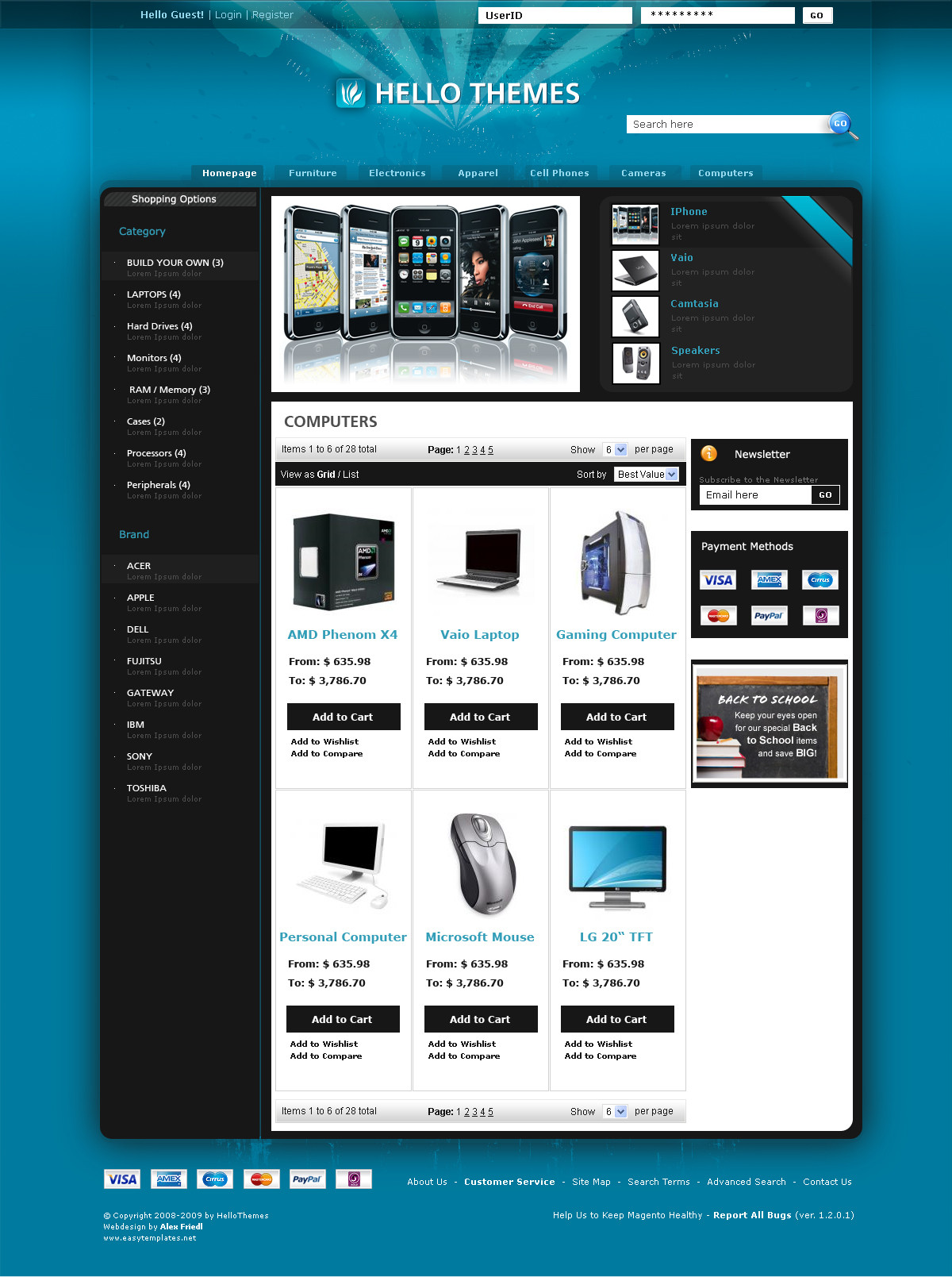
Buy this cool website at easytemplates.org - [link]It's 7€ / 5,4$
Related content


Comments: 54


Top image is clean and has depth with corner shadows and drop shadow effect on the topper.
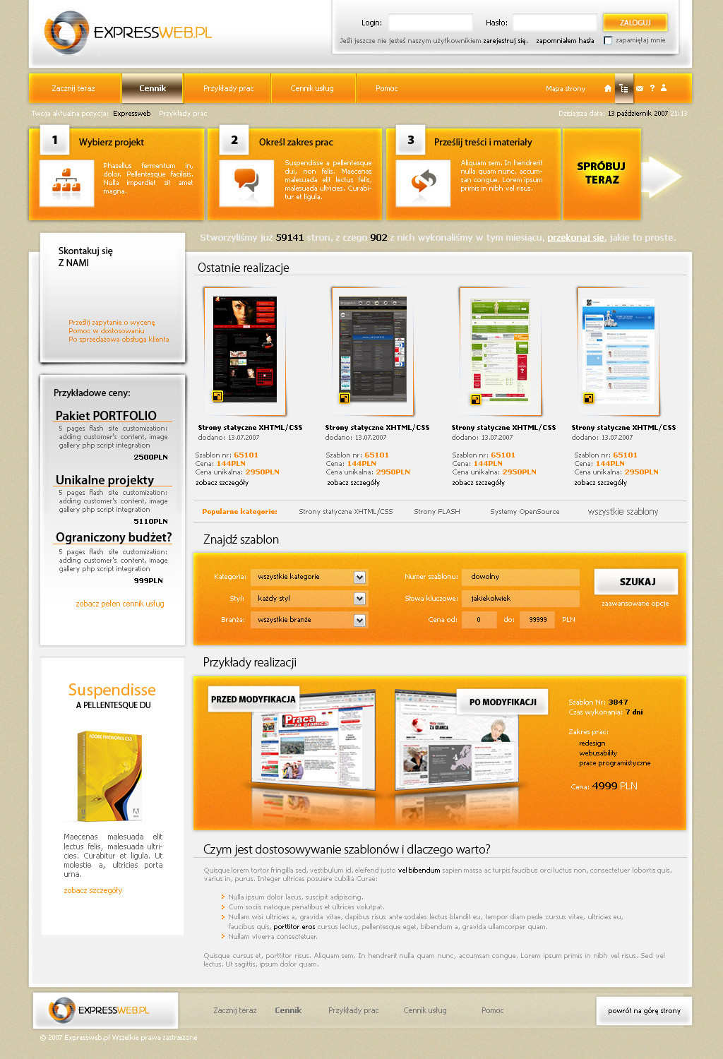
Bottom one is more flat and doesn't make a presence like the first one does.
👍: 0 ⏩: 0


I think the second one is cool.
Also i saw that the name that is Lost Password - the "S" looks bad, maybe you should change the font.
👍: 0 ⏩: 0


Startseite gefällt mir der Schatten bei den Buttons sehr gut. Design hat ansich ne geile Farbe  (Smile)")
 (Wink)")
Die Stock Seite kenn ich noch ni^^
👍: 0 ⏩: 0

First
Though I think both designs need some more work on the content area. Navigation is awesome
👍: 0 ⏩: 0

Looks good, and - what is the most imoportant in upload sites - clean and easy to read
👍: 0 ⏩: 0

")


Very nice man, I'd say the first one. Definitely. The nav shadow is much more unique and gives the design a great deal more depth
👍: 0 ⏩: 0


cool dropshadow you have going on there, and purple is nice!
👍: 0 ⏩: 0


Ist das für netload?
Die haben mich auch angeschrieben?
schönes Design, gute userfreundlichkeit!
👍: 0 ⏩: 1

yoa, die haben nen contest draus gemacht. zuvor hatt ich den auftrag (wer weiß, vielleicht auch du), aber hab zu lang gebraucht - abitur!
👍: 0 ⏩: 0


NICE!
I really love the first one, the drop shadow is sexy.
👍: 0 ⏩: 0

very clean! Can't decide which i like better though i'm afraid!
👍: 0 ⏩: 0

endlich wagst du dich mal an mehr details^^ konnte deine normalen verläufe bei deinen ganzen community designs und so net mehr sehen
top!
👍: 0 ⏩: 1
yoa, probs gibts dann aber mit css ")
👍: 0 ⏩: 2

wo soll es denn da probleme geben? O.o ist zwar schwieriger aber geht alles ...
zum design:
v2 ist besser. aber die button rechts bei dem upload center passen nicht so wirklich^^ und ansonsten kannste das auch besser
👍: 0 ⏩: 1
ehm nit wirklich wenn man en ordentlichen puffer sliced ... aber naja
👍: 0 ⏩: 0


erstes ist besser, aber gut isses dennoch nicht wirklich...
👍: 0 ⏩: 1


Sehr schöne Farbwahl, das hält ein doch etwas länger auf der Seite.
Schlicht gehalten, Tolle Stock Fotos verwendet was bleibt mehr zu sagen außer
Gute Arbeit!
👍: 0 ⏩: 0


The second.
This layout aint as good as some of the others you've made.. /:
👍: 0 ⏩: 0

| Next =>