HOME | DD
 alexdesigns — GRAPHWARE
Published: 2008-01-12 18:39:04 +0000 UTC; Views: 16676; Favourites: 128; Downloads: 931
Redirect to original
Description
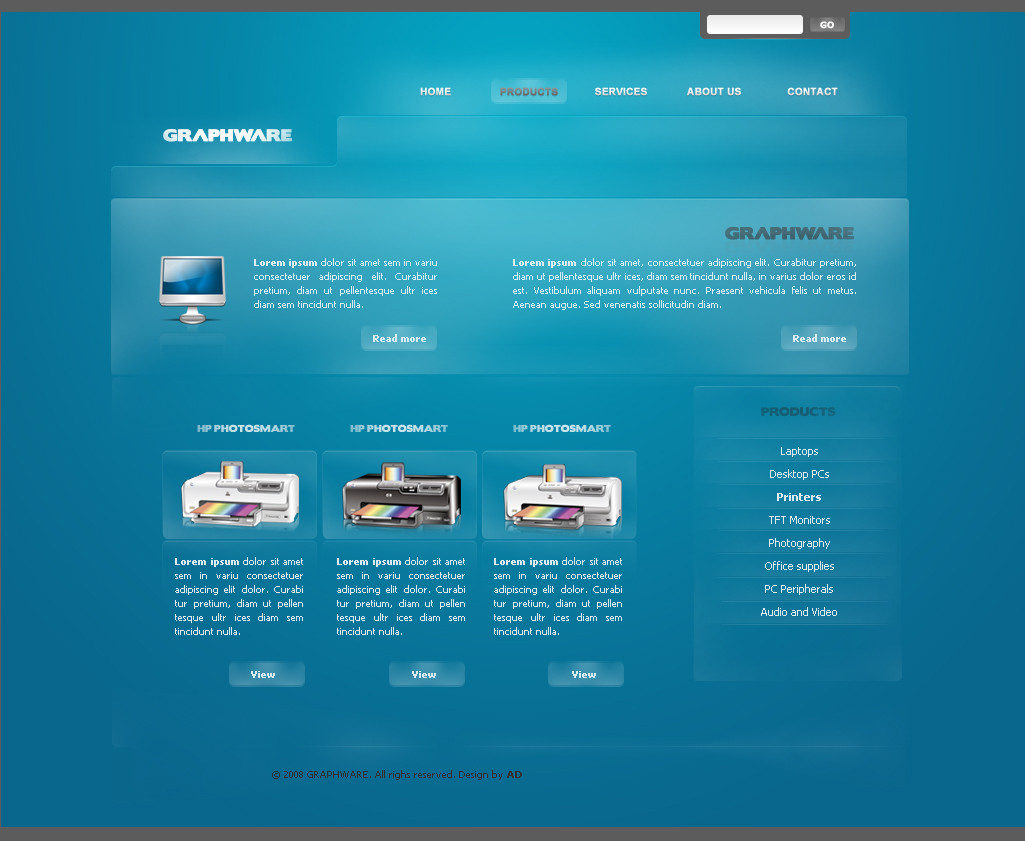
I had some free time yesterday and I made this.Willing to make some changes I suppose.
Icons by www.iconbase.com
EDIT: Took everyone's comments into consideration and edited this entry. The contrast is higher and it has a better focal point. Hope you like it better now
 (Wink) - ;)")
Edit 05 March 2010: Moved to Scraps
Related content


Comments: 40


GRAPHWARE was made for practical purposes. The idea was used for a contest and got transformed into Attollo...
👍: 0 ⏩: 0


in what? i kinda like it like it is...
👍: 0 ⏩: 2

The grey text it's soo dark man, hard to read, but yea it's your choice
👍: 0 ⏩: 1

The gray is cool on top and bottom bars, search area + the Graphware text...But otherwise, it doesn't suit the layout imo.
👍: 0 ⏩: 0


Looks good
Like what has been said, you just need a focal point and more contrast
👍: 0 ⏩: 0


it's gorgeousssss
like i keep saying, you should code your layouts and learn how to ...they'll be amazing if you do!
👍: 0 ⏩: 0

I like the shapes and setup and everything about it except the color: its too much the same. At quick glance without fullviewing, all you see is blue. Add more contrast and it'd be amazing.
👍: 0 ⏩: 0

Looks good bro. But I don't think there's enough contrast with the main content text and the background.
A brighter white would be sweet.
👍: 0 ⏩: 0


I like it  (Smile)")
looks fresh and very clean
but the grey colors dont fit with the blue
👍: 0 ⏩: 0

nice work.. looks smooth.
Could use some more contrast and I don't like the grey on blue titles.
but what this design needs most is a focal point.. something that stands out..
still good work though
👍: 0 ⏩: 0


Looks awesome mate, especially the buttons. Reminds me of osec a little bit.
I would use a darker grey on all areas, as at the minute, it looks quite brown. Maybe try using a dark blue colour for the grey text to increase readability.
Other than that, nice job. Love the gradients.
👍: 0 ⏩: 0

I like it! Good work. But yes, maybe the grey is too bright and the contrast is low. You may try with something like #555 - 333.
Fav, again
👍: 0 ⏩: 0
change the highlighted font color from grey to another color mate
👍: 0 ⏩: 0

