HOME | DD
 alexmodi —
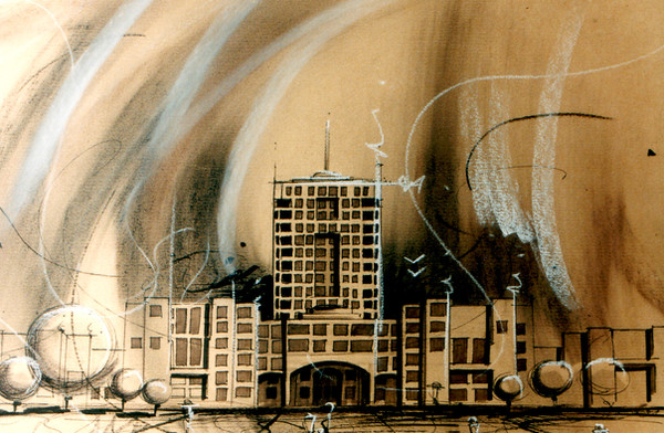
HIPODROM
alexmodi —
HIPODROM

Published: 2005-05-03 22:37:29 +0000 UTC; Views: 10367; Favourites: 194; Downloads: 2371
Redirect to original
Description
pastel A3Related content


Comments: 64


👍: 0 ⏩: 0


cat de marfa ... o arzi aiurea ca un copil de 12 ani cu acuarela pe hartie...iti bagi pula in gemulete...si rahatul tau ajunge DD...ca lumea...
👍: 0 ⏩: 2
ce mah? te-am dat de gol?..
")

👍: 0 ⏩: 0

bah dilaule mai bine nu scriai nimik...TZIBA-n pula mea.
👍: 0 ⏩: 0

Multzam lui Stalker ca mi-a deschis ochii! Complimentele mele!
👍: 1 ⏩: 0

Cel mai mult imi plac ferestrele in forma de om si lucrurile care sunt deasupra blocului.
Frumos, merita DD.
👍: 1 ⏩: 0

i find the combination of the yellows and red with the more neutral stone colors very interesting, i also like the slight slant in the buildings.
Good job.
👍: 0 ⏩: 0


It also looks like some artwork from Radiohead, I don't know, like something they would put inside a booklet....
👍: 1 ⏩: 0

 (Cool)")

what is hipodrom... that sound very familiar. isn't it in like beograd or something?
👍: 1 ⏩: 1

Actually it's the name of a city district from a city in Romania. [other cities within this country might have districts that are called the same, but I have no idea]
👍: 1 ⏩: 0

This reminds me of an (ex) hotel in Tulsa, Oklahoma. I think it was called the Camelot. This is roughly what it felt like.
Excellent work. I like the messiness. It works with the urban setting. The graffitti at the bottom is great too.
👍: 1 ⏩: 0

Interesanta piesa... Felicitari cu DD-ul... !!!.....
👍: 1 ⏩: 0


So cool. This reminds me of Marilyn Manson's watercolours and Tim Burton's pencil drawings. (Trust me, both of those are good.) GREAT WORK! Automatic +fav
👍: 1 ⏩: 0
I remember doing something like this a while ago, (it wasn´t that good) I really enjoyed this one
👍: 1 ⏩: 0

i love this ^^ very cool and well done hehe  (Smile)")

👍: 1 ⏩: 0


This flies in the face of art teachers who say you have to have an odd number of objects in your art. xD
👍: 1 ⏩: 0

i like it.
wouldn't give it a Daily Dev.
but then again, I wouldn't give my work one either.
Congrats.
👍: 1 ⏩: 0

very creative.. I love how it can look real, yet it doesn't. I really like it. =3
👍: 1 ⏩: 0

I love the detail... at first it seems to be so simple (like one person mentioned a kid drawing it) but when you take a closer look it seems much more powerful... The colors are striking, they are 'drab' colors which make much more impact that say a pretty baby blue sky and perfect silver buildings... it's grey, quite like how most people envision a sad world... The two people (are they falling?) isn't noticeable, which makes another sort of statement (which I don't know if you were aiming for) about how people's deaths aren't quite noticeable to most people unless it sticks out severely...
I can't make out either of the graffiti markings (is that what they are?)... but I think it helps a bit, sorta makes our signatures on this world blurred and not as important as we'd like to think...
I disagree with ahlen about the background, it's perfect the way it is in my opinion...
I'm going to add you to my watch list, I would definitely love to see more art by you.
👍: 1 ⏩: 0


Very creative and original! I love how the colors are mixed into the buildings, and I also love how some of the windows are actually shaped like little people.
And hey, don't let any one else's comments bring you down. It's what you think that counts!
👍: 1 ⏩: 0

I enjoy the painting but since its a political piece shouldnt there be some description based on the point or meaning behind the piece? Anyway almost has a watercolor feel to it...very cool
👍: 1 ⏩: 0


luv the pastel work and the buildings... though I would have liked for the background to be something else (not white).. keep it up!
👍: 1 ⏩: 0


I like how it blurs into the background... ^_^
👍: 1 ⏩: 0


oh, i just noticed what looks like graffiti at the bottom of the buildings? if that's what it's meant to be, excellent :-D
👍: 1 ⏩: 0
this is great. i love the smudging, like rain falling or smoke stains or something. maybe it would look even better if youd filled in the background somehow, made it claustrophobic. but it's great as it is. fave, because it's not the norm.
👍: 1 ⏩: 0


Very interesting ! It's nice. The colors are beautifull. Good job ! ^^
👍: 1 ⏩: 0

")
| Next =>