HOME | DD
 Alexx-C — Page 1 Color
#color #comic #fight #girls #page #painted #sexy
Published: 2015-01-11 22:20:45 +0000 UTC; Views: 11358; Favourites: 85; Downloads: 404
Redirect to original
Description
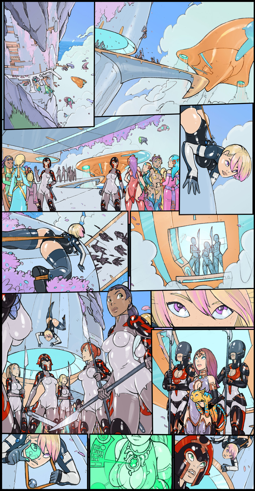
Here is the first page one of my sexy sci-fi comic in full color, and without any text or sound effects. I did a color shift on the sky and clouds and added painting some touch ups. I think the characters stand out better against the blue sky and bright day time lighting, and I will carry this though the rest of the pages.Page one (pencils with text)
Related content


Comments: 25

I love the costume that "princess?" is wearing
👍: 0 ⏩: 1

Thanks! Yeah, she is some kind of fancy royal
👍: 0 ⏩: 0

Love the design elements going on in this page. The consistency is fantastically fun around the piece, some nicely adventurous panel construction... heck of a lot of neat!
👍: 0 ⏩: 1
Thanks, I'm glad it read well. I should be posting all the coloured pages with text and the cover soon
👍: 0 ⏩: 1
Can't wait to see how it all comes together. I love the very "european" flavor to the composition - it's a hell of an awesome bit of layout work and I hope that it will keep on going in the future, as time permits!
👍: 0 ⏩: 0


The colors work better on this page for sure.
👍: 0 ⏩: 1
I think so too, I'm going to go with the blue sky
👍: 0 ⏩: 1

I love the shiny uniforms everywhere!! So tight, so shiny

👍: 0 ⏩: 1
Thanks! There is lots more of that in the next pages
👍: 0 ⏩: 0


The Sunset sky colors look is really pretty. However, the Blue sky colors make the foreground people and objects pop. And the pink hair tips are very cute.
I wonder about the, um, monocle, and her 'monocle vision.' The cyan kind of echos the other cyan in the page and makes it stand out less. I'm thinking that the monocle/vision should stand out more. Perhaps the cyan should be replaced with a color less represented on the page, like red or green or something. Or perhaps the cyan of the monocle vision is okay, but her amulet and the, um, data pop-up thingy, should be in a contrasting color.
Anyway, even as-is, it's AWESOME. Love the palette.
- Ark
👍: 0 ⏩: 1
Good call, I tried out an green/blue and it works a lot better. Thanks. I also changed the royal's ship to look more broze/metallic, so it ties into her outfit and the architecture more.
👍: 0 ⏩: 1
Cool - the green looks good!
I gotta tell ya - I like the more warmer goldy ship as opposed to the bronzy ship, and I'll tell ya why . . .
1. The gold attracts my eye better, so I know that the first three panels are about that ship. (I happened to save the old version to my desktop, so am doing direct compares.)
2. It also ties in with panel 6 and 9 better, establishing that Arian is coming out of the gold ship, as opposed to using some other bronze portal at the - space port thingy.
3. The ship's profile from different angles is vastly different, so the singularly unique color told me which ship in panel 1 was the same in panel 2 and 3. The port is pretty busy, and there are a couple of ships in panel 1 that could be the one in panel 2, judging from shape alone.
4. The gold just screams self-obsessed monarch who owns cats. Bronze - not so much.
5. And the bronze is kinda dingy (gloomy and drab, not ditzy) and fades into the background.
6. The gold goes with the various shades of purple and lavender on the page better. In my mind. But then again, purple and gold were my high school football colors, so who knows.
Anyway, if I'm getting annoying, just tell me to pipe down.
- Ark
👍: 0 ⏩: 1
No, I like the feed back, that's why I post these images. I was thinking the same thing with the gold ship from my original post (the sunset version). It does stand out more and is easier to follow.
👍: 0 ⏩: 1
Well cool then.  (Smile)")
- Ark
👍: 0 ⏩: 0

They stand out really well, and I like the look of the technology you have them. I was wondering: do they have a cultural biase against any kind of projectile weapon?
👍: 0 ⏩: 1
I'm thinking they have laser type weapons (like in star wars), and in this area there is a force shield that disables them. So it is all hand to had here, but there may be some guns in future stories.
👍: 0 ⏩: 1
I see. It's kind of like the situation in the "Dune" series where personal shields that react badly with lasers and fend off bullets make most guns impractical and bring back swordplay.
👍: 0 ⏩: 0