HOME | DD
 AliceInDarkland — Janhaus.com Official Homepage

Published: 2006-06-20 17:37:01 +0000 UTC; Views: 3995; Favourites: 18; Downloads: 251
Redirect to original
Description
Wondering what I've been doing lately? Here's the answer (Smile)")
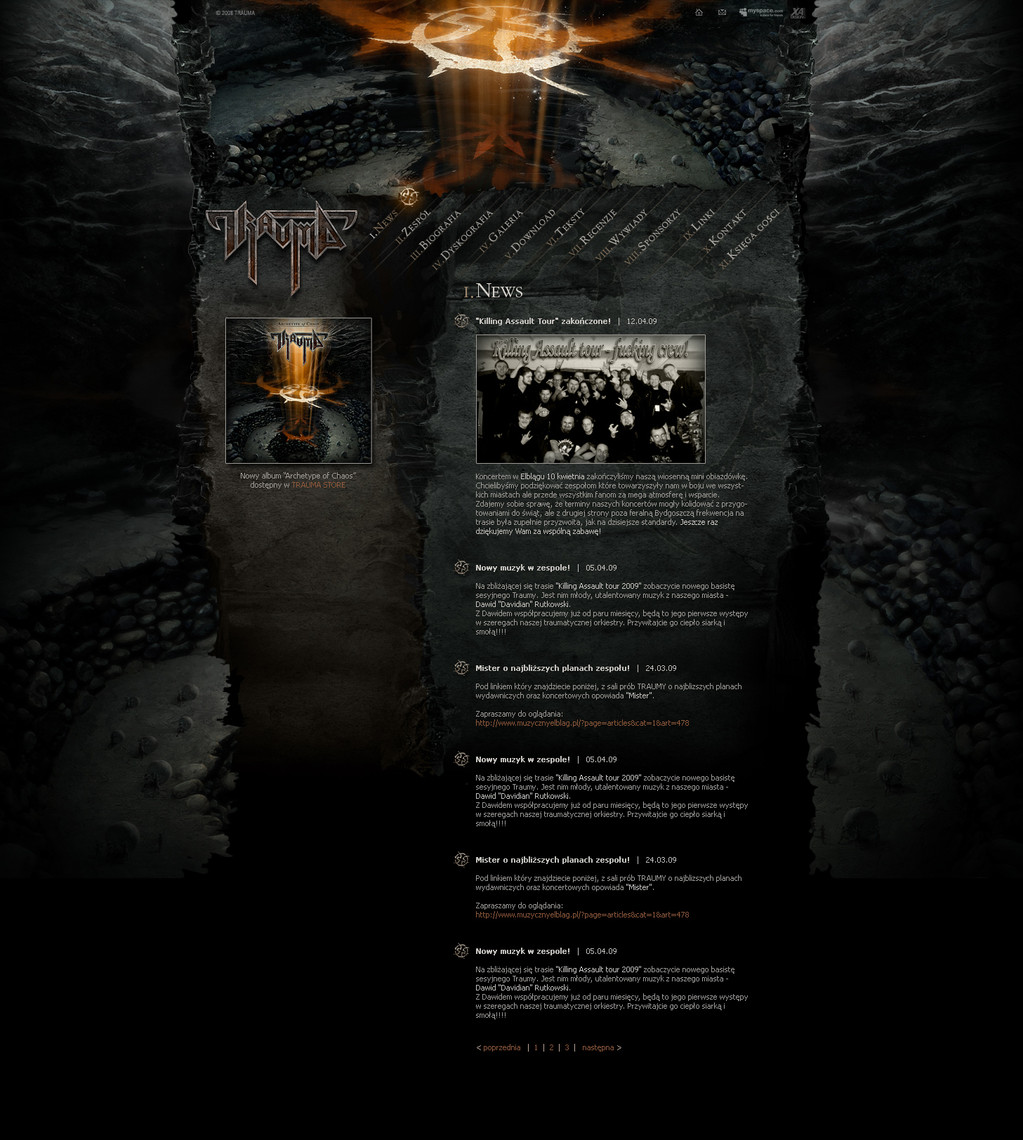
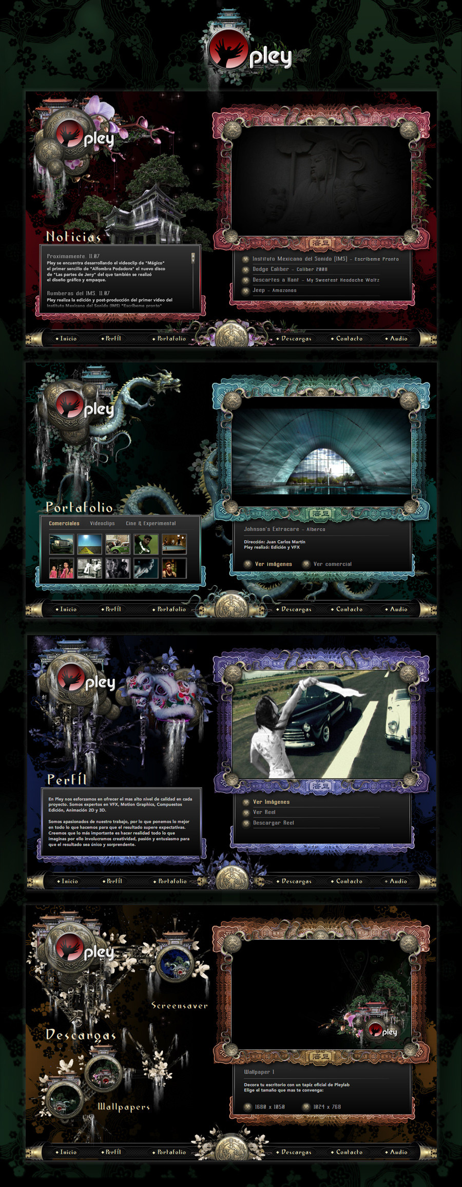
Design for Janhaus' Site , a local rock band.
Graphics + XHTML + flash intro + PHP form all by me.
CREDITS
Book "cover" by: ~pdtnc-stock
Pages by: ~amethyste-stock
Card by: brokenarts from Sxc.hu
Related content


Comments: 19


Fantastic!
You'll laugh when you'll see online my new site
")
👍: 0 ⏩: 1

Did you use the same book?
")
👍: 0 ⏩: 1
Nah, I used David Copperfield date 1800, which is actually falling in pieces
👍: 0 ⏩: 1
When are we going to see it?
👍: 0 ⏩: 1
Hahahhah....the next year maybe
Sai che tendo sempre a complicare le cose, a parte gli scherzi, probabilmente tra un mesetto sarà pronto spero, adesso torno al volantino

👍: 0 ⏩: 0


I'm glad you like it, thanks again for letting me use your stock
👍: 0 ⏩: 0

Ma dai, tu hai fatto il sito ai Janhaus? Grande!
Mio padre conosce Alex e Andrea, anni fa aveva fatto delle riprese per loro a dei concerti
Comunque, complimenti, hai fatto davvero un bel lavoro
👍: 0 ⏩: 1

I think the general layout looks good, with a nice vintage touch. Since it is a commission, I won't criticize any element which seems to me a bit out-of-place (for ex., the big menu, which takes the half of the layout). I think you made a great job, you really have your own graphic style, and I appreciate that.
👍: 0 ⏩: 1


Not bad, I'm digging it. Its just the HTML text and forms that bother me, they stick out like sore thumbs with all that texture and such around
👍: 0 ⏩: 1
Well, that's personal taste I guess... I don't like it that much either, but they did

👍: 0 ⏩: 1
Thats what usually matters too
👍: 0 ⏩: 0