HOME | DD
 alisaurusrexx — Sparks

Published: 2011-04-21 00:55:08 +0000 UTC; Views: 728; Favourites: 20; Downloads: 26
Redirect to original
Description
Did I drive you away?I know what you'll say.
You'll say, "Oh, sing one we know"
But I promise you this,
I'll always look out for you.
That's what I'll do.
Singing...
Singing...
My heart is yours.
It's you that I hold on to.
That's what I'll do.
But I know I was wrong,
And I won't let you down.
(Oh yeah, oh yeah, oh yeah, yeah I will, yes I will…)
Singing...
Crying...
Yeah I saw sparks,
Yeah I saw sparks,
And I saw sparks,
Yeah I saw sparks,
Singing out.
La, la, la, la, oh…
La, la, la, la, oh…
La, la, la, la, oh…
La, la, la, la, oh…
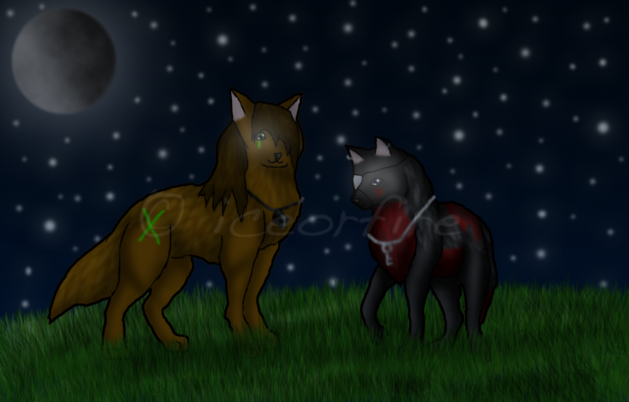
I'm uber proud of this.

Ayla and Lynx belong to me. Please don't steal them kthxbi.
Those are not fireflies around them. they're sparks :c
EDIT: Fixed the tree some more, and added more grass around the paws/tree trunk.
EDIT #2: Cleaned up around the lineart and tree and shtuff.
This is also for them #2, Love, of the 100 Theme Picture Challenge
Speedpaint: [link]
Related content


Comments: 20

Overall
Vision
Originality
Technique
Impact
Let me start off by saying this piece is truly magical and holds a wonderful meaning, showing the attraction to one another; is quite strong and cute nonetheless. The atmosphere it gives off is wonderfully created, that single star up in the sky really brings the fairytale like magic to this piece.
Now a few areas I notice that need the most attention would be the legs of the canine, the muzzles, the tails, and the perspective.
• Now any animal or human is hard to draw and takes a very long time to gain the experience needed to draw such creatures with ease. One thing to remember about canines (Wolves, Domestic dogs, etc) is the neck - shoulder. One of the hardest things on canines are the legs, neck and paws, when drawing these parts of the canine it requires a lot of persistence and patience; the key to drawing these are to remember their level points. The length of the shoulder to elbow will connect at the same level as the stomach, same to the hind leg, the bend will be level with the stomach as well.
It seems as if the length on the male canine is alright, however the shoulder blade shown should be smaller and less revealed. As for the female the legs are spread a bit too far so it seems as if she was trying to become human with arms in a sense; also her stomach is a bit too long and be it the position she is in, you would still have a glimpse at her second hind leg/ paw. As for the males hind legs, the leg itself is a bit too long and the knee should be a bit bigger as well as not having that rounded bump showing behind it. Maybe instead remove that upper bump and replace it with fluff, after all canines have fluffy behinds.
• Now the muzzles need to be a bit straighter towards the top and go out with a slight curve where the nose connects, once it goes to the opening of the mouth it should have a line (representing the mouth) that meets just above the jaw, and the open jaw should be more visualized by giving it 3D look rather than flat against the sky so it seems as if it's a whole mouth instead of half a mouth.
• The eyes are a bit too far from the muzzle and in the positions they are in, you would still be able to see the second eye, the basic shape of the eyes are alright, just remember in future works you produce to give the 3D effect by adding a bit more shading to make it seem as if it were alive.
• Finally the takes seem a bit too thick near the connection to the body itself and should be thicker near the ends of the tail, rather than the beginning.
I hope this helps at all, even if just a little bit. Good luck in future works e.deviantart.net/emoticons/t/t… " width="15" height="15" alt="

👍: 0 ⏩: 1

Thank you! this was very helpful. :3
👍: 0 ⏩: 1


Overall
Vision
Originality
Technique
Impact
While this is a nice composition, it could really do with some work.
One of the first things I noticed about this piece is that the wolves' anatomy is quite poor. Their heads are far too large in comparison to their bodies and their muzzles are too triangular and wide (I don't know much about canine anatomy, but I do know some basics). Also, their hind legs look too small and the character on the right's back legs look too straight; there should be a slight curve to them (remember that straight lines don't exist in nature; every leg, arm, tree trunk, plant stem, whatever, is not totally straight). To achieve better anatomy drawing skills you should observe canines in any way you can; nature books, drawing books, your local zoo, even Google. Practise makes perfect, and the only way to draw ANY creature anatomically correct is to observe and reference.
Your colouring skills, on the whole, are not bad, although there are some places where the colour has slipped outside the lines; I would go back and erase these as they're small, preventable mistakes which, unfortunately, make your work look very messy. You've experimented with different shades and hues, which is good, and the highlights on the fur have worked quite well. However, there is very little shading on this piece which makes it look quite flat; use a wider tonal range to make your characters look more 3-dimensional (NEVER use black for shadows, though; this looks very amateur and unrealistic). I'd like to see some darker shades under the wolves' legs, muzzles, tails etc., and some light brushstrokes to define their fur more. However, the shadows you've put underneath the wolves are quite good and help the characters fit into the scene.
The lineart for this piece is very wobbly and messy (I guess you used a tablet?). To stop this, resize your image to a large size (at least 2000-3000 px wide) and use quick strokes; the longer you take to draw a line, the wobblier it will be.
The background is quite nice, although the grass looks somewhat unrealistic - I would search through some background tutorials here on dA to improve this. I think you've used far too much blur/smudge tool on the moon; again, REFERENCE. Google pictures of the moon and observe the craters and spots on the surface; where are they, and what shape/texture do they have? I would also use reference for the tree on the right, as it looks a little odd. Remember, tree trunks are thicker at the base than they are at the top.
I hope you'll take my advice on board and use at least some of it. You have potential, and with practise your skills could improve a lot. e.deviantart.net/emoticons/s/s… " width="15" height="15" alt="
 (Smile)")
e.deviantart.net/emoticons/b/b… " width="10" height="10" alt="

e.deviantart.net/emoticons/b/b… " width="10" height="10" alt="

👍: 0 ⏩: 1
Thanks for the critique :3
👍: 0 ⏩: 1
I hope it was helpful!
👍: 0 ⏩: 0


Okay, let me first say that this is a fantastic drawing. I seriously love every aspect of it, such a romatic setting e.deviantart.net/emoticons/s/s… " width="15" height="15" alt="
Lets get the bad stuff out of the way first hm?
Cons
Not much to say here, besides a couple minor things. First is the tree, I feel as if it should be more blurred. If you blurred it more, the realism would take place and you would get bark patterns. Also try adding a little grass around the base of the tree, to make it look like its growing in the ground, not on top of it. Same with around the wolves feet and tails, just add a little grass. Also, Links back leg looks a little awkward. If he was sitting on his haunches, the hip bone would protrude a bit more and be a tad bigger. Also, give him some muscle girl! Make his arms and legs have shadow muscle e.deviantart.net/emoticons/s/s… " width="15" height="15" alt="
e.deviantart.net/emoticons/s/s… " width="15" height="15" alt="
Pros
Firstly, I was blown away by the emotion in this picture.
The expression on Ayla is great, She looks really very happy e.deviantart.net/emoticons/s/s… " width="15" height="15" alt="
e.deviantart.net/emoticons/s/s… " width="15" height="15" alt="
Overal, fantastic picture. Seriously, the expression and feel of this picture is just unbelievable. You are on your way to becoming an AMAZING artist. Keep it up!
👍: 0 ⏩: 1
those fireflies are sparks...heh get it :3 they look crappy i know
DARN I FORGOT TO ADD GRASS. I KNEW I WAS FORGETTING SOMETHING. *goes to add it*
thanks kendy :3
👍: 0 ⏩: 1
Well how about they are sparkly fireflies?
LOVE YOU ALI!
👍: 0 ⏩: 0

Oh why thank youuuuuuuu
👍: 0 ⏩: 0

nice theme ")
👍: 0 ⏩: 1


By the way, could this qualify for your contest? C;
👍: 0 ⏩: 0