HOME | DD

alivepixel β€” ArtColide

Published: 2009-03-19 21:14:28 +0000 UTC; Views: 42972; Favourites: 416; Downloads: 1515
Redirect to original
Description 
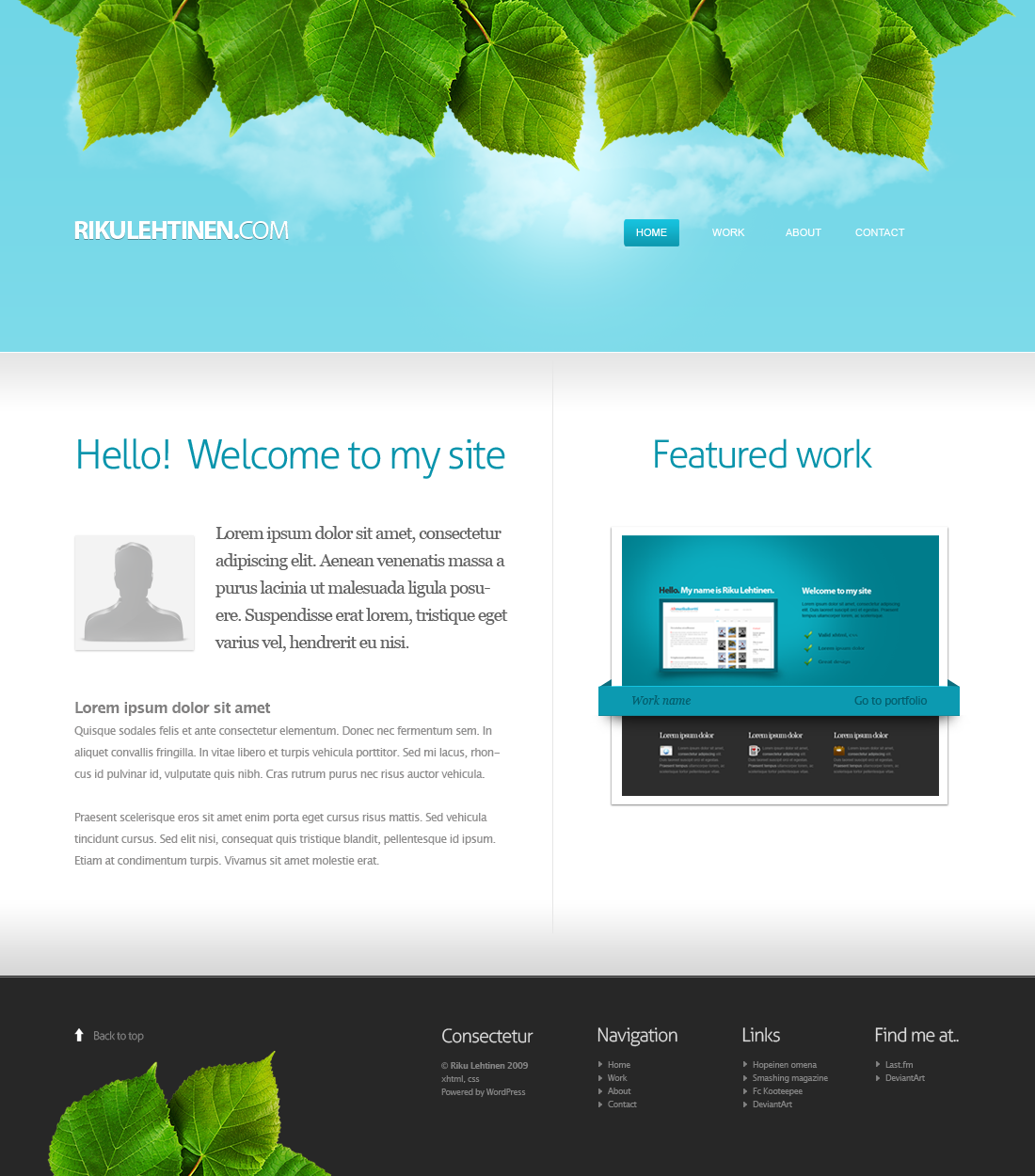
Another practice layout , i wanted to make something in a carbon theme and went for an portfolio style layout.

icons: [link]

and btw, I haven't done so many layouts yet so im sry for the lack of different design thumbs in previews!

edit
daily devitation! wow, thanks alot =edumicro for suggesting and ^NunoDias for featuring
Related content
Comments: 66

achraf26 [2010-10-24 19:53:05 +0000 UTC]

hello
please iwant to know if i can download this template, where ? .. thanks

πŸ‘: 0 ⏩: 0

jlpweb [2010-07-15 22:28:06 +0000 UTC]

Great design, the carbon looks good.

πŸ‘: 0 ⏩: 0

usaholes [2009-11-04 01:25:21 +0000 UTC]

i fuckin like this

πŸ‘: 0 ⏩: 0

jezebel-delilah [2009-09-28 17:56:24 +0000 UTC]

Hey there! A friend of mine spotted a site for a design agency that posted a bunch of other people's designs on their portfolio page and pretended that they did the work. This design was one of them.

This is the site: [link]

If I were you I'd sue the pants off of them...

πŸ‘: 0 ⏩: 0

MH-Design [2009-06-08 14:46:44 +0000 UTC]

Cool, good use of icons they really complete the design.

πŸ‘: 0 ⏩: 0

the-danzor [2009-04-18 23:58:20 +0000 UTC]

great as always man, gratz on the DD

πŸ‘: 0 ⏩: 1

alivepixel In reply to the-danzor [2009-04-19 00:39:06 +0000 UTC]

Thanks allot m8

πŸ‘: 0 ⏩: 0

godzio89 [2009-04-16 22:03:19 +0000 UTC]

Nice work

πŸ‘: 0 ⏩: 0

Sanjo-Design [2009-04-16 20:25:10 +0000 UTC]

Good job

πŸ‘: 0 ⏩: 0

dreamsmithy [2009-04-15 15:32:44 +0000 UTC]

ParabΓ©ns! mandou muito bem!!!

πŸ‘: 0 ⏩: 0

pannpann [2009-04-09 20:58:13 +0000 UTC]

Great work man! I like it. Very clean.

If you don't mind, I hope you'll appreciate some feedback. If you can decrease the number of pages in the navigation, I think you should, to create more focus. What about merging portfolio with gallery, and about with services, for example? If you can communicate the same thing in less pages, that's a good thing.

The front page would also do good with some more focus. What about making the "Welcome to artcolide" section even bigger (taller)? Just a thought.

Anyway, great work. Keep it up!

πŸ‘: 0 ⏩: 1

alivepixel In reply to pannpann [2009-04-09 23:12:32 +0000 UTC]

Thanks for feedback
I basically added a few more links to fill out the menu, instead of using too much spacing, and for the title, well i guess it could be a little bit bigger ^^

πŸ‘: 0 ⏩: 0

mattdanna [2009-04-01 01:41:53 +0000 UTC]

Love it!

πŸ‘: 0 ⏩: 1

alivepixel In reply to mattdanna [2009-04-01 21:18:03 +0000 UTC]

thanks alot

πŸ‘: 0 ⏩: 0

EAMejia [2009-04-01 00:17:58 +0000 UTC]

Really nice job bro!

πŸ‘: 0 ⏩: 1

alivepixel In reply to EAMejia [2009-04-01 21:18:14 +0000 UTC]

thanks!

πŸ‘: 0 ⏩: 0

LiDiL [2009-03-31 22:14:25 +0000 UTC]

very nice design.

πŸ‘: 0 ⏩: 1

alivepixel In reply to LiDiL [2009-04-01 21:18:37 +0000 UTC]

thanks

πŸ‘: 0 ⏩: 0

pacoarts [2009-03-31 21:00:35 +0000 UTC]

nice work! keep it on..

πŸ‘: 0 ⏩: 1

alivepixel In reply to pacoarts [2009-04-01 21:18:40 +0000 UTC]

thanks

πŸ‘: 0 ⏩: 0

hbjrockzz [2009-03-31 19:28:53 +0000 UTC]

which program do u use for designing web pages?!!!

πŸ‘: 0 ⏩: 0

Zuku23 [2009-03-31 16:59:23 +0000 UTC]

Great

πŸ‘: 0 ⏩: 0

bluefuze [2009-03-31 16:04:57 +0000 UTC]

nice work

πŸ‘: 0 ⏩: 0

drainZZZ [2009-03-31 12:05:37 +0000 UTC]

i think it's lame ) sorz i saw it somewhere

πŸ‘: 0 ⏩: 0

TomBiker [2009-03-31 11:50:06 +0000 UTC]

not bad! I like that pattern in headline

πŸ‘: 0 ⏩: 0

Silver911 [2009-03-31 11:20:51 +0000 UTC]

great design

πŸ‘: 0 ⏩: 0

mfcreative [2009-03-31 10:30:01 +0000 UTC]

Amazing layout! I love it! very clean

πŸ‘: 0 ⏩: 0

kristjan07 [2009-03-31 10:17:32 +0000 UTC]

what font you used for the text: "Welcome to artcolide"???

πŸ‘: 0 ⏩: 1

alivepixel In reply to kristjan07 [2009-03-31 12:12:03 +0000 UTC]

Klavika Light [link]

πŸ‘: 0 ⏩: 1

kristjan07 In reply to alivepixel [2009-04-01 05:45:27 +0000 UTC]

thanks

πŸ‘: 0 ⏩: 0

ODmitrijS [2009-03-31 07:39:03 +0000 UTC]

Interesting design!+

πŸ‘: 0 ⏩: 0

PaulNLD [2009-03-31 07:33:57 +0000 UTC]

Looking good mate gratz on the DD!

πŸ‘: 0 ⏩: 1

alivepixel In reply to PaulNLD [2009-03-31 11:44:29 +0000 UTC]

thanks

πŸ‘: 0 ⏩: 0

xAikaNoKurayami [2009-03-31 07:08:26 +0000 UTC]

I absolutely love this layout!

What language is that? At first I thought latin, but I don't think it is.

πŸ‘: 0 ⏩: 2

krash In reply to xAikaNoKurayami [2009-03-31 11:21:36 +0000 UTC]

It is actually gibberish, a mash up of letters used since the very early days of printing as a place holder. [link]

πŸ‘: 0 ⏩: 1

xAikaNoKurayami In reply to krash [2009-03-31 15:15:59 +0000 UTC]

Wow, now I feel ridiculous. I should have known something like that. Thanks for the info~!

πŸ‘: 0 ⏩: 0

z-design In reply to xAikaNoKurayami [2009-03-31 07:28:28 +0000 UTC]

It's Lorem Ipsum. Look it up.

It's basically dummy text used by graphic designers to give the look of content on the site.

πŸ‘: 0 ⏩: 1

xAikaNoKurayami In reply to z-design [2009-03-31 15:16:24 +0000 UTC]

I noticed that it repeated itself, but I figured that was normal anyway... hmm. You learn something new every day.

πŸ‘: 0 ⏩: 0

NunoDias [2009-03-30 20:34:00 +0000 UTC]

I like the clean and smooth look of this layout. Colors are well chosen, what creates a good harmony in the overall. Seems very intuitive. Nice job!

πŸ‘: 0 ⏩: 1

alivepixel In reply to NunoDias [2009-03-30 21:00:06 +0000 UTC]

thanks mate

πŸ‘: 0 ⏩: 0

P4B10 [2009-03-27 07:14:52 +0000 UTC]

wow, very nice! +fav!

πŸ‘: 0 ⏩: 1

alivepixel In reply to P4B10 [2009-03-30 20:59:50 +0000 UTC]

thanks!

πŸ‘: 0 ⏩: 0

bigdiZZay [2009-03-24 22:27:05 +0000 UTC]

I featured this artwork here [link] i hope you don't mind

πŸ‘: 0 ⏩: 1

alivepixel In reply to bigdiZZay [2009-03-24 23:54:49 +0000 UTC]

I sure aint, thanks!

πŸ‘: 0 ⏩: 0

Axertion [2009-03-21 09:27:50 +0000 UTC]

this is very nice. Everything is so rounded off and perfect, but then there are these nav buttons that have sharp cut corners edges. You should smooth out those edges, I noticed them right away

Not a single complaint on anything else though

πŸ‘: 0 ⏩: 1

alivepixel In reply to Axertion [2009-03-21 12:53:09 +0000 UTC]

oh didn't notice that untill now, and thanks for the comment

πŸ‘: 0 ⏩: 0

edumicro [2009-03-20 21:32:33 +0000 UTC]

Great!

πŸ‘: 0 ⏩: 1

alivepixel In reply to edumicro [2009-03-21 12:39:06 +0000 UTC]

thanks man

πŸ‘: 0 ⏩: 0

lethalogica [2009-03-20 20:02:45 +0000 UTC]

Nice design, very professional. Collide has two L's though.

πŸ‘: 0 ⏩: 1

alivepixel In reply to lethalogica [2009-03-20 20:49:26 +0000 UTC]

thanks m8, yeah i know, didn't bother to change

πŸ‘: 0 ⏩: 0


| Next =>