HOME | DD
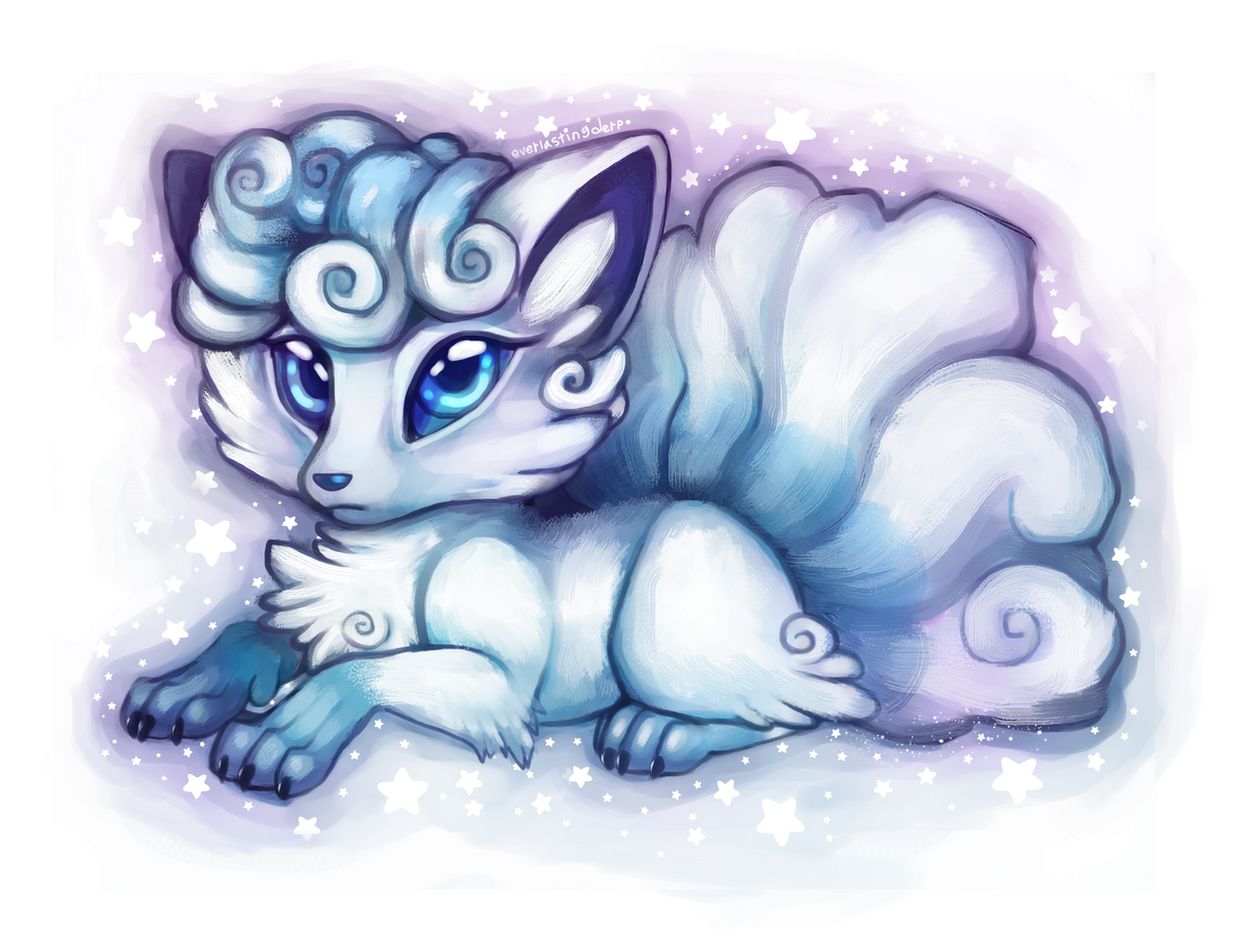
 Alolan-Vulpixy — Alolan Vulpix

#fanart #nintendo #alolan #cute #pokemon #vulpix
Published: 2017-12-14 19:18:38 +0000 UTC; Views: 1041; Favourites: 179; Downloads: 0
Redirect to original
Related content


Comments: 33

She looks like she gots a dirty little secret........
👍: 0 ⏩: 0


hey i used this as a ref for my new digital drawing
👍: 0 ⏩: 0

Super Cute, coo! What do you think, Mr. Warden?
: YEEEEEEEEEEEEESSSSSSSSSS!!!!!!!
👍: 0 ⏩: 1
you're welcome, coo! (boy, the Warden sure likes Alolan Vulpixs doesn't he)
: C'mere you! (reaches out for a hug)
👍: 0 ⏩: 1


This looks really adorable. The little bowtie really adds to that factor.
 (Smile)")
👍: 0 ⏩: 1

Thank you so much! I actually have a Vulpix done in a similar style if you wanted to check it out too. I think I'll do more Pokemon with adorable bows in the future, too!
👍: 0 ⏩: 0

OMG!!! This looks adorable as heck!!! <3333333
👍: 0 ⏩: 0


I love this piece! The composition is very appealing and the colours are pleasant. The stylized body and the character's posture improves this art greatly. I don't have really any criticism about this piece since it is so nicely done, but I think the turquoise border you placed all around this alolan vulpix may be more interesting if you chose different colour. (just my thoughts) The bow looks very adorable pulled to the side of the neck as well. Another idea could be to add more shading to the furry areas and shade it much like a cloud to show texture, it would certainly add an aspect of interest to the piece, but not entirely necessary. A texture overlay on a low opacity would also look nice on the fur, one or the other. The only confusion I have with this piece is where the back legs may have gone, unless there is a seal body behind. otherwise and overall, i l o v e, l o v e, l o v e, this piece and think you did a very nice job! so! this concludes my rather lengthy review-ish type thing. this was a thing for ProjectComment !! 6-7 lines. I enjoyed writing this and look forward to seeing more artwork like this from you. thanks! (and sorry if i come off as rude, i am just very blunt) goodbye then
👍: 0 ⏩: 1
Thank you so much for the review, I really appreciate it! I'm glad that you liked it so much! As for those back legs, I wanted to keep it simple. It's sort of like how when a super floofy cat sits you don't really see the back feet.
You mentioned a texture overlay for fur, do you happen to know of any? I'm still learning as I go along and would love to have more tools at my disposal!
👍: 0 ⏩: 1
the current art program I use is rather limiting, so i don't have the option to search for textures and apply them easily to my artwork, but what I usually do when I need brushes is just look up brushes or tools on deviant art and choose and downloads other deviant's available brushes. I adjust the settings to my liking and work away! Thanks for the leg explanation by the way and you are welcome. <3
👍: 0 ⏩: 1
Thanks for the tip. I'll keep an eye out for neat photoshop brushes and textures on Deviantart.
👍: 0 ⏩: 1

This is a comment made on behalf of ProjectComment
I can see that you tried to remain withing Pokemon anime style - which is well executed if I do say so myself! Coloring and shading is kept in the style, as well as the over all look of the character. I still can see that it is done in your own style, which is always great to see. It is simplistic, the anatomy is also in place. What I would point out is how the eyes are colored in. You have used three colors to indicate shade, default color, and light reflexes. I personally think that shade color could be darker, perhaps a very dark shade of blue. I have a feeling that you used a half-soft paintbrush for the eyes, which kind of crashes with the shading on the character. Shading on the character is a hard edge cell shading, while eyes are sort of soft but not quite there. Try making the eyes with the same hard edge shading, or maybe try a much smoother gradient on them. Play around and see what fits you more! Generally, this is a well-done drawing and I like it a lot. Keep drawing and keep experimenting, apply different things. Don't be afraid to explore ^w^
👍: 0 ⏩: 1
Thank you for taking the time to give a detailed review. When I did the shading on the eyes for this piece I took heavy influence from the official Alolan Vulpix. Looking at it again however I do agree that they feel a little off compared to the rest of the piece. Thanks for pointing that out so I know what to improve on
👍: 0 ⏩: 1
You're welcome, dearie! ")
Prince Sidon believes in you!
👍: 0 ⏩: 1
I've already grown so much since I started here, so I can't wait to see how I continue to improve! Btw, this is the image that I used as a reference for the Alolan Vulpix
👍: 0 ⏩: 0


