HOME | DD
 alptraum — 3 - Visual Perception

Published: 2002-04-05 04:26:36 +0000 UTC; Views: 2017; Favourites: 18; Downloads: 254
Redirect to original
Description
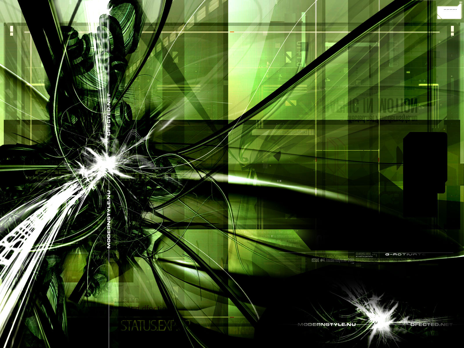
ahhhh, this is a third piece using something similar to my new style. it has that hardcore look, all the white being encompassed in white. any comments,...escpecially on the TYPO!!!! are welcome. enjoy.Related content


Comments: 19

this is sweeeeeeeeeeet.
i love how bright it is. very dynamic flow.
good work for this abstract, love.

👍: 0 ⏩: 0

")
")

whoa I'm not sure how I stumbled onto your site but I did and I really like this piece. It kinda looks like something from a Linkin Park video. It's really awesome. The colors blend together perfectly.
👍: 0 ⏩: 0

-----
Angel of the Night
Visit Angelworld now
[link]
Version 7 - State of Iridescence
👍: 0 ⏩: 0


WOW i love this one 2 , if you want to pay it a visit sometimes it's in my fav's
-----
****** Any questions ?
****** deviantART Frequently Asked Questions : https://www.deviantart.com/help/faq.php
****** deviantART help : https://www.deviantart.com/help/
👍: 0 ⏩: 0

WOOOOW!!! You are getting better eery day I like the newest wallpapers always better and the new style... incredible!
Perfect!!!
👍: 0 ⏩: 0

nice, I think the post-work compliments it well
-----
I Are Ninja!
👍: 0 ⏩: 0

well, it wasent so much typo here, more design and it looks good
👍: 0 ⏩: 0

*nominates for DD*
Nice Work.
*forwards note to *
-----
https://www.deviantart.com/deviation.php? id=243015 Enjoy Hesitations Forlorn Deviation, An Astounding Photograph!
Last words are for fools who have not said enough. -Karl Marx
Xehirut
👍: 0 ⏩: 0


Beautiful colors and blending!
-----
Proffasee :: Seeing The Future
__________________________
http://www.digitallypoetic.com
👍: 0 ⏩: 0

looks nice..i think it would be better without the "you are not seeing this" text though
👍: 0 ⏩: 0

a lot of people who do these make them all geometric or hard looking, yours is all soft and blended, i like that
-----
Free thinkers are dangerous.
👍: 0 ⏩: 0

whoah. probably the best piece in entire day.
very nice work here.
👍: 0 ⏩: 0

A lot better mate, I have only two suggestions, if I may.
Get rid of that 'You are not seeing this' text, it just takes up space.
Maybe not so many brackets and side arrows. My main thing is with the 'visual range' text, get rid of the brackets and arrows and maybe have it a tad smaller and/or faded. *shrug* Just try that out.
The design itself is superb as always, you do such great work with that. Great job mate, the best I've seen from you yet.
-----
--
_Saige
_Zero
👍: 0 ⏩: 0

this is nice. Colors are great. I like this wallpaper alot! Great job
👍: 0 ⏩: 0

all i can say is
"mm mm good"
very well done i lub it
blue rules
-----
click it & enjoy - http://12.24.88.28/rebecca
👍: 0 ⏩: 0

huge improvement. looks good with typos. keep those typo-3d work coming. i like the wall btw
-----
------------------------------
[bahay_casa_inidoro]
http://serp.port5.com
👍: 0 ⏩: 0