HOME | DD
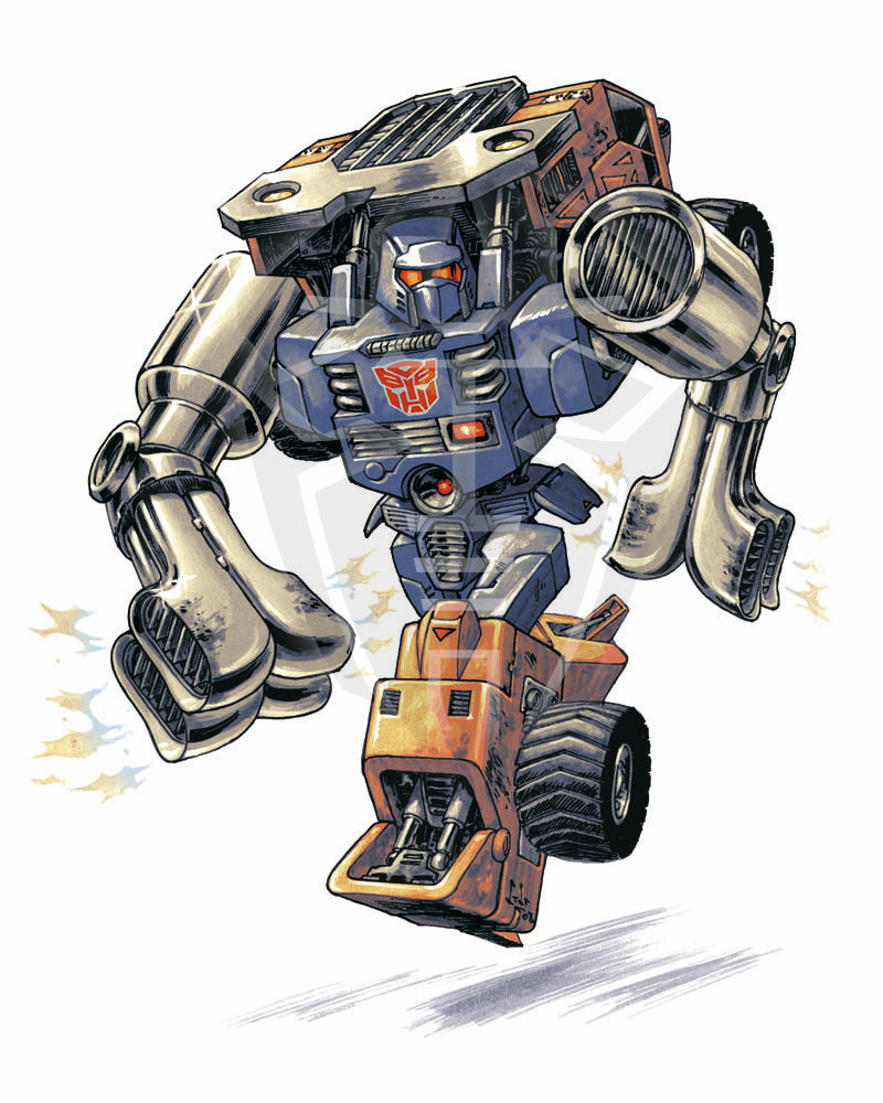
 alteride — Huffermax Prime by Novastorm73

Published: 2010-08-30 18:44:08 +0000 UTC; Views: 1907; Favourites: 35; Downloads: 0
Redirect to original
Description
Original lineart by can be viewed here [link]
Colors by me. I just love Nova's work upgrading Huffer to a Prime, I couldn't resist.
The frames around the name and alt mode gave me the idea to take one step further and make it like Huffermax would be seen through a Seeker's or Laserbeak's optics, with data flashing and streaming on the picture, and a red filter emphasizing the Con optics' POV
 (Smile)")
Related content


Comments: 20


Actually, it makes me realise how the first Movie Voyager Prime mold could do a pretty decent Huffer !
👍: 0 ⏩: 1

Oh, je ne sais pas... le moule Power Hook serait plus approprié à mon avis [link] Il a même les couleurs
")
👍: 0 ⏩: 1
Oh qu'il est vilain !
Certes mais l'avant du camion n'est pas derrière la tête. Enfin bon... spéculations, spéculations ...
👍: 0 ⏩: 1
Là, c'est encore pire [link] Huffer SANS un gros pack derrière la tête (cabine ou autre  (Wink)")
👍: 0 ⏩: 1
Ho moi j'aime bien la version Cybertron qui est ma version "classic" de l'édition française de Huffer en bleu et blanc.
Quid du Power Core Combiner alors ?
👍: 0 ⏩: 1
Ah, c'est Huffer ? J'ai cru à une nouvelle version de Drag Strip - Ou Slick
([link] Je ne plaisante qu'à moitié - si j'enlève l'image de l'alt-mode - la partie bleue de son torse-abdomen me fait vraiment penser au nez d'une F1)
👍: 0 ⏩: 1
Haha. C'est pas faux.
Mais c'est la F1 orange e tblanche qui va être repainte en Drag-Strip. En pack de 5.
👍: 0 ⏩: 0
^^ Thanks alot - Actually, this is only half "my style" as lines are by , and I came up with colors on this.
👍: 0 ⏩: 1

Ow, I see. Good team work, both of you
👍: 0 ⏩: 0

Thanks alot - I'm only half responsible for this lookin'good though - came up with a great char in first place
👍: 0 ⏩: 0

Looks excellent Sara; the graphics really add a lot to this, now it looks more like a comic page than a pi-up.
And congrats to Greg for getting another great coloring of this image
👍: 0 ⏩: 1
Congrats to Greg for coming up with a great char and great lines
👍: 0 ⏩: 1
Now we just have to convice him to do some lines with us
👍: 0 ⏩: 0

Thank you for the great colors! This looks really great. I love seeing different interpreations of the same lines. Great creativity showing the data displays and red-hued point-of-view. Totally unexpected but it works.
👍: 0 ⏩: 1
Glad you like what I did
Even considered typing the data in Decepticon runes at some point, but it made the pic messy so I stuck with English
👍: 0 ⏩: 1
...so I stuck with English
Good choice.
I really like how the same lines took on two totally different interpretations.
👍: 0 ⏩: 0