HOME | DD
 altermind — AlterMinds Button 2

Published: 2002-07-12 06:35:59 +0000 UTC; Views: 419; Favourites: 0; Downloads: 27
Redirect to original
Description
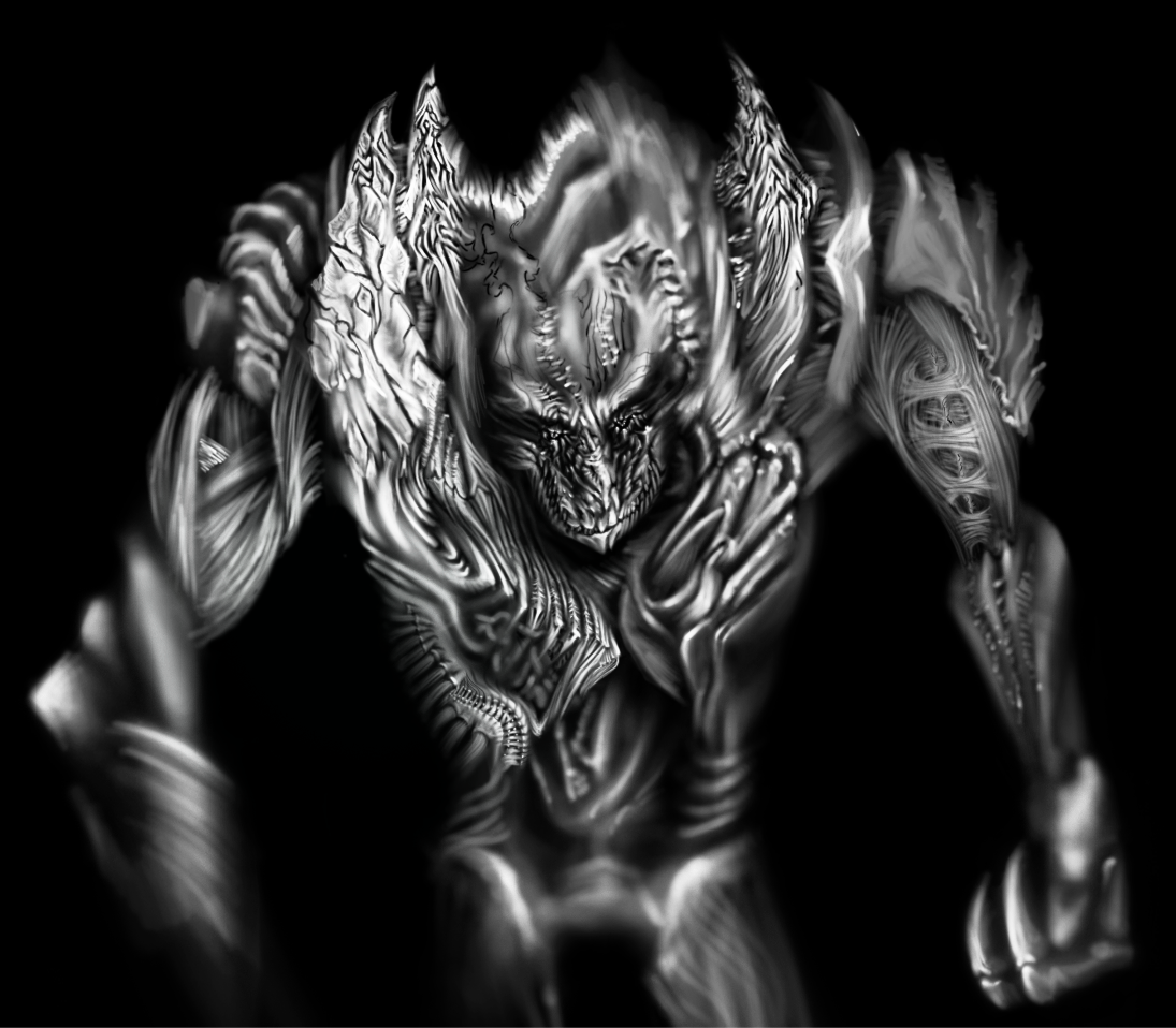
basically the same as the last one... but with a few change1. clearer text
2. more depth to fella
3. slightly more colorised BG
5. text in front of fellas ear
6. fellas eyebrows darkend
Related content


Comments: 12

Looks like there's a whole deviant cyberworld behind fella there, great depth!
👍: 0 ⏩: 0


Out of the 4 you've submitted so far, this is up as the best contender imho. Good work.
👍: 0 ⏩: 0


This is your best one, for sure. Love it, wouldn't change a thing. I could see this taking top prize.
👍: 0 ⏩: 0

This looks awesome. Very clean.
Here's an idea I have (I do it myself if I had any skills...)
- Leave everything the same except for the text
- Put "deviant" along the bottom from the left border to Fella
- Put "ART" behind fella in large letters that span the entire height (in terms of width, "ART" goes from the text "deviant" to the right border)
- Optional: Put the hands of Fella over top the black border
You won't see the text "ART" very well but hopefully you'll be able to see enough to make out what it says.
Just an idea... take it as you will...
👍: 0 ⏩: 0

very nice..this would be even more interesting animated..or is it already..forgot to check.
👍: 0 ⏩: 0


bump the text up by.. 1px..
im supporting you, im even going to use your icon on a website as an affiliate button, if thats ok with you of course
👍: 0 ⏩: 0

Nice. I think this is my favorite submission so far for this contest, especially after the changes. Great job, and good luck.
👍: 0 ⏩: 0

