HOME | DD
 AlternativeMethods — Fattening Falindre pt2

#ass #bbw #boobs #chubby #fat #gain #obese #ssbbw #weight #weightgain
Published: 2015-08-30 19:53:52 +0000 UTC; Views: 3208; Favourites: 54; Downloads: 24
Redirect to original
Description
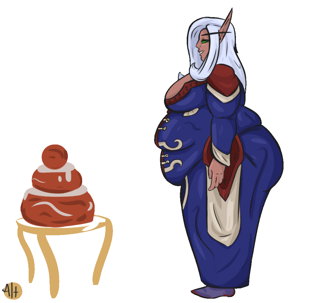
Part two! Falindre finds herself trying to catch her breath in a newly fattened form! Running is much harder when you've got extra pounds of elf to carry around, after all. Fit and proper no longer with a missing belt to boot!Part one: alternativemethods.deviantart.… here!
After all parts are finished, I'll be writing a story to follow along, so there's that.
Now, if you've any tips to offer me or critique to share, don't be shy! Even if it's just telling me what parts worked and what didn't, any scrap of information is super appreciated, no matter how small.
And finally, the race and setting are not mine, they belong to the respectful owners at Blizzard; plz don't sue me!
Related content


Comments: 6

Lol damn dude this file size is actually making the image lag whenever I scroll back up to look at it XDDD.
Despite the relatively flat coloring you did for the character, the balance of color you dedicated to her outfit make those flat colors pop rather nicely, the electric blue in her torso offering a bright contrast to the the dark maroon and grey (though considering this is a Warcraft inspired character, I have no way of knowing how much was your design and how much was pre-made by the game). On closer examination you do actually have some nice shading that matches to a proper light source, but the values are too muted for a passerby to notice, I would suggest experimenting with darker values for shading and shadows.
While I'm on the subject of color I feel i must state the obvious that the quality of the character doesn't quite match that of the background, on the one had it does put emphasis on the character, but on the other it makes the world she's in look "fake". That said I give you points for including a background at all (something I tend to skimp out on ;w; ), plus the scenery does it's job to help imply a hint of story. So although flawed, the background is a good addition to the overall piece.
I've mentioned before that the red dot/chin ring is a bit of an odd character quirk for a female design, but in this particular scene her thick lips better balance the face for a more overall feminine look. Along similar lines I quite like the shape you gave her one visible eye, that sort of partially opened look to indicate fatigue or possible regret ")
And of course I cant mention cuteness without talking about that flabby little belly she has pooching out on her thighs
By the way is the blue part of her outfit meant to be armor or just cloth? I was under the impression that it was armor, but the way it deforms around the bulge of her belly suggests to me that it's cloth instead. The power of the belly is mighty, but I doubt it would be able to warp armor-caliber metal (unless it was magically made to fit her body shape as she grows or something, which would honestly feel a bit contrived unless she was planning on gaining weight).
Overall I'd say this piece was made in good fun with some nice details despite some flaws. A decent score with room to improve^^.
👍: 0 ⏩: 1

First of all, thank you very much for the feedback, especially such a thorough comment, I really appreciate all the thought you put in.
For some reason, exporting will only give me these monster sizes, but at the same time, it suppresses the shading until you click on the image to enlarge it. ;3;
I enjoy experimenting with armor and what have you and trying to make the pieces look relatively metallic; obviously in this one, I took a far more flat approach as opposed to my usual level of shading, such as the first part of this sequence. Though overall, my lighting of the full piece does need work!
The character design was ever so slightly influenced by the actual character art. The only bit I -did- take from it was the loose color palette of crimson and blue, and even then the colors aren't in the actual screenshot I originally referenced. I really enjoy just making armor for characters anyway, lol.
I intentionally made the background lines sketchy to draw more focus on the character, but I'll admit the painted snowbanks and what have you need work. This is only the second piece I've done with an actual background, so it's a learning experience. It's something I really want to work on, and the only way I can do so is through practice. It does look somewhat lifeless upon any lingered inspection, which is fully my fault because of how much I just wanted to finish and post.
I've been trying to make her mouth in particular feel more feminine, as it's one of the biggest problems I have with drawing faces! My hope is to make them more expressive as a whole in the future [nod]
Ahhh, I shoulda caught that narrow belly, as it's an easy fix too, but I hadn't even noticed till you pointed it out!I gotta fix doing that ;3; Just one of those mistakes I need to double check on from here out.
The blue is indeed cloth! It's a tucked in tabard that goes over armor and displays heraldry. In this case a hidden layer of leather underneath (The same color as the matte leather leggings she wears. The off greenish blue color.)
Many thanks! that's the best answer I could ask for ^^ I know my work needs improvement, and that's what I love to post for ")
👍: 0 ⏩: 1
Oh not a problem, as I've said before I'm happy to offer my opinions in the comment sections, I just wishi i had the time to do it more often ;w;
Lol for me when I export form GIMP it actually shrinks my image a little, so I have the opposite problem XD
Mmm flatter colors for armor certainly does make sense now that you've pointed it out. Still, the shaded areas that are meant to be represented in shadow, such as her inner calves, don't read dark enough to be those shadows.
Oh OK, good to know the majority of the design was your own design. I give credit where credit is due for the armor designs which, as I said in my note to you, has a nice balance in it's interwoven parts; a fair mount of detail without looking too crowded.
Only your second piece with a background eh? Pretty good then, I actually think the painted snowbanks look just fine, it's just the scratch sketchy lines that make the world feel "fake". I think a more successful way to make a "muted" background would be to just remove the lines entirely and only have the shapes be implied through color, this way the character still draws the most attention for having outlines and the background doesn't feel so rough.
Well I think you did a great job with the mouth since it it looks decidedly feminine  (Wink)")
Heh yeah I've had that sort of thing happen, in one of my comic pages I ended up drawing Nala's hands just a size too big but couldn't really see it until someone mentioned it in the comments. Sorry I couldn't have pointed it out back when you sent me the original sketch, though to be fain I might not have noticed it then myself without the clean lines. Never the less she still looks good.
Ah OK, I'm not overly familiar with armor so that's just me being ignorant
Daaww, glad I could help buddy >w<
👍: 0 ⏩: 0
