HOME | DD
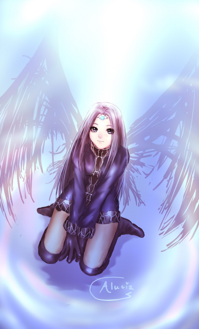
 Aluciz — Arisa ::another II::
Published: 2006-11-16 05:14:48 +0000 UTC; Views: 2111; Favourites: 91; Downloads: 83
Redirect to original
Description
it's just another effect I tried on her duh - -" no reflect this time ^^:- -"
another version = [link]
Related content


Comments: 29


Honestly...a beautiful artwork...it's only that I say...
👍: 0 ⏩: 0

I think this one is better. I like colourful artrwork, and the wings look more appealing, did you edit the wings or it's because of the effect? Anyway, congrats this is surely better than before . ^_^
👍: 0 ⏩: 1

yes i did XD i was quite lazy back tehre anyway ehehe
thanks sil~*
👍: 0 ⏩: 1
")

I think you're coloring is getting sharper and sharper.
👍: 0 ⏩: 1

I like this version more.
Clothing, Hair, face, everything rocks.
👍: 0 ⏩: 0

Absolutely beautiful! I just LOVE how the wings came out!
👍: 0 ⏩: 0

just swing the tablet - -" it's very simple 
👍: 0 ⏩: 0


Maybe just my imagination or weird senses, but these second wings remind me of cursed wings, comparing with the first ones. Maybe because they "weight" a lot more in the drawing. The ground, on the other hand.. looks more "magic".
👍: 0 ⏩: 1
good that you see as a cursed one eheh
👍: 0 ⏩: 0


Well, at least this one looks great.  (Smile)")
👍: 0 ⏩: 0

Both pictures are beautiful but I liked the simple wings on the first one better. You did a good job on those too, it's just personal preference.
There was something bothering me about the reflection (I think you should have seen her from another agle, more from below if that makes sense) so that's where I prefer this picture... can't decide ^_^"
👍: 0 ⏩: 1
lol I noticed it too anyway I just have no idea what to do at first ahaha
- -"
thank you
👍: 0 ⏩: 1
I guess you would have had to redraw her from a lower angle but it would have been so hard to make it look realisitc... this way is much easier and still looks great
👍: 0 ⏩: 0

No matter what effects you use, it still looks good!
👍: 0 ⏩: 0

love the wings u make her look so cl=ool mast fave this one too
👍: 0 ⏩: 0

Hm... I like this one a lot more, and the wings look significantly better.
👍: 0 ⏩: 0


Just as pretty as the other one... absalutly fabulous ^^
👍: 0 ⏩: 0