HOME | DD
 alyn — Collab :: Celestial

Published: 2003-12-02 17:20:07 +0000 UTC; Views: 12063; Favourites: 246; Downloads: 5459
Redirect to original
Description
Spatter the stars,douse their luminosity,
with our amneotic retch,
and keep also in mind,
the stampede of clouds,
from dusk's predatory sky.
Leave thy gown a dark pool at thy feet,
I yearn musky valleys that no man hath seen,
the chill keen of stars,
over yew and deep wooded ravines.
----------------------------------
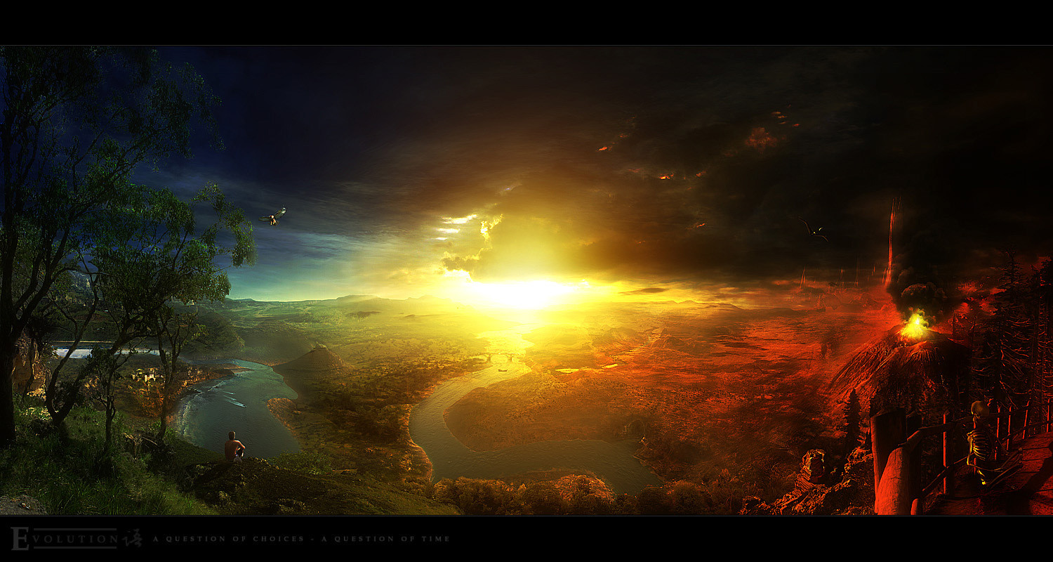
(terragen and valley) + (space scene)
----------------------------------
This is my first released deviantart collab
 (Smile)") and i think it turned out well. Started off with the godhanger valley render i originally churned out last week ( [link] ) except i fixed up some of the bugs from that initial image, including fixing the triangulation problems. That fixed version was sent to *Naithin , who in turn did the space scene above, which from my point of view, looks astounding The image was then returned, and i have made some alterations to try and make the transition smoother, such as making the earth scene a little more blue
and i think it turned out well. Started off with the godhanger valley render i originally churned out last week ( [link] ) except i fixed up some of the bugs from that initial image, including fixing the triangulation problems. That fixed version was sent to *Naithin , who in turn did the space scene above, which from my point of view, looks astounding The image was then returned, and i have made some alterations to try and make the transition smoother, such as making the earth scene a little more blue ")
Anyway, we both hope you enjoy this image, naithin has done incredible work here, and i urge you to go check his gallery for more of the same
He also seems to be in doubt about some of his collab skills, so prove him wrong and show your appreciation appropriately Comments and most especially
 's for this image appreciated muchly
 Enjoy!
Related content


Comments: 167

Words cannot describe how I feel about this piece. I'm not going to give you two some bullshit one word expression of how I feel about your work, I will just say this. This is very simply one of the most remarkable pieces I have ever seen anyone on DA submit, everything from Contrast, to Focal areas, to general subject matter completely blow me away. This is goddamn spectacular, and I will be severely pisssed if this does not get the recognition I feel it deserves.
👍: 0 ⏩: 0


wow u 2 this is absolutely gorgeous..the combine style reallly r0x in this..dammn everything is beautiful and i love this piece...!!!!!! and congratsss alynnn and naithin..your image makes it to the DF yayyyyyyyyyyy!!!!!!!

👍: 0 ⏩: 0


oh god i love it
brilliance
this is really fuckin good
right on man!
👍: 0 ⏩: 0

Wow I really like this idea. Everything is sooo beautiful. The only critique I can offer is that I don't like the texture of the moon, I think something a little smoother may fit better overall, or maybe a more detailed texture would work too. But no matter, it's still sweet.
👍: 0 ⏩: 0

Wow...this is absolutely incredible!
Great collab!!!
👍: 0 ⏩: 0

It's breathtaking. The transition was done well. The fade from bursting space scene to serene river feels good. The two scenes contrast rather harshly, though, as the space has many colourful active elements and the earth scene has few. The grand composition, though, is really beautiful. I'd like to see more images like this. The combination of two great elements on DA and two great artists has created something I think is unprecedented in the art world.
Amazing work, both of you.
👍: 0 ⏩: 0


Wow! All I can say is, "wow." The flares around the moon are amazing... I simply love the entire piece. Excellent work!
👍: 0 ⏩: 0


very superbeautiful... i like it a lot, the colors and tones and shades blend very well together... awesome piece!
👍: 0 ⏩: 0


Nice collab! How I luv this!
I wish more people would do collabs like this!
👍: 0 ⏩: 0


this is really beautiful! I love the colors and the sky! very lovely!
👍: 0 ⏩: 0

Absolutely stunning! Just marvelously done. Great job, to both of you! Everything just looks so fantastic...it really is so gorgeous!
👍: 0 ⏩: 0

Heh, thats a pretty neat peice. I was sent the link and when I looked at it all I could see was the top part. I thought to myself "Hey self this is a pretty cool picture" then I scrolled down... and I thought to muself "he self the pictures still going..." then I realized how very awsome it was. *GREAT WORK!*
👍: 0 ⏩: 0


This is so beautiful...I wish I had that talent when trying to do anything to do with space.
👍: 0 ⏩: 0


wow... thats some beautiful work... much respect to you both
*bows down*
only thing i would say is perhaps having stars visible a little bit in the top of the terragen scene, to make it blend better. but it already looks excellent anyway
👍: 0 ⏩: 0

really nice work, great concept but i think theres a bit to much overkill around the moon, and maybe some added depth to the planet itself would improve the composition dramatically!
👍: 0 ⏩: 0

No words is soooo beautiful! And very very original. The two things merged very good!!!
👍: 0 ⏩: 0

Very nice ")
The planet could use some work as said above though
👍: 0 ⏩: 0

the planet looks like poo heh. but otherwise nice. terragen never looks quite real, i think its the lack of transition between elements. but eh. it does what it does.
👍: 0 ⏩: 0

heh, i'd love to see another collab in the future naithin, what you've put together is nothing short of genius from my angle  (Wink)")
anyway, fact stands, it's an image i'm proud of, and naithin should be proud of too
anyway, tis late, gotta be off to bed - *hopes for more comments and favs whilst slumber occurs* - all comments and favs shown thus far have been appreciated muchly
👍: 0 ⏩: 0

Oh, just another quick note, few people have commented on not being able to see it in its entirety.
The design idea that I had was actually to make it a scrolled image. I take it this doesn't work for people, so I apologise. Part of the trouble with the transition was the hard edge between the two image sections, even after I softly clone brushed some of the clouding up.
Next thing I tried was selecting the edge of the valley image, and filling it with a gradient and setting the image mode to multiply, darkening the top, letting it get gradually lighter as it flowed down. Actually at first, I had darkened the whole image, wasn't til realising needed to get it to flow better as a scrolling image that I changed it to a gradient. Also on that layer, I set a soft glow above it, which actually helped some what.
The next thing I tried was the aurora, actually at first tried layering it over the clouds somewhat. It actually kind of worked, but in the end it looked best on its own, but still helped the transition somewhat I think.
The final touches were done by alyn, and I got to say, absolute genious must've been involved, because the transition itself has come out beautifully. Nothing I tried got it quite as good as what alyn in the end accomplished with it, so hoohah! to him.
If we do another collab at any time, some suggestions on improving the visibility are welcome, this is aimed at those who commented on not really liking not being ableto see it as a whole, what do you think might have been a better way to go?
👍: 0 ⏩: 0

whoa! i just saw ur comment on my deviation, thanks... but this... ")
👍: 0 ⏩: 0

Wow.
The colors and textures of the landscape are beautiful, and the space scene above is also excellent.
Good job.
👍: 0 ⏩: 0

God this is beautiful. You make me yearn for terragen. 
👍: 0 ⏩: 0
Now that read-only mode is over..
Thanks for all the comments guys, they are muchly appreciated, I agree with pretty much all said so far. The valley - Alyn's part - is pretty much perfect. And the hue change just really fixed a lot of the problems I had with the work as a whole. Hitting myself thinking 'duh' for not thinking of it myself, but thanks Alyn, that made a major change to the overall impression of the image I had.
The space scene side - my side - could indeed have been a lot better. As has been said, the planet thing doesn't look that great, the over lighting is sort of intentional though, as the aurora like effect below it is sposed to be 'in front' of the planet in terms of depth. However, it is still overlit, as the mid section should have a much softer lighting scheme than that of the lower edge which is lit by the sun.
I disagree with the comment regarding the rings though. Perhaps tis a personal preference thing, but in terms of the left side, I would've said that they were probably the best thing on it. Only thing I perhaps could have done better regarding the rings is shadowing on the planet, but the light sourcing made it a little confusing as to how to lay them out. :/
I think though, that if I were to redo this, the right side of the space scene would be nearly ok.. Would want to tweak some more in terms of the lensflare stars there, I'm happy with the bottom left of the gaseous cloud, and happy with the two major 'bright points', in the center left especially, and to a lesser degree the upper right.
The other stars I think now in hindsight a perhaps a little overdone. In place of filling the blankness with stars, would have been best to do additional shading perhaps.
The aurora like effect, I'm actually surprisingly happy with, but would want to get rid of that slight tannish-green tinge that is cropping up in it.
I guess that's all my comments at this time, again, massive grats to Alyn for what is in my view, fixing almost the entire image with the hue change, really a breath taking difference between the before and after shots.
And thanks to all of you who have liked it so far. Initially after this one my thoughts were along the lines of, 'Never again!', but perhaps might be worth a shot. Comments thus far have been helpful, and hind sight of my own is kicking in, so know a few more things for 'next time' if one comes around.
👍: 0 ⏩: 0

beautiful...the aurora is great, i love it...again the planet a little out of place but everything else is FABULOUS, +fav
👍: 0 ⏩: 0


Wow this looks great, the two together make the scene complete. Great job!
👍: 0 ⏩: 0


great piece....
beautiful...
the valley is perfect, to my eyes... and so is the sky (the lower part, the clouds and stuff)
the only thing i slightly dislike is the planet
i think the shadows are not fitting it properly, it looks a but overburnt and the rings are not looking as good as the rest of the space.... but still, great piece, and very powerful composition
congrats to you too
👍: 0 ⏩: 0


wow so nice! Shinyness and gleamyness
")
👍: 0 ⏩: 0

absoloutly stunning piece
I love the in space part most of all
beautiful colours
👍: 0 ⏩: 0


a great combination... some fantastic colors. the space above the scenery is a great addition. and the scenery is a great addition to the space.
👍: 0 ⏩: 0
<= Prev | | Next =>