HOME | DD
 Amadoodles — Troubleshooting

Published: 2013-12-28 12:36:40 +0000 UTC; Views: 1260; Favourites: 20; Downloads: 4
Redirect to original
Description
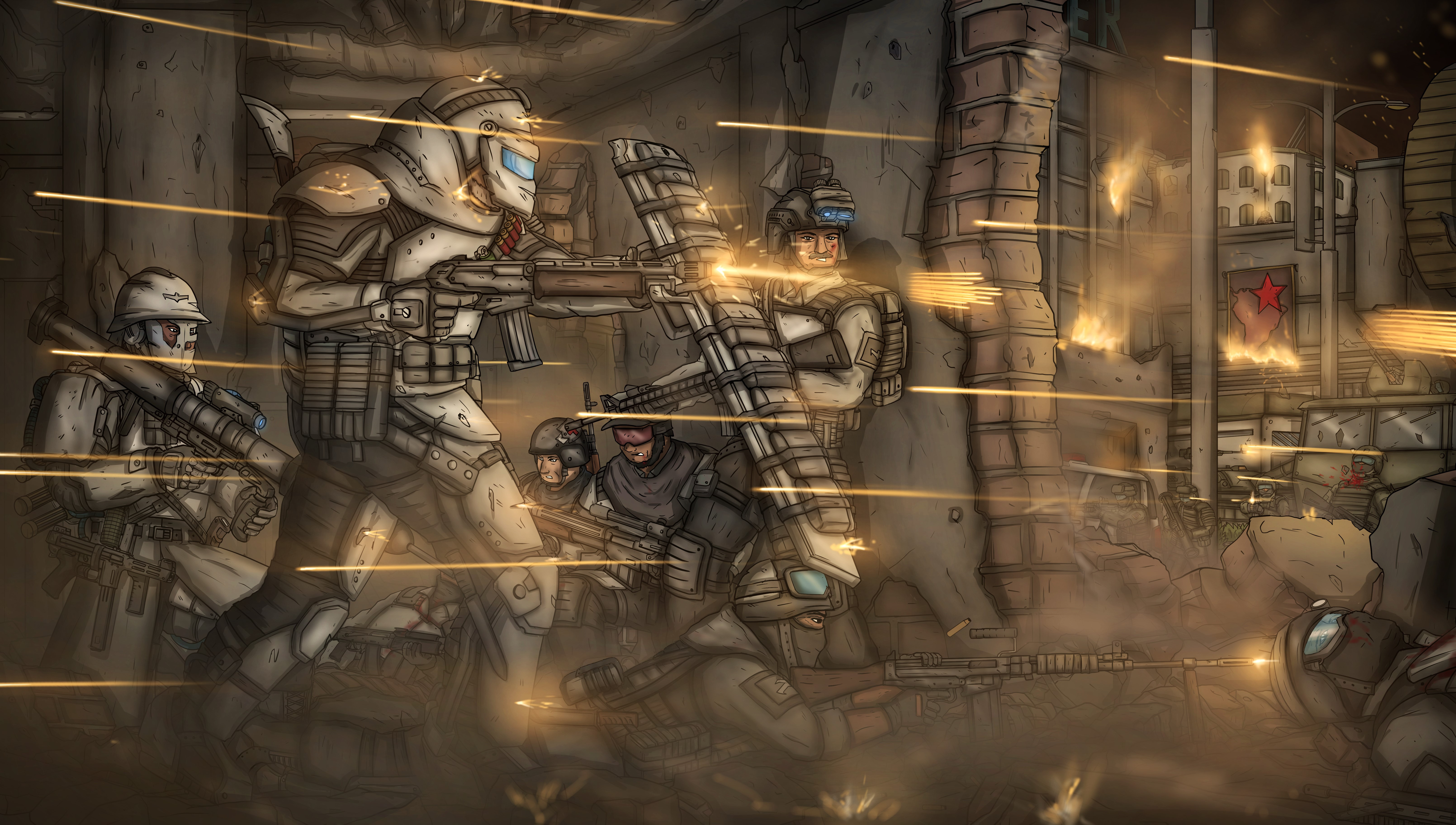
A christmas gift for my super sexy bf. Unfortunately I only thought of this idea with three days left to create it, so it was created under rather large time constraints. But there he is kicking ass against some Tyranids, and looking very happy. (he says he looks like he just made a horrible pun, and its thanks to him for the title).
So uhm yeah, I'd love some feedback on this. I'm really not at all familiar with drawing this sort of subject matter in any way, so the whole thing was a new experience. And keeping in mind that I was under time constraints so not all of it is as polished as I would like etc. But critiques would be very appreciated!
Ps6, about 15 hours? I don't really remember
Also, if the background and the ground appears to be pretty much black, then its cause your screen is darker. it looked great on mine, but when I put it on his screen, everything dark was simply pitch black :/
Related content


Comments: 14

Overall


Vision
Originality
Technique
Impact
I like the play with light and dark. There seems to be happening many things in the background. The background supports the foreground very well. I'm a bit jealous about the background because it's painted very ruffly and shows so much without going so much in detail.
Also is the amor from the guy painted good. Especially the tunic and the ribbon.
I think you could improve the impression of your painting if you would increase the size of the right demon. Maybe about 1.5 his actually size. At the Moment you have a diagonal line downwards. If you increase the demon size, you slow the eye down and it will not slip out the picture this fast. And it would give the picture more balance and harmony.
The face looks slightly wrong. Maybe it would also an idea to turn the face a bit to the (viewer) left side. I think it's about the eyes. It could be enough to rework the eyes. His hair is painted great.
I would paint also some blood on the sword, but it don't need to be there.
I like the clouds and the figures in the background. I find the one directly about his head funny. It looks like a missile with the smoke behind it.
For your first image from this sort it's really well done. I think some small changes and it will become perfect.
👍: 0 ⏩: 0

Poses are pretty cool, and perspective of the charas is cool too and it's so nice you've done something different from your usual works. It's refreshing ^^ But like the previous person said, if I do detailed work with background I check if everything is alright by minimalizing the picture. If even on a miniature everything is clearly visible, then it's alright. Picture is to dark and the background is a bit flat (propably because it shoud be lighter, like AboveClouds said. don't know myself, colour theory is a new ground for me).
But for an attempt on something new, this is really goood... seriously. If you put your mind into it, I'm sure you'll get the grasp of the mechanics pretty fast
 (Smile)")
👍: 0 ⏩: 1

Thanks! yeah, it was definitely a .. challenge to say the least. Basically EVERYTHING that I either never draw, or really struggle with. But you're right about the background. And thank so much for the comment!
👍: 0 ⏩: 1
You're much welcome, happy I could help
And the next attempt will be a lot better! I'm sure you've learned a lot with this work
👍: 0 ⏩: 0

I gotta say, I really like that you're pushing yourself to do new things. I always love seeing new stuff from people I've been watching for a while. It's such a cool picture concept as well.
But the picture looks really dark because you're using pure #000000 black in your shadows (I eyedropped it). It isn't a good idea to use pure black or pure white in a picture because it doesn't look like a darkened shape or lit area - it looks like an empty void. In general, it's better to stick to between 80% brightness and 20% brightness on a picture, and use more extreme colors *only* on the focal point.
This is a picture where atmospheric perspective would definitely come in handy. As objects get closer to the viewer they (generally) get darker. Lighter objects read as farther away, so the clouds should be much, much lighter.
The dark background also breaks up the character's silhouettes and makes them kind of hard to read. If you look at artwork from, say, LhuneArt , you'll see that her character's silhouettes are always visible: lhuneart.deviantart.com/art/Kl… lhuneart.deviantart.com/art/El… If you blur your eyes on those paintings (or look at them from 2-3 feet away), you'll be able to tell which part is the character and which part is the background. On your painting, the characters don't stand out nearly as clearly. I'm losing most of the right monster's sickles, and the left monster looks like it might be another cloud from 2-3 feet away.
Oh, and here's a tool for calibrating your monitor: www.photofriday.com/calibrate.…
But I can definetly see the enthusiasm behind this picture. I really want to see what your paintings will look like in a year or two if you keep pushing yourself like this. (And I can always get behind an artist drawing more humans.)
👍: 0 ⏩: 0

Hmmm, yeah, it's super dark even on my large bright monitor.. oh well ")
")
👍: 0 ⏩: 1
hopefully its a bit fixed now : D I'm trying to fix my screen, but I'm really not sure of the best way to do it
👍: 0 ⏩: 0

His face looks disjointed from his body; the body's travelling in one direction and the face is going another. Also, his left arm needs to be a bit more behind his body I think... Also the cloth (?) on his chest although it looks good doesn't seem to have many overlapping areas (it would, since it appears to be sagging) and instead looks like it just has a lot of creases.
Unfortunately the picture's pretty dark on my computer but I really like the fiery background, especially the brighter area around the sword; draws the eye really well
👍: 0 ⏩: 1
yeah, you're right about that. I kind of messed up when I made it, as I used a painted over photo for his face. Unfortunately, i only realised that I needed the photo AFTER I'd already painted the body :/ But I'll be sure not to do that in future. And you're right about the overlaps. Thanks for the advice! I've also lightened the image as it seems to be a problem for everyone
👍: 0 ⏩: 0

I can help you out about Warhammer 40k and the resources which I've found helpful.
👍: 0 ⏩: 1
Thanks, I'm not overly worried about the accuracy of the figures themselves in terms of fidelity to the originals, as I didn't have much time to research it. More the work itself, and how someone who isn't a 40k fan would percieve it I guess
👍: 0 ⏩: 0
A game that gives men an excuse to play with toys, google it 
👍: 0 ⏩: 1

I know, my ex paints them xD
He painted one in my honor for my birthday
👍: 0 ⏩: 0