HOME | DD
 Amarynceus — Tavern 'Sketch' WIP 4
Published: 2006-09-16 01:14:16 +0000 UTC; Views: 1675; Favourites: 7; Downloads: 22
Redirect to original
Description
Again I go with the subjecting you to this thing.")
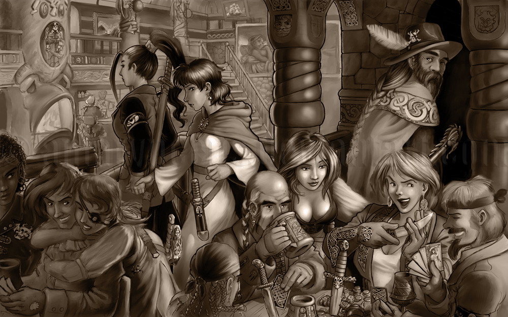
It may not look like it at first glance, but there's been quite a bit of work since the last WIP of this -- it's mostly really small though. I tinted it just for a change from the black and white.
Usual routine -- indulging your critical eye will make me happy. Anything that seems wrong, don't hesitate to point it out even if you don't know exactly how to fix it. I can usually figure out how to fix things once I see that they're wrong.
I really want this to be as good as possible; I think it will make an excellent key piece for my portfolio push in a few weeks -- I'm trying to finish up a bunch of new pieces as well as touch up old ones to get as broad and appealing a body of work as possible.
Man, they need some kind of huge puppy-dog eyed emote.
 So I can use it when I say: Please rip my work to shreds!! It really needs to be as strong as possible.
Oh, except ignore the hand of the guy at the lower right; I had fixed the hand and arm and the cards when I did...something... trying to add to a selection and Painter crashed. Of course, that sort of thing only happens when one has neglected one's normally careful regimen of frequent saves... and poof goes almost two hours.
And finally, it's pointless to fave any of these WIPs as once it's done I'll delete them all anyway. I'll leave them up until then though -- it's kind of interesting to see the slow evolution of the picture. Links: WIP 1 , WIP 2 , WIP 3 .
Painter, Wacom. Cover pencil, smooth gouache and various blenders (mostly the round blender brush and the just add water blender)
© Avatar Z Brown.
Related content


Comments: 30

That's truly awesome...I can't believe how much character is in every single person. The lighting's spot on, too.
👍: 0 ⏩: 1

Thanks! I'm paying special attention to the lighting on this one, so it's gratifying for someone to notice.
Really, the lighting is one of the few things that prevent this thing from falling apart visually....
👍: 0 ⏩: 0

Holy spiked monkey brains... I know who I'd employ if I wanted an artist to do a graphic novel!
👍: 0 ⏩: 1
Thanks kindly! I just need to convince a publisher to have the same opinion.
👍: 0 ⏩: 0

it is starting to take on even more depth to it really feels like yo could walk into the iamge and interact with the characters
👍: 0 ⏩: 1

👍: 0 ⏩: 1
yes BUT were will his hat end? what happens if it becomes so big that it consumes the globe when it finaly becomes un starched and flops down and then makes eating chcolate imposable? or what happens if it's so big it stays enternally night and the clubs never close and everyone dies from drinking to much cheap ale? remember a big hat is a dangerous thing... don't go to far!
👍: 0 ⏩: 0

Mmkay, I'll just pump out the things that catch my eye.
The knife on the girl in white walking toward the left of the scene stands out rather strongly.
The man holding the beer mug has it in a seemingly light grasp, for such a heavy-looking object.
The skeleton-pirate dude in the top-left is confusing. It's hard to determine what's what.
Couple of the braids (Man walking to the right, man bottom-center) are still unfinished, I presume.
There's an inconsistency in outlines around heads. The girl hugging the guy near the bottom-left has no outline around the top of her head, but others do.
The staircase in the background doesn't look square to anything, really.
The whole fireplace looks like you started with it as some hooded person with ears on the hood, then decided against it, and made it a fireplace instead
Yuh. I don't like being so picky. Hopefully at least ONE of those observations will be of some use to you.
 (Smile)")
👍: 0 ⏩: 1
Thanks man! A few good spots there, I really appreciate the input. You may not like being picky, but it really makes my day.
I agree on the knife that Eris is wearing, there's several issues there in fact. I think I see how to fix them now. I hadn't really noticed the errors before.
Something has to be done about that mug-holding hand, aye. It's better than earlier versions but there's still no weight to the hand-mug interaction. I think I can fix it pretty easily; just rotate the handle farther down, fold the first three fingers more tightly and brace the pinky outside the handle.
Once the skeleton-pirate statue has a defined surrounding, it should look more definite.
Yes, there's an arseload of braids left to finish. 
Outlines at this stage are more thought aids than anything else. I still don't know how far I'm going to go with outlines on this.
The lower steps on that staircase are misdrawn. I think I'm going to obscure that part of the staircase with some middleground elements to help define that part of the space more fully.
Thanks again for the observations, several were useful for pointing my eyes in certain directions.
👍: 0 ⏩: 0

D-mme, this is looking awesome! I agree with Inkthinker; it's almost, almost, almost there. (I agree with all his comments, actually...)
I'm really liking the almost blown-out look of the light there, though.
My two pennies. Can't wait to see it finished!
👍: 0 ⏩: 1
Well, I guess it will have to be the barmaid's bust then (that and Eris's dress are the only places with more than a speck or two of 100% white). Yay for low-opacity gel layers; I only recently discovered that trick and it sure makes things faster. Especially with things where I've completely smoothed out the surface and don't want to go through all that blending again.
Or I could leave them unaltered, if I get the flow of the pic to work. I've got the start of a figure-eight eyeflow, I think; certainly there's a flow (to my eye) from the lower right to the upper left; I just need to figure out how to pull the eye around from Erin to the fireplace down to the left trio then across to the guy with the extremely big hat, the feather of which leads to the upper space. I have some dead zones/flow blockers to deal with though -- mainly that damn fireplace which needs to be altered, and Eris's knife, which besides being drawn wrong (it's not sitting properly on her thigh) seems visually awkward.
I want to see it finished too!
👍: 0 ⏩: 1
Well, I definitely commend your patience. You're well beyond the point where I would've either chucked the thing, or said, "To heck with it! It's finished enough for me."
👍: 0 ⏩: 1
If it were just for me, I'd be beyond that point too -- but when it comes to portfolio pieces that will hopefully help land me some work, "finished enough" is hard to arrive at!
👍: 0 ⏩: 1

I agree with DiRi at this point its so good that I could be a deviation.
👍: 0 ⏩: 2
It's not even close to that...  (Wink)")
👍: 0 ⏩: 1
well, if you say so... but I think it looks well enough to be ready now.
👍: 0 ⏩: 0

still a WIP???????????? I can't believe it, it looks so finished all the time, and every time you post another WIP it gets better!!!!
👍: 0 ⏩: 1
That's how the work goes... make it better and better until I don't have the ability to improve it any more (or don't have the time).
At most 10% of the surface area of this is completed, if that.
👍: 0 ⏩: 1
ok, I'll try that the next time with one of my drawings...
👍: 0 ⏩: 0

I like a lot how the illumination looks, very impressive.
👍: 0 ⏩: 1

I like the mood and setting of this picture... the picture and details are sharper too!
👍: 0 ⏩: 1

Mmmm... looking pretty close to done, actually. If I could find something to pick at, I would, but I'm not seeing much. The depth between the woman with the ponytail and the person sitting at the bar seems a bit extreme... maybe if someone was walking up the stairs in the background it would reinforce the field back there, and prevent that painting on the wall from being taken as a character (which I momentarily did).
👍: 0 ⏩: 1
Yah, I've been pondering where to include some background figures. The original intent was to have the floor of the common room filled with tables and figures to fill in the space, but I get this little twitch in my eye when I think of the work. There will certainly be a figure or two up in the second floor, and one on the stairs would be good too. I think I'll draw some quick blocked figures and move 'em about to find something that makes a good flow.
Hmm.. actually, two or three strategically placed tables could be useful for convincing the viewer of the depth of space... and convincing the artist, for that matter!
Truth be told, I think there's a perspective glitch somehow. Since this began with no perspective study or anything I've been tacking on structure to a less than coherent structure.
Thanks for the input, I always appreciate it -- that you didn't find much to pick at is encouraging. Maybe I'm glimpsing the light at the end of the tunnel on this one at least.
👍: 0 ⏩: 1
I should think there's a glimmer out there somewhere, yes.
Though not setting up an underlying perspective grid was a mistake, and one I'm sure you won't make twice. I often sketch out the rough freehand, but when it's time to do the final it's also time to break out the tools.
👍: 0 ⏩: 0

WOW its changed alot! I love it man fits the mood and style and really immersive into the fantasy element!
👍: 0 ⏩: 1
Yeah, it really has. I just spent a minute or so with all the versions I've uploaded opened in separate tabs , flipping back and forth.
Thanks!
👍: 0 ⏩: 0