HOME | DD
 AmberLeach — WIP - Walter White
Published: 2012-10-25 00:02:55 +0000 UTC; Views: 977; Favourites: 23; Downloads: 18
Redirect to original
Description
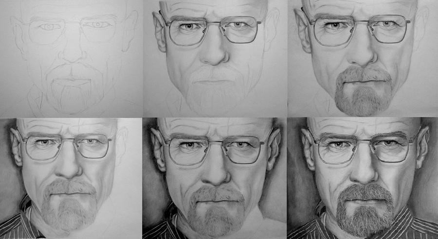
I always think it's fun to look at it step-by-step (Smile)")
Related content


Comments: 6


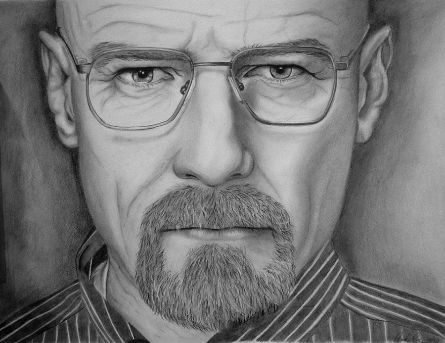
I'm honestly not sure if it's the scanner/camera's fault, but your white areas look darker than they should. and that in general mutes the rest of the piece. It's a great picture, and lots of technical skill behind it, but it loses a part of itself with the bad scan/photo. Based on the first couple wips, it looks like your whites ARE white enough, and your blacks may need to be pushed just a bit, but I honestly can't tell for sure due to the quality of the image.
👍: 0 ⏩: 1

It might be the quality of the photo I took, I think, because the shading didn't come through quite the same. Although the original reference photo is also quite dark and there are a lot of shadows on his face, so I didn't want too much bright white drawn in there.. But who knows, maybe it's just me  (Wink)")
Thanks for your comment though!
👍: 0 ⏩: 0


Awesome job. Great detail and I like how you did the shadow around him to make him stand out more. Very well done
👍: 0 ⏩: 1