HOME | DD
 ameba2k — The God Complex
Published: 2011-09-26 13:49:20 +0000 UTC; Views: 3405; Favourites: 107; Downloads: 88
Redirect to original
Description
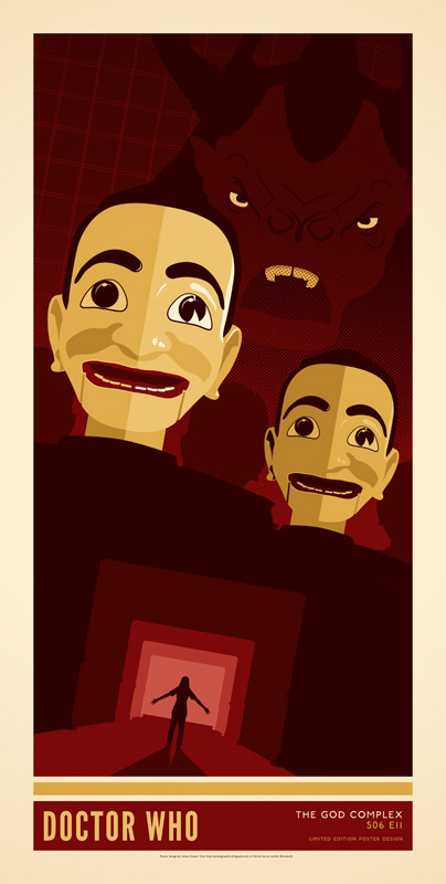
Think I had the colour scheme for this design down from the start, but the overall concept, as usual, took on a LOT of different forms before materialising as the poster here. Obvious things like the Minotaur had to be in there, but I found the puppets so amazingly creepy that I just had to include them. Think they turned out to be the best thing I have vectored so far in my opinion.I love hearing everyones thought, positive or constructive, on my designs. So let me know in the comments what you think of this, or the series in general
 (Smile)")
-Jonny
Related content


Comments: 43


Was for me too. Hence their inclusion in this poster design
👍: 0 ⏩: 1

Good color choice, REALLY nice job on the puppets. But I think something's missing here. Maybe room #11 sign or "Do not disturb" or something like this. Maybe coridors and doors. Oh, and what about the farewell scene?
👍: 0 ⏩: 1
Could have possible had some more in there somewhere. The bottom silhouette for me could have either been the one that is there now, or one of the Doctor saying bye to Amy and Rory outside their house
👍: 0 ⏩: 0

Love the colour scheme and the minatour looks cool but no Ponds? I just felt they're ending deserved a spot on the poster. Your poster, your rules. Still love it
👍: 0 ⏩: 1
I was convinced that its not the last we have seen of the Ponds this series. So they may have more of a dominance in the last episode? Maybe?
Thanks for the comment! ")
👍: 0 ⏩: 0

Thought you may have gone for the clown as the iconic image for this one, but am liking the puppets...
 (Wink)")
👍: 0 ⏩: 1
The clown was present quite a lot in trailers and things like that, but the Dolls had more of a creepy fear-inducing look to them over a sad clown I think
👍: 0 ⏩: 0

Amazingly creepy puppets are amazingly creepy in such an awesome way
I really love the colour scheme on this one. It depicts the atmosphere to the hotel from hell so well.
👍: 0 ⏩: 0

I love the way the puppets look! I like how the closest one has a shine to it.
I also like how you have the Minotaur behind them along with the way the grind is in the background.
Pretty awesome!
👍: 0 ⏩: 1
I did the first puppet first, and as I knew that there would be another one behind it I knocked the colours down a little
Thanks for the comment
👍: 0 ⏩: 1
I think it worked pretty darn good!
And you're welcome! Can't wait (as usual) to see the next one.
👍: 0 ⏩: 1
👍: 0 ⏩: 1
I can't believe that the season finally is coming up. Grrr.
It'll be pretty awesome to see what you did with this Saturday's episode.
👍: 0 ⏩: 1
Still quite undecided, but I'll come up with something
Really don't know what I'll do with myself with no Doctor Who posters to do!
👍: 0 ⏩: 1
You'll come up with something.
👍: 0 ⏩: 0

Thanks
👍: 0 ⏩: 0
YEAH! Was based on Rita embracing her praising. Thought it was the more iconic of the deaths in this episode. It was either that or the Doctor approaching room 11. Thanks for the comment!
👍: 0 ⏩: 1

you're welcome. I really loved the doctor approaching his room and when he opened the door, he said of course, it couldn't be anything else. Nice jobe on the poster. Looks amazing. my fav episode of the season.
👍: 0 ⏩: 1
For me it's between Doctors Wife and Girl Who Waited as my fave episodes of this series.
Thanks for the comment
👍: 0 ⏩: 1
same here. I'm leaning more towards doctor's wife. you're welcome!
👍: 0 ⏩: 0

Dude, this episode was sick. I loved it. kinda scary. Loved how they went from screaming to laughing. 
ANYWAY. This is great. As always love the differant layout. Esspecially the fears in a angle, it looks kinda 3D. Almost like from a classic, horror poster which is a nice effect.
I REALLY like how you've doen the puppets. 
the the shiny effect and lines on the doll brings them so much more to life.
Red is a nice colour too. red represents blood equals horror/fear. Very important in posters. Media studies student so does a lot on that lol
I must ask, what made you create the vector lines in the left corner? Is it based on the ending scene?
I like the bold tone narrowing on the figure too. It works effectively as it's bold...but it almost shows a new section of the hall way like with the doors.
Altogether, another successful piece.


 (Cool)")
👍: 0 ⏩: 1
Lol I like the media student approach to analysing my designs. To be honest I chose red because it was a predominant colour in the episode, but you are right though, it really gives off a horror film vibe. Ill roll with it
The vector lines are indeed from the last scene. As I have mentioned in another comment, I like the idea that you have to watch the episode in its entirety to understand everything in the poster. On the surface it doesn't seem to fit, but in the context of the episode it works quite well I think.
I like that the dolls heads have gone down well
Altogether, another brilliant comment
👍: 0 ⏩: 1
rofl, In media studies we talk about colours and red is a important colour. 
ah ok, I did think that.
Maybe you could take that section further and make is more inner box shape? Just something if anything similar pops up again.
That's fine.
👍: 0 ⏩: 1
Any other colours I should be wary of that are of great importance? ")
👍: 0 ⏩: 0

Brilliant. I enjoy how you choose the most iconic images from that episode. The monster, the creepy dolls (creepier then the ones in Night Terrors) and then the sacrifice. I think it would be cool if you worked in "praise him" like a movie quote near the bottom. It might throw off the balance or whatever but I think it would be cool. Also the front Doll's head seems shinier then the one further back.
Great colours and placement! The perspective is amazing too, it has great layers.
Completely Fantastic!!
👍: 0 ⏩: 1
I just think creepy dolls tend to be iconic. And yeah you're right, the ones in this episode where WAY creepier than the ones in Night Terrors. They should have swapped them over.
I did have a layer of text that said "Praise Him" over the top kind of pasted around, but it kind of looked too cluttered I figured, so I left it out. I think you are right though, maybe just one at the bottom or the top? Ill give it a go
Thanks for a lovely comment!
👍: 0 ⏩: 1
Dummies are the scariest dolls of all. I cringed when all of their heads turned at once. Maybe it's the fact they didn't talk, and that head turning thing.
I would have it at the bottom near the sacrifice so it's like they're saying it. I would put it near the bottom right corner at the same size in the God Complex type maybe just a little bigger, and in quotations like when a movie has quotes like "Five Stars" "A Thrill Ride" etc.
Definitely at the bottom. I see a nice little spot.
Comments are raw now a days, I get like 1 for every 15 faves and that's sad. I like lengthy comments!
👍: 0 ⏩: 1
Come to think of it, adding a little bit of text like that might have added more to the whole "horror movie poster" vibe. I was just unsure whether a bit of typography like that might not have matched the rest of the series, which only have text in the bottom box.
I left you some comments too
👍: 0 ⏩: 1
Something you could always fiddle with! If not this poster is still brilliant! Continuity could be an issue if you add it to this one and not the others, I understand that completely.
Awww thanks sweetie! Your comments totally made me smile!
I think I have the strangest hobby for a 20 year old ever!
👍: 0 ⏩: 1
No problem
👍: 0 ⏩: 1
If you ever want to learn and just happen to be in Canada I'd be more then happy to teach you! Haha!
👍: 0 ⏩: 1
Ill send you a note next time I am heading down that way
👍: 0 ⏩: 0

The color scheme is the winner here. Not only is it this alarming sort of red but it takes from the hotel and resonates that creepy feeling. I love the slanted horizon line and how everything follow it. The dummies are definitely crisply constructed. If you could have vectored the hotel wall paper and put that instead of the graphing boxes in the far background, that could have made it pop.
For some reason all this read and I'm a little melon that there is no red balloon. Have you notice the red balloons across Doctor Who? The little girl from he family of Blood, The father from the Almost People gave one to his son, Red Balloons at Amy and Rory's wedding, the clown here. It's could just be a repeated prop use, like the bought a bag of 100 red balloons and everytime they need one they blow it up or it's something significant no one can figure out....
👍: 0 ⏩: 1
You know I had never seen the recurring theme of Red Balloons until you mentioned it just now! If one appears in the final episode I will definitely try and include it in the design. Thanks for the heads up!
The colour was pretty much taken from the hotel. I wanted the colours to be as rich as possible, as we haven't had a deep red as the predominant colour in any design so far. The gold just worked well with it I think
As far as the background goes, It was a toss up between the floral wallpaper or the grid. I think the grid works as it doesn't detract too much from the minotaur in the background as a complicated floral pattern might have done. I think if I was going to have it in I would feature it more somewhere else on the design too
Thanks for another lovely comment!
👍: 0 ⏩: 1
Oh! Well now you know. There's been a few oddities like that. For example In the Silence int he library when Donna was in that data core living her fake life, she was walking with Dr. Moon and she mentioned there were no ducks in the duck pond, and in Eleventh Hour The doctor asked Amy that. It's odd, and we don't know if it's significant but it's happened more than once.
There are two arguments for the wall paper/not wall paper and I can play devil's advocate here. Pro-wall paper would take from the episode to give it more familiarity plus if you lowered opacity or kept the pattern light it still could have had a non-detracting effect for the minotaur. You could also argue that while the grid is less detracting it has more meaning because it's what the hotel is when it's stripped of it's perception filter. (Okay I don't know what it was technically, but it seemed like a perception filter-esque camouflage.) All in all the wallpaper would have given me more of a visual memory of that feeling of eerie since we saw so much of it as opposed to a little bit of the minotaur. The cracking open eyes would be even more eerie to depict as that was the start of it. That way the poster is really a teaser in a sense instead of a spoiler. Not that it's your aim to spoil or tease just catch the essence of the episode. There were many possibilities and choices for the top half this time around.
👍: 0 ⏩: 1
I noticed that about the Duck Pond too. Maybe it just that Moffatt wrote them both? I know that sometimes they write stuff in like that so they can use it as a plot device later on. I mean they introduced River Song in Silence In The Library too without fully knowing what she was going to be. Just an interesting concept at the time I think. The balloon might be something similar. We will find out soon!
There are a lot of ways my posters could go I think. I like that if someone else had the same format as I do they would come up with something completely different based on what they like about the episodes. Both your suggestions would work in this instance, but one decision is better than no decision
👍: 0 ⏩: 1
Moffat is a tricky man, but I love him.
There have been a few things like that: The Doctor's daughter, the malevolent voice-snatcher in 'Midnight' and the duck pond and red balloons could very well be the same open-ended plot device waiting to be utilized.
And I agree, there's a thousand ways to complete a task - poster design included. And a decision is better than no decision at all, it is true.
👍: 0 ⏩: 0