HOME | DD
 anachsunamon — Lost in Replication: Monet
Published: 2007-04-29 15:37:53 +0000 UTC; Views: 3085; Favourites: 80; Downloads: 39
Redirect to original
Description
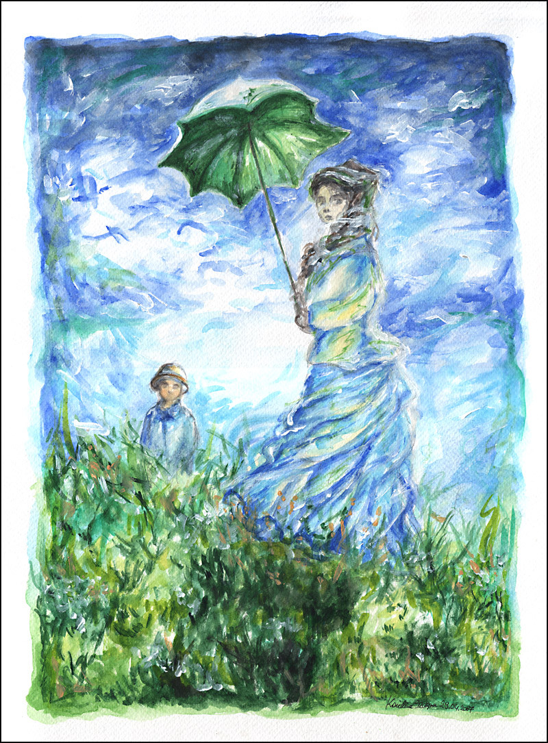
 "The Stroll, Camille Monet and Her Son Jean" was painted in 1875 by Claude Monet, size 100 x 81 cm, oil on canvas. More about Claude Monet: [link]
 This here was originally made for *painters "Lost in Replication" contest, but I decided not to enter, mainly because I didn't read all the guidelines properly (stupid me), and made, not an exact one, but still a copy. Maybe next time
 (Wink)") Good luck to all the great painters! This is also my 100 deviation here!
Good luck to all the great painters! This is also my 100 deviation here!size: 30x40 cm
medium: W&N watercolours (not a joke!!), a bit of white acrylics, and only one brush, Vincent "7" for acrylics; fabriano paper for water works.
[ note: I sent a note to *painters club and my painting has been accepted for the contest. Yay! ^^]
Related content


Comments: 67

All credit goes to the Magnificent Monet
👍: 0 ⏩: 1


Should have been more watercolourish. Ahh well... maybe next time. Thanks!
👍: 0 ⏩: 1

to my it's ok!!! you're welcome!!
👍: 0 ⏩: 0


You seem to like it more than I do. Thanks
👍: 0 ⏩: 1

The title was very eye-catching, it drew me right into the piece. This is so beautiful.
With mostly watercolors, you've managed to create thickness and depth, it has an extremely "painter-ly" style to it. I really like how each individual stroke makes up the painting, the harmony of the colors, tones, are astounding. The careful messiness radiates a wild, a sort of carefree freedom.
Congratulations on this being your 100th deviation! This is superb artwork, absolutely beautiful use of style, texture and shapes.
👍: 0 ⏩: 1
Messy... I like messy, messy is good ")
👍: 0 ⏩: 0


Jeden z moich ulubionych obrazow Moneta ^^ Tez go kiedys namalowalam bo mnie wziela ochota. Bardzo ładne kolorki no i ogolnie calosc fajnie wyszla
👍: 0 ⏩: 1
Co ciekawe, jakos tak dziwnie malo znany 0o
A tez go bardzo lubie, kiedys dobralam sie w empiku do takich podkladek pod kubki z tym obrazem (bylo piec w paczce, mam je do dzisiaj
👍: 0 ⏩: 1
Hmmm...no malo znany dla tych co sie Monetem nie interesuja ")
Wiem o jakie podkladki chodzi
Bardzo dobrze ze wiesz ze stac Cie na wiecej

👍: 0 ⏩: 0

um...I hope you don't find this weird but the painters club posted your painting as an example for other contestants.
So it's there and it struck me as odd that you would write
"This here was originally made for *painters "Lost in Replication" contest, but I decided not to enter, mainly because I didn't read all the guidelines properly (stupid me)"
Because they accepted the submission.
I just wanted to ask you why, because I am painting mine right now (Btw, yours is beautiful) and since your's so similar to the original, I was kind of wondering if they told you something about it that you did that you shouldn't have done according to the rules. Because so far, your painting does abide by the rules.
I'm a bit confused. I'm painting a Waterhouse pic, using watercolor, but I'm already nervous that they won't accept it. I didn't changed anything, but oh well, they seem to be rather picky.
(sorry for the long post)
👍: 0 ⏩: 1
I would advise you to read the guidelines three times before starting
No worries, you sure are doing great. I was worried, because I made something very similar (with watercolours, but still similar), and I thought they won't accept it, because they want something like own interpretation of a painting. That's why I first asked in a note if this is acceptable, and I recieved a reply: "I think this is a beautiful entry  (Smile)")
My painting is not an example or anything
I was probably the first who submitted something for the contest ^^'
Good luck to you! *painters contest are always fun
👍: 0 ⏩: 1
Thanks!
It's my first time in a painters' contest...so let's see how well I do
I'm already halfway done and I asked all kinds of questions to the administrators, just to be sure that I wouldn't botch the submission by adding or taking out something off the original piece.
yours is a beautiful entry indeed. I'm crossing my fingers that the administrators at least will accept mine
👍: 0 ⏩: 0

w miniaturce wygląda niemalże indentycznie jak oryginał ^^
świetna robota
👍: 0 ⏩: 1
Wlasnie cholera... mial wygladac jak najbardziej inaczej od oryginalu, taka wiesz, wlasna interpretacja obrazu. A ja sobie kopie zrobilam :/ az sie balam, ze mi na konkurs nie przyjma, ale sie udalo. Chociaz na kokosy nie licze, bo nie doczytalam wskazowek konkursu ^^'
Dzieki za odwiedziny
👍: 0 ⏩: 0

First of all, best of luck in the contest! 
I like your inclusion of the aqua blues on her skirt, your piece has a real vibrancy to it whereas the original has a more subdued feel. This contrast is pleasing, because it means you have put your own original take on the piece, and not just blindly copied it stroke for stroke.
On the note of strokes, I think the similarity between the two is really nice to see, it shows an attention to detail and also shows that you have studied the original carefully.
The facial expression in this piece seems a little troubled to me (perhaps she's expecting some bad weather
Great quality piece, pretty good copy.

👍: 0 ⏩: 1
But I still feel bad about it, it wasn't suppose to be a copy, rather my own interpretation
I tried too hard to make it more like the original piece, because I didn't read the contest guidelines properly. I realised my mistek when I was waiting for one layer of paint to dry and took a closer look at the guielines. And... damn, I thought, I screwed... Anyhow, the painting has been accepted and I'm happy happy about that ^^ although I don't expect winning anything. I have still so much to learn. Thank you for all your precious tips, I'll try to remember my mistakes
The detailes, like faces, are different, because look at the sizes of my painting, and the original piece. It was huge! And I wanted to use only one brush, which seems to be not so good for small detailes. Oh well, it was my choice, perhaps not a good one
Oh, and by the way Steph, you're a senior member now?!?!? WOW!! CONGRATULATIONS!
If you help other people (and I know you do) like you have helped me with all those important tips and comments, then you trully deserve to be deviantARTs senior member
👍: 0 ⏩: 1
You're very welcome, thanks for the congratulations.

👍: 0 ⏩: 0

beautiful!! your impressionist style is amazing!!!
i think i like it better than the original! XD

👍: 0 ⏩: 1


👍: 0 ⏩: 1
OMG, what are you saying

👍: 0 ⏩: 1
XD!
you're an amazing painter, you're just going to have to deal with it!!!
👍: 0 ⏩: 0

I wonder why I want to drink a cup of tea suddenly?
Anyway, nice piece of art. I like it.
👍: 0 ⏩: 0


Łooo... kocham jego obrazy. Ten jest wyjątkowo piękny. Mogę gapić się na niego godzinami i wciąż widzę falującą na wietrze trawę, te chmurki cudne... To całe rozświetlenie obrazu, zamknięcie ulotnej chwili i jednoczesne sprawienie że obraz żyje własnym życiem (wiem, masło maślane
Mi tam w życiu nie udałoby się tego obrazu namalować tak jak on to zrobił.
👍: 0 ⏩: 1
Mi tez...
Ale coz, zawsze mozna probowac
👍: 0 ⏩: 0

Wow, glad to hear that
👍: 0 ⏩: 1

Problem is, I have a house, but not much money left to buy wall hangings! That's what drew me to DA, actually. Looking for art. Now I'm inspired to start working on my own.
👍: 0 ⏩: 0

Staram sie, chociaz czasu brak ")
👍: 0 ⏩: 0

Congratz on the 100! This is a really nice painting. Of course I like the color choices
")
👍: 0 ⏩: 1
Ahh... Monet, my love... he deserves the credit for that
Thank you, glad you like it. Next step: 100 challange (I saw many of them, so I'll try to choose a list best for me). But first I must do some stuff for my master's thesis ^^'
👍: 0 ⏩: 1
Sounds like fun! I got your kitty account the 3 month sub today

👍: 0 ⏩: 0

beautiful classy work carolina and congrats on your 100th!!
👍: 0 ⏩: 1
Doing my best, thank you
You're "message in a bottle" was really stunning! (I forgot to leave a comment, but I really loved it). As for me this was one of your greatest works ever!
👍: 0 ⏩: 1
aww carolina thank YOU so much 
👍: 0 ⏩: 0

Śliczne, nawet bardziej żywe i barwne niż oryginał (który jest ciut przygaszony), aczkolwiek Moneta bardzo lubię.
👍: 0 ⏩: 1
Impresjonizm! Absolutnie jedyny kierunek w malarstwie, który jestem w stanie rozpoznac i nazwac. A straszna ze mnie noga w tej krestii, bo historia sztuki nigdy mnie nie pociagala (ani nic z tym zwiazanego). Monet nalezy do moich idoli
A tak sobie naciapalam byle jak akwarelami w pare godzin, co by sie konkurs nie zmarnowal. Zawsze to jakas forma darmowej promocji wlasnej osoby
👍: 0 ⏩: 1
No nie, ja po rodzicach odziedziczyłem miłość do sztuki a że jestem historykiem, to i historię sztuki (choć pobieżnie) znam. Jeśli chodzi o impresjonistów, to cenie bardzo Van Gogha (jego "Droga z Cyprysami" wisiała kiedyś u mnie w pokoju, w reprodukcji, ma się rozumieć
👍: 0 ⏩: 0


| Next =>