HOME | DD
 anchen82 — Apashi Coloring Updated
Published: 2007-11-14 02:46:49 +0000 UTC; Views: 1120; Favourites: 14; Downloads: 27
Redirect to original
Description
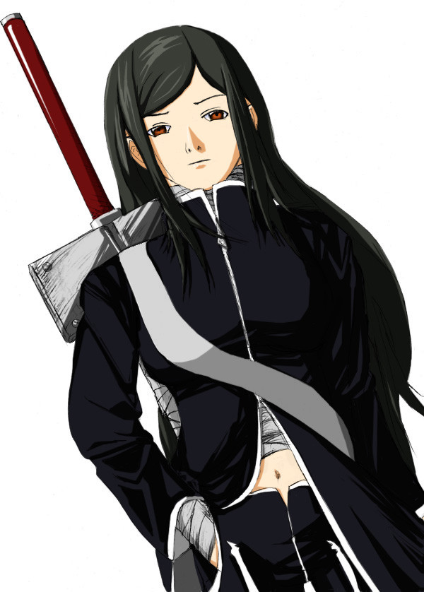
Finished coloring Apashi herself and her stuff, need to figure out a background though. I'm open to ideas if anyone has any. I may go back and add highlights to the clothing and elsewhere as well, not entirely sure though. I'm also not entirely thrilled with how some of it came out, especially the guard on her sword, as I'm really not sure how to draw something that resembles metal well. Anyone have suggestions on that? General feedback is appreciated as well.Related content


Comments: 18


Thinking of redrawing a character of mine soon. Named Murasaki Kinomi.
👍: 0 ⏩: 0


Awesome character
As for a background hmmmm since this looks like i'm looking up at her so you would probably only see the sky, or trees hanging over, tall buildings or a roof if she is inside. Sorry if I can't be to much help on the background I still have trouble with them as well
👍: 0 ⏩: 0

Looks great! Though I think the sword handle could use more of a wrapped hilt
👍: 0 ⏩: 0

The clothing around her upper chest to the neck looks too rigid. The hair - the way the bangs go under and the rest droop - feels also a tad off.
👍: 0 ⏩: 0

the color is awesome  (Smile)")
👍: 0 ⏩: 0

I like the perspective here. I think for background either a bit of ceiling or sky and tops of trees or something. Nice coloring and shading cell style. Maybe some more highlights (they don't have to be really bright) would make her pop more. For the metal parts, I think you might need to add a very bright highlight to it. Not a lot, just a spot where the light really hits the metal. Overall she looks good. ^_^
👍: 0 ⏩: 0

Here is the constructive critique you wanted:
While the proportions and colors scheme is good there is an over all flatness that really show through here. The angle also has a skewed feeling to it. Some more highlights would have helped with the flatness here and maybe if a more neutral non-white back ground.
👍: 0 ⏩: 0

I like your shading style – there should be more of it if at all possible. For you your weakest link is you line work – it definitely shows a lack of confidence. Ofc a BG would be nice. Just keep practicing.
👍: 0 ⏩: 0

")

You know this is really good
👍: 0 ⏩: 0

nice crisp coloring. i like the angle and concept. Good detailing too.
👍: 0 ⏩: 0


really cool. I like the perspective.
hmm... for colouring metal: you need sharp light reflexes (in the form like the light on the handle of the sword)
I like your cell shading and I would pursue the idea of adding highlights.
I suck at bgs... sorry. but someone wrote that a sky could work. I think so too.
👍: 0 ⏩: 0

*O* You keep getting better and better, Anchypie! *O* <3
Keep it up, it's awesome! n______n b
-snuggles her-
👍: 0 ⏩: 0

*squee!* it's coming along fantabulously! i think the metal bit looks really good! the only thing i could suggest for it would be maybe a bit more highlighting? but i dunno, i'm not sure how to colour metal either!
as for a bg, i think anything could work. because of the upward angle we're looking at her from, you could probably even just make it sky behind her and it would look ok. i'd say just go with whatever helps the mood you want. ^^
👍: 0 ⏩: 0
