HOME | DD
 anchen82 — Been a while WIP 3
Published: 2012-01-23 03:25:25 +0000 UTC; Views: 542; Favourites: 4; Downloads: 5
Redirect to original
Description
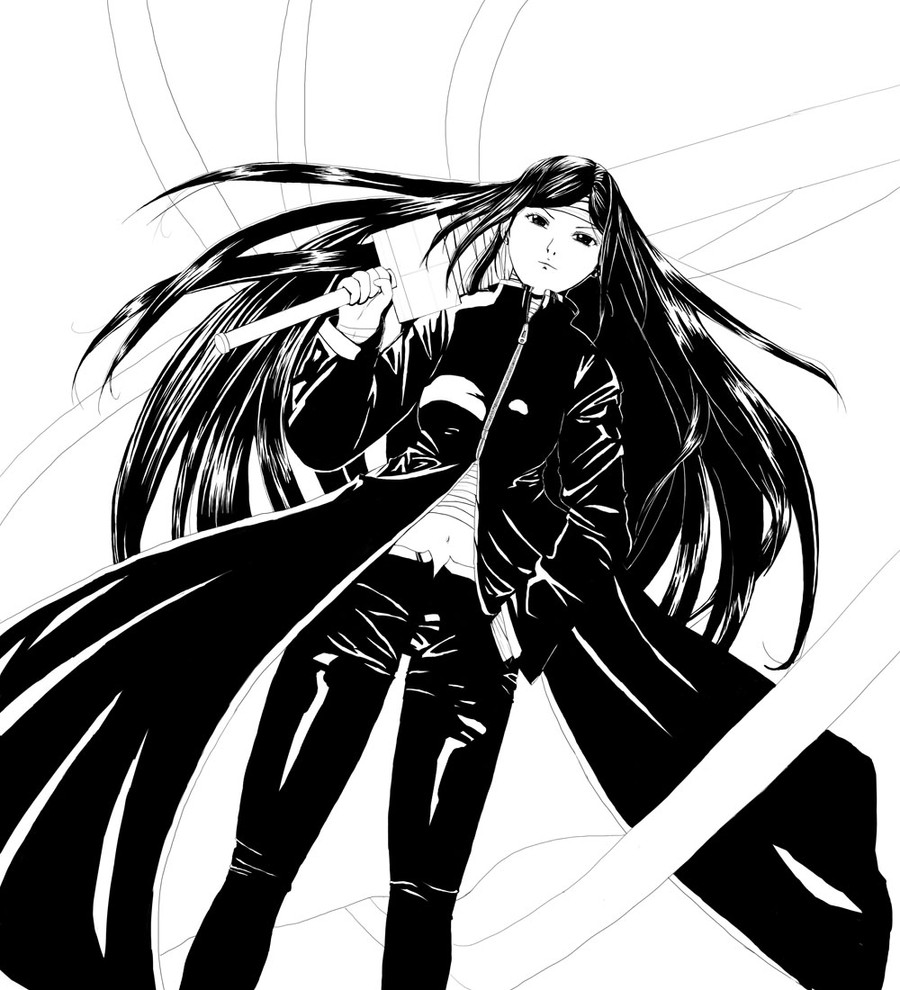
For anyone redlining, this is a female human (more or less, anatomy is the same). She's technically of chinese/japanese descent, but given the style that probably won't be clearly evident. She's also fairly tall (about 6 feet) and is supposed to have a somewhat mode-like appearance/proportions.Still iterating on this drawing -_- Tried to incorporate some feedback I got from other people on the face, which looks better I think than before, but still not quite to my liking. If anyone wants to leave suggestions on that still that'd be great. Any general anatomy, feedback, critique, or other suggestions welcome, doesn't need to be a redline or anything!
Related content


Comments: 13

Overall
Vision

Technique
Impact
Great work! This is definitely a very good piece! I love the hair and the shines throughout! Great work on the hand!
Her legs are, however, on the long side. The strands that are swirling around are also very visually distracting. What are they? There is no shading on them and the lines are very thin so they are difficult to easily distinguish from the background.
Although there are lots of shines and great uses of black - I'd love to see some shading on this piece. Notably her midsection, her hand and hammer, as well as her face! Without the shading she looks rather flat, especially because of the fact that the background and the random strands are pure white, so the impact of this piece is lost.
I must commend you on the hair, the strands are really well done and flow very nicely!! Very original, as well - you don't find too many anime pieces like this!
👍: 0 ⏩: 1

Thanks for the critique ^^ The strands that you see swirling around are ribbons/bandages, which are actually her primary way of fighting/ability. She basically controls them and uses them to do things like grab people to bring them closer/bind them/swing around with them (like hmm spiderman does with webs) or use them to swing additional weapons. Basically they are versatile but easily cuttable for instance. But yeah without knowing what they are I think it can be confusing.
As for shading and background, yeah that's why it is still a WIP (Work in progress) heh. Hoping to still work on those. For the legs, yeah they might be a bit long. It's hard to balance since I was trying to make this a bit of a low angle shot (viewer is looking up at her) which involves foreshortening the body and legs a bit. Not sure if I went too far on that though since the angle isn't that extreme.
Thanks for the comments, compliments, and suggestions!
👍: 0 ⏩: 1
Ahh! Wonderful! Whenever you finish this picture would you mind sending me a link of it? I'd love to see it!
It's difficult to tell whether foreshortening is really needed because the angle isn't that extreme. Since there is no other reference in this piece, the camera height could be waist height. If you want to go the foreshortening route, though, the legs will still be shorter and I would expand the picture a little more to (possibly) see the feet.
I love this piece you have done a great job!
👍: 0 ⏩: 0

Overall
Vision
Originality

This is seriously impressive for a black and white vector style piece. Not a huge anime fan myself, so I can't supply much insight into my thoughts in that area. That said, I can say the artwork itself is clearly well done. The minimalistic shading is quite effective, I am especially fond of the dynamic shapes you've used to represent highlights (like on the pants), rather than simply using unrealistic square reflections or something. Normally with anything I'm not too big on outlining, but in this piece it actually works, and is probably necessary. The white outline really emphasizes the subject. I like the flowing hair, it adds a lot of power to the character and seems to emphasize the negative space around her. The proportions are great, however it seems the shaping of the legs could be refined a bit. Something about them seems off-- I think it may be the roundness in the shins and lack of shape in the knee and crotch area. You could perhaps add some shading to otherwise indicate a hand in her pocket, as it currently looks rather flat in that area, which is illogical when you come to realize her hand's in there. e.deviantart.net/emoticons/let… " width="15" height="15" alt="
")
e.deviantart.net/emoticons/s/s… " width="15" height="15" alt="
 (Smile)")
👍: 0 ⏩: 1
Yeah I need to work on the hand in the pocket thing, you're not the first to point that out ^^ Thanks for the comments about the general appearance and I'll definitely look more into the legs since I found them to be a bit off too. Not sure how much I'll be able to fix up on the character but will definitely look into it and keep it more in mind for future works. At the moment the only thing I was planning to add was a background (why it is still a WIP in the title) but we'll see how it goes!
👍: 0 ⏩: 0

Overall
Vision
Originality
Impact
Coming from the Reactor Girl thread to comment + critique.
I have to say, judging from the submissions I've received in the thread so far, you and yzabel have the best knowledge of anatomy. I'm impressed. : ) Your style is a slick ink style with minimalistic shading which is actaully one of my favorite inking styles for manga art. The shading looks particularly good on the hair, the shines being placed at good spots without cluttering her hair. The clothing seems well inked, showing off a understanding of light source and having folds placed at logical spots. The flow of this picture is good, the girl's flowing jacket and ribbons leading one's eye all around the picture to then focus back at the center (the girl). You say it's hard to tell her ethnicity but I have to disagree. She does appear Asian. I'm not quite sure why since the eyes don't look very Asian but there is something Asian-esque about her. e.deviantart.net/emoticons/let… " width="15" height="15" alt="
Overall, you are a excellent artist with a good eye for light source and anatomy. I hope I have been helpful as well.
👍: 0 ⏩: 1
Thanks for the long and detailed critique. For the pose, yeah I think I actually mentioned in the first or second version of those that I felt that the pose was stiff looking, and I think a lot of what you said is true. I thought about redoing it but I decided since it has been a while since I had really submitted anything for real I was going to finish this one as is (in regards to general composition, fixing anatomy and such along the way) and work on something more dynamic for my next piece. As for the chin/mouth I've had some struggle with it due to the low angle. I think part of the issue was originally I meant for her not to be looking down as much, but instead a little more straight ahead, so you would see some of the bottom of her chin and that area should have been that. But it sorta turned to be more frontal for the face...Thanks again for the critique!
👍: 0 ⏩: 1
You're quite welcome.
It'd be nice to see this one finished, I think you should go for it!
👍: 0 ⏩: 0

Her ears seem a little too high, and her hands are too big (unless she has naturally big hands, then it's fine like that) and her boobs are too low.
👍: 0 ⏩: 1
Yeah I think I had a lot of the positioning still as if it was flat instead of looking up. The ears should be a bit lower since that part of her head is "lower", and her breasts should be higher due to the angle. As for the hands, not sure, I had someone on a previous version say they were too small, maybe I went too far on it? I was going for hmm, normal sized hands, but also needed them to comfortably hold the sword too I guess...
👍: 0 ⏩: 0

This looks so good--It looks like it's from an actual manga! The anatomy and shading (especially the hair!) are all very well-done. The only things I'd like to point out are the folds on the pants, around the knees. The folds look a bit unrealistic since they tend to form in different directions instead of in parallel lines.
👍: 0 ⏩: 1
Thanks for the comment ")
👍: 0 ⏩: 1