HOME | DD
 Andasolo — Get Shredded - Sold

#adobe #bodybuilding #clean #content #creative #css #design #fitness #flat #game #gaming #html #interface #layout #minimalistic #muscle #online #photoshop #portfolio #protein #responsive #shop #structured #template #theme #training #ui #web #webdesign #website #wordpress #andasolo #andasoloarts
Published: 2015-03-21 15:44:51 +0000 UTC; Views: 23523; Favourites: 211; Downloads: 222
Redirect to original
Description
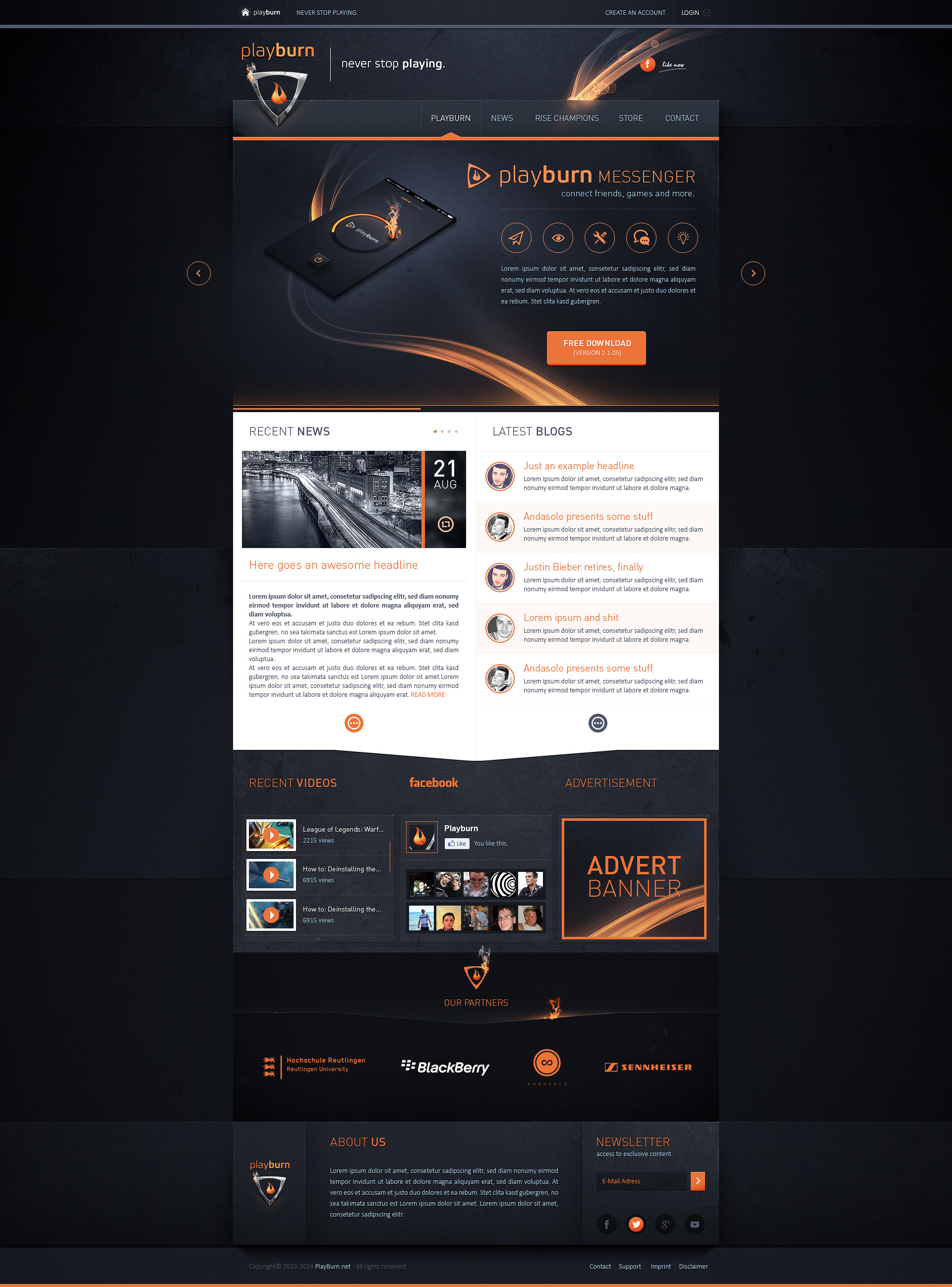
Get Shredded - 21.03.2015Template Status: Sold
Follow me on
 facebook Twitter Behance dribbble Online Portfolio
Related content


Comments: 36


 (Wink)")


Great design! Sweet colors and smart layout.
Well done.
👍: 0 ⏩: 1

Thanks for that great feedback
👍: 0 ⏩: 0

Thanks again leonardo!
👍: 0 ⏩: 0

Beautiful selection of colors and strong arrangement of white space and content mate
👍: 0 ⏩: 1
Thanks mate, really glad about your feedback
👍: 0 ⏩: 0


Thanks a lot, glad to hear that
👍: 0 ⏩: 0


Can't really see these borders - prntscr.com/6jlo9v , but in the same way, excellent work! I don't understand how do you get so good quality web designs.
👍: 0 ⏩: 1
Thanks a lot!  (Smile)")
👍: 0 ⏩: 0


find die licht streifen im header bei so einem design eher unpassend, die font größe für den fließtext könnte nen ticken größer und auch etwas dunkler sein, dann wirkt das ganze gleich "schärfer"
sonst cooles teil
👍: 0 ⏩: 1
Ja bei dem Lichtsreifen war ich mir ne zeitlang auch echt unsicher. Werd mir das nochmal genau anschauen. Un wo genau meinst du das mit der Fontgröße? Direkt unter "Motiviere dich und erziele optimale Ergebnisse"?
👍: 0 ⏩: 1

bei dem Fließtext gefällt mir die Schriftart nicht so wirklich - sieht etwas zu gequetscht aus.
Sonst top Design! Mich würde bei der Seite mal ne beispielhafte Unterseite evtl ohne riesigen Header interessieren
👍: 0 ⏩: 1
Ist das leserliche wirklich so extrem? Bei einer Unterseite würde sich beispielsweise der Slider Teil soweit verkleinern, bis nur noch der Navigationsbereich sichtbar ist
👍: 0 ⏩: 1
Extrem nicht ")
👍: 0 ⏩: 1
Ist schon an den Kunden raus, aber werd beim nächsten Layout wieder auf konventionelle Schriftarten für den Fließtext zurückgreifen und mehr auf Lesbarkeit achten. Danke dir
👍: 0 ⏩: 0

