HOME | DD
 Andasolo —
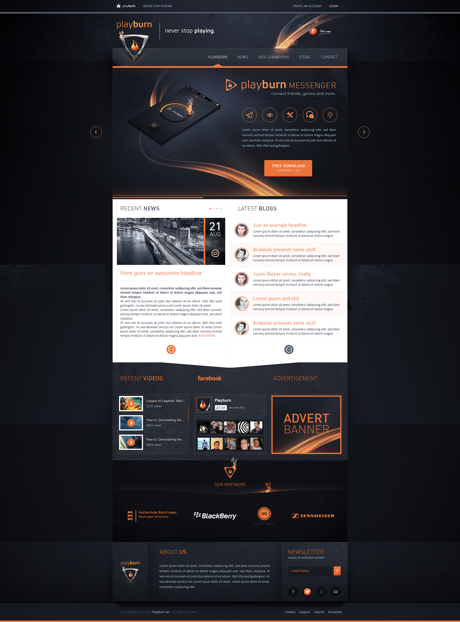
energydesign Portfolio - Sold
Andasolo —
energydesign Portfolio - Sold

Published: 2012-03-02 13:51:58 +0000 UTC; Views: 126939; Favourites: 1262; Downloads: 2564
Redirect to original
Description
energydesign Portfolio - 02.03.2012Template Status: Sold
Follow me on
 facebook Twitter dribbble Online Portfolio
Related content


Comments: 127


 (Smile)")


 (Wink)")


Hey thanks, I didn't notice it. Very nice news after this shitty week (:
👍: 0 ⏩: 0


Cool, very cool. I love the combination of colors and flowing into each other. You have a good chuvsvo composition. Good web design is immediately evident. I want to go to sites takii
👍: 0 ⏩: 0

I just love that background. Does anyone have a link to a tutorial to create a similar effect?
👍: 0 ⏩: 0

Wow, really great design... is there a link to live preview?
👍: 0 ⏩: 0


This is one of the best webdesign I ever seen! oO
I make webdesigns too (don't have uploaded any webdesign on deviantart) but I can't code it
Worktime on this?
Greetz,
")
👍: 0 ⏩: 0

Way too busy. Eliminate blog posts/entries. Services can be put in the nav with central drop down or direct links. This would be at least 2-3 scrolls. Repeating social icons/links is a big no no. Why are you repeating their logo twice. Too me this design is garbled and it looks like you just put extra stuff on there to fill space you don't even need in the first place. If you simplified everything below your first container it would look much more clean.
👍: 0 ⏩: 0


wie bereits schon gesagt nen geiles teil
kannst du mir evtl. sagen wo du diese texturen/muster her hast? bin gerade auf der suche nach so coolen
")
👍: 0 ⏩: 0


Very nice work! Gratz,
If i may say something, the hire us now buttons have great style but still there is something about them that bugs me.
👍: 0 ⏩: 1

I definitely agree. In my opinion, the whole template feels like it's going "up" - all the drop shadows etc are lifting all of the elements and giving it that positive feel. The 'Hire Us' buttons are the only elements on the page that are pointing in the other direction, giving it that 'out of place' factor.
Other than that, incredible, incredible design! well done
👍: 0 ⏩: 0


Gewohnt gut, nur die Perspektive bei dem Button scheint mir nicht ganz stimmig, oder ist das absicht?
👍: 0 ⏩: 0

Nice work! I love the colours on the top. Well done man
👍: 0 ⏩: 0
| Next =>