HOME | DD
 Andasolo — myRISK Gaming - Sold

Published: 2012-01-04 22:37:55 +0000 UTC; Views: 46559; Favourites: 305; Downloads: 779
Redirect to original
Description
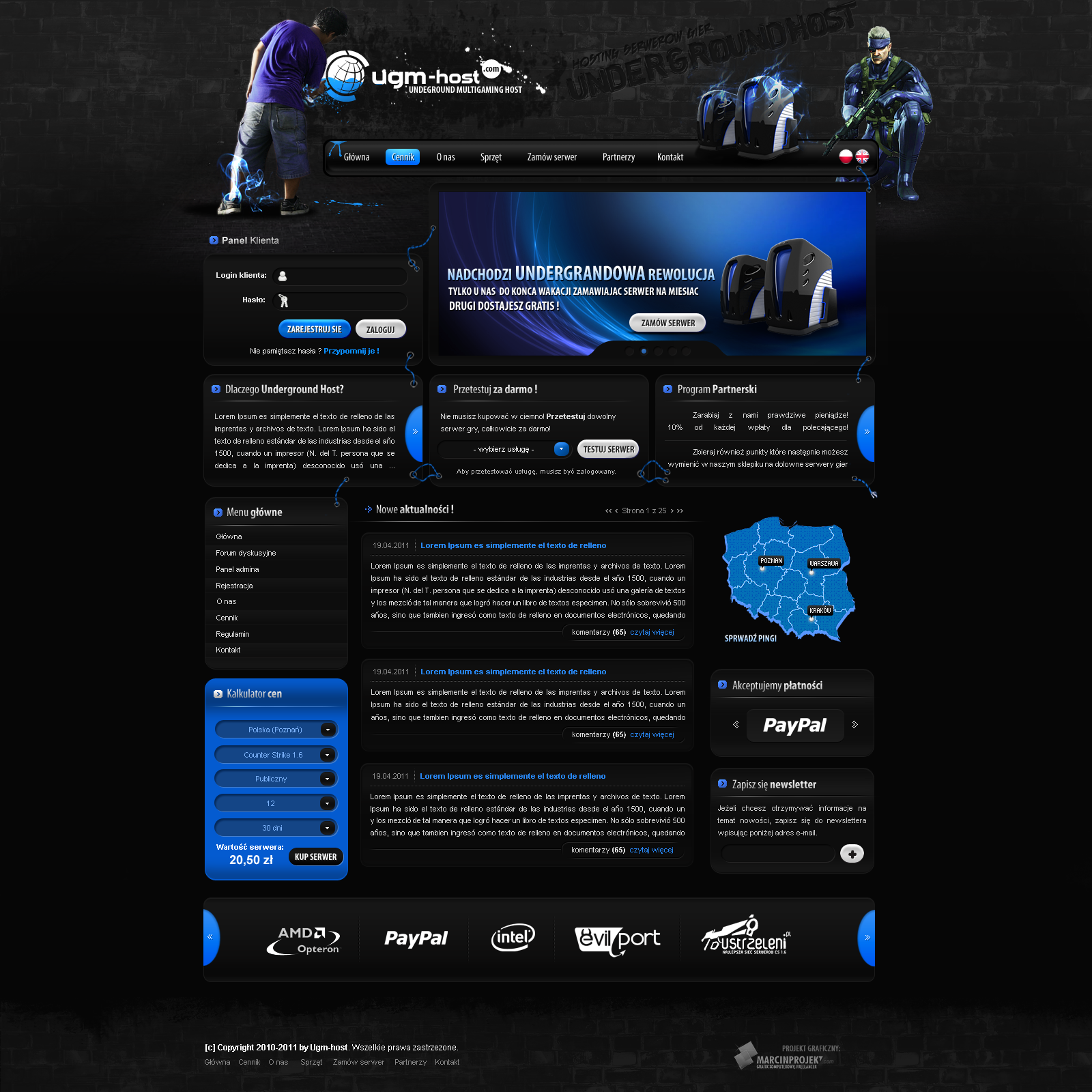
myRISK Gaming - 04.01.2012Template Status: Sold
Follow me on
 facebook Twitter dribbble Online Portfolio
Related content


Comments: 82

Good work!
Please check out my new work too vuongthanhchung.deviantart.com…
Hope you appreciate it
👍: 0 ⏩: 0


Thanks for the amazing link...
👍: 0 ⏩: 0


any way i could find that line effects like on the header ?
👍: 0 ⏩: 0


")


hello
u sell these webspell theme ? im interesting if u want talk lovescamilo@hotmail.com
👍: 0 ⏩: 0

Schick wie immer !
Wie lange arbeitest du an einem Design dieser Art ?
Gruß
👍: 0 ⏩: 0


And yet another fantastic design from *AndasoloARTS . Keep it up, man.
👍: 0 ⏩: 0

Hello, Andasolo, wonderful work! I was wondering if you had any pointers on how to cut these up and perhaps even coding them using CSS/HTML? I am still a little new to transforming PSDs to effective and clean CSS/HTML. Also, any tips on making designs as beautiful as yours would be fantastic!
👍: 0 ⏩: 0

Super Layout! Einzige was ich zu bemängeln habe, ist die Schriftgröße oben in den 3 Boxen. Ansonsten super ding!
👍: 0 ⏩: 0


")


Now change your screen resolution to 1024px and look at this project, it's too big..
Graphic in this project is not bad - I like it man
👍: 0 ⏩: 1

What's to big?? See here it's perfect for screen resolutions starting from 1024px: [link]
👍: 0 ⏩: 1
Menu on full screen ")
I like it
👍: 0 ⏩: 0


Puh, die Schriften sind aber unscharf
Das Design ist wieder klasse geworden. Aber was zu meckern habe ich, kennst mich ja
Die Newsansicht ist nichts für mich, also damit meine ich die Linie zum Datum usw. Matches sind geil geworden, auch wenn ich den Text jeweils für sinnlos halte (Kunden halt?), aber den Hover vom Switch hätte ich heller gemacht. Da wäre ein kleiner Eyecatcher perfekt! Zudem stört mich der Schein links oben in der Sponsorbar.
Insgesamt wieder erste Sahne. Ich sitze auch an einem neuen Design und jetzt fühl ich mich schlecht. Danke Michael
")
👍: 0 ⏩: 1
die Schriften sind unscharf? versuchs mal mit Download  (Wink)")
👍: 0 ⏩: 1
Ok, mein Fail mit den Schriften.
Der Schein links oben in der Ecke. Also nicht vom Hintergrund sondern der, den du nochmal drübergelegt hast. Ich finde es auch gut neue Dinge zu machen. Das zeichnet dich ja auch aus. Muss ja nicht alles immer jedem gefallen
👍: 0 ⏩: 0
Wow, LOVE the color scheme and just overall feel. Very nice job!
👍: 0 ⏩: 0


ja kann man nich viel dazu sagen außer ... SUPER
das design is klasse ... super farben ... super stil  (Smile)")
gibt nix, was man zu beanstanden hätte
mfg
soturiy

👍: 0 ⏩: 0


mega geil, auch die farben! und die buttons erst, alter...
👍: 0 ⏩: 1
nice work and nice colourscheme ! This is an inspiration for me
👍: 0 ⏩: 1

| Next =>