HOME | DD
 aNdre-W — Beautiful Future Updates

Published: 2009-02-17 12:10:47 +0000 UTC; Views: 9242; Favourites: 17; Downloads: 0
Redirect to original
Description
Okay just a quick one so people can see what ive been up to before i get to bed.. (My eyes are killing me!)
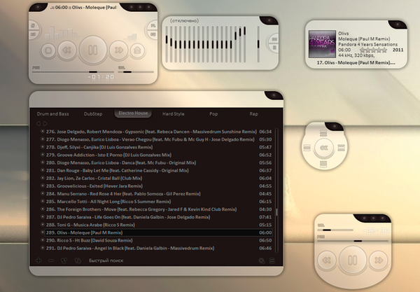
This is a rough design for future updates of my very popular Winamp skin Beautiful Simplicity .
Still working on the look of it.
I want it be released to look perfectly,
cause i believe in this case,
looks are a little more important then functionality


Feedback is loved


 haha.
haha.Thanks!
Update 2011: Wow i never realised the demand for this.. I really haven't found time to go back to this, but i feel it is incomplete and i need to.. I will be attempting to push out an update for this soon. Thanks everyone for your support and patients !
Related content
Comments: 105

well i was thinking of having the Hz labels on the actual buttons of the sliders..
im focusing on the playlist atm though.
and its proving a challenge
👍: 0 ⏩: 1

Oh I see. That just might be better.
I think the playlist looks great. What are you trying to change or add?
👍: 0 ⏩: 1

well im trying to figure out how to skin it..
i am completely stumped :[
and there is absolutly no reference on how to do it at all :[
👍: 0 ⏩: 1

Oh I see.
What program are you trying to make it for?
👍: 0 ⏩: 1

Ohh, thats somewhat even better
👍: 0 ⏩: 1

you don't have a (equalizer folder) in your skin! only change the background and other images!
the setup in screenshot is perfect, but still lack some resources!
for now is a great work
👍: 0 ⏩: 0

haha well it is the latest version?
this is still in production though..
👍: 0 ⏩: 1

Yeah I recently updated winamp and Im sad cause none of my old skins work.
👍: 0 ⏩: 1

it works when i updated my computer,
try removing any old plugins,
cause they could no longer be compatible.
👍: 0 ⏩: 0

Could you release a beta? beceause I can't wait any longer
👍: 0 ⏩: 1

haha sorry
im really low on time at the moment
im trying my hardest though..
👍: 0 ⏩: 0

ooh, I like de skin so much, I can't wait for the release
👍: 0 ⏩: 2

thanks so much, watch this space for updates !!
👍: 0 ⏩: 0

Hope things are going well for you with this
👍: 0 ⏩: 1

thanks mate.
im doing my best !
👍: 0 ⏩: 0

Yay~~ you've started skinned the PL ^^
Hoping to see the ML soon
I agree with On-The-Fly that the PL corners are a little dark
As for the close button, the top left or bottom right might be a good place to put it, or remove it completely ^^
You might also want to make the EQ skin the same color as the player itself and also info on the EQ. Button to close the EQ as well maybe?
CD cover display might be nice to add to the player, but not sure if that will ruin the whole title of "Simplicity"
The V2 is comming along nicely
👍: 0 ⏩: 1

thanks so much for the feedback,
so its taken me ages to reply.. ive been soo busy
alright ill take everything into consideration,
im planning to release another design of V2 very soon,
so if your intereced keep a watch on it !
thanks
👍: 0 ⏩: 0

I don't use equaliser, but playlist skin is very good. Hope you don't forget to make a ML skin as well
Also hope to see skinned notifications (with CD cover) and cyrillic tag support
👍: 0 ⏩: 1

alright thanks
im using a different font,
so i dont know how it works with different langauges..
i might try it out
perhaps later ill look at the ML,
the PL and EQ are all i want to do at the moment..
but thanks again
👍: 0 ⏩: 0

yeeees, you listened to my wish! Though you haven't finished yet; thanks a lot that you begin skinning PL and ML too :> Which program do you use to create your Modern WA-Skins anyway?
Well... at least I hope, you won't leave out ML, because I neeed it
To the PL-skin: The corners seem to dark for me. Lighten them a bit, so they'll fit to the main window-color. And keep in mind that line pattern should be slightly visible in the PL-window as well
The Eq looks very nice, very smooth, but you maybe should think about putting the hz-numbers onto it, though it would ruin a bit of simplicity :\ I don't need the Eq anyway
Thanks for asking me 
👍: 0 ⏩: 1

of course id ask you!
feedbakc is the most important thing
umm i use fireworks to make the designs,
and write all the code by hand :]
ill work on the PL and EQ soon,
and the eq looks very bare at the moment,
i didnt spend much time on its design
watch this space for updates if your interested !
thanks !!
👍: 0 ⏩: 1

When there is a new skin downloadable, you need new feedback or you finally got something with the ML, I'll be back again
👍: 0 ⏩: 0

in my opinion i don't think you have to change anything, ver 2 looks excellent to me m8.
have been waiting for this kinda skin for along time
👍: 0 ⏩: 0

yeah, that's cool!
that oldskool playlist editor is simply annoying me, so hurry please
👍: 0 ⏩: 0

Looking good man! 

👍: 0 ⏩: 0

Hi aNdre-W, I'm really liking how your v2 skin is turning out to be! I'm so glad you listened to everyone who liked your skin. It looks a lot better now. Goodluck on making it work. By the way, this is my favorite skin. シ
👍: 0 ⏩: 1

thankyou 
so watch this space as i work on it
👍: 0 ⏩: 0

Close and mininize buttons could be put at the top (left) like in takanory's iChange x240 playlist window - hidden - at mouseover visible.
(
👍: 0 ⏩: 1

thanks for the help
i know how to do the mouseovers thanks,
but its just the problem of finding a suitable place for all the items to go,
so at the moments its just trial and error of moving things around everywhere!
👍: 0 ⏩: 0

Oh, and can you add a minimizer to the main window please?
👍: 0 ⏩: 0

I'd like it to look the same as the main window (no inset), with the same font too if possible.
As it is it doesn't match very well.
And thank you for skinning the rest of it, this skin is my all time favorite.
👍: 0 ⏩: 0

Biggest issue is familiarity. Windows users are so used to the X being on the top-right, and the controls being lower and in the middle or so.
Buttons for at least the Playlist would make it just about perfect. Currently, I use EbonFix. That one's very simple, but the scroll text on the long-version bar is a bit small.
Compete with that one. >.o Beat it at its game!
👍: 0 ⏩: 1

true.. i totally forgot about the close buttons on the other windows..
this is just a design after all, but i might need to look in having a common close button on all the windows.. but find somewhere to put it where it dosent screw up the design ?
and there are buttons for the playlist, underneith it.
also any chance of a link to the skin?
i cant seem to find it
thanks so much!
👍: 0 ⏩: 2

Your skin is looking great!
Maybe if you make the top border of the playlist as big as the bottom one you could add the close buttons and even more.
For the equalizer you would just put it at the top right corner. But I'm not sure about the player...
That's just my opinion, hope it helped
👍: 0 ⏩: 1

alright ill look at doing that for the PL editor.
thanks so much for your feedback!
and sorry i took ages to reply,
I've been really busy..
if you interested,
watch this space for updates
👍: 0 ⏩: 1

No problems, and that's OK.
And, I'm already watching you
👍: 0 ⏩: 0

I was familiar with the skin as "Ebonfix," but it's really "Ebonite-fix." My bad. 
As you see, it has six interfaces, but I use only the extended horizontal. It's simple, it has the progression and volume bars, it has links like PL and such, and it's hardly noticeable unless I look to where I know it's docked on my Windows. I'd use something like yours, with a few adjustments, of course. >.o The look of yours makes it seem like it's... almost embedded into my desktop, like it's not a program, but a part of the OS. Makes it more sleek and stylish than my My Documents window. ^_~
👍: 0 ⏩: 1

thats exactly how its desgined
im glad you like it!
ill take a look at the link and see what i can do :]
if your interested,
watch this space for updates
thanks again!
👍: 0 ⏩: 0

looks really nice m8
nicest skin out there
👍: 0 ⏩: 1

thanks soo much
do you have an opinion on how the skin design looks for the eq and playlist?
it will help me so much thanks!!
👍: 0 ⏩: 0

Looks good. I would like to see an icon for palylist on the right of the repeat-button. P-Button or something like that.
Oh, and does have the transparent area of the playlist the same transparency level as main window? It looks lil bit darker that main and eq windows!
👍: 0 ⏩: 1

Okay firstly thanks for your feedback! greatly appreciated.
I will be adding buttons for the Play list and Equaliser onto the main window,
as well as several others
And yes the playlist and the eq windows are darker then the main player, just to make them look doifferent and make the main player stand out.
Its an idea i was playing around with and really need to know what people think!
Thanks again
👍: 0 ⏩: 0

looks good
I would add a little info to the equaliser so you can see, which thing you're changing (I hate havin to express things i cannot express in other language than mine 
It's really beautiful simple done, what about using the loop-strokes you used in the player and equaliser also as a slight background for the playlist?
👍: 0 ⏩: 1

Thanks for the feedback, i really love to hear from you
well the equaliser was pretty much just quickly made, and i left a lot of detail out.
i will aim to put labels and buttons on there!
also by loop-strokes do you mean the glass effect?
I took that away to make the focus the main player, not the other windows.
This is an idea im playing around with,
please let me know what you think of it.
thanks
👍: 0 ⏩: 1

add more detail, it looks still a bit out of style..
well, it's okay whitout the glass effect, but I would add some effect to make clear, that that's still the same style...
it seems a little bit out of...
👍: 0 ⏩: 1
| Next =>
