HOME | DD
 andrewackroyd — Urban Typography

Published: 2008-04-08 00:03:52 +0000 UTC; Views: 76580; Favourites: 512; Downloads: 11658
Redirect to original
Description
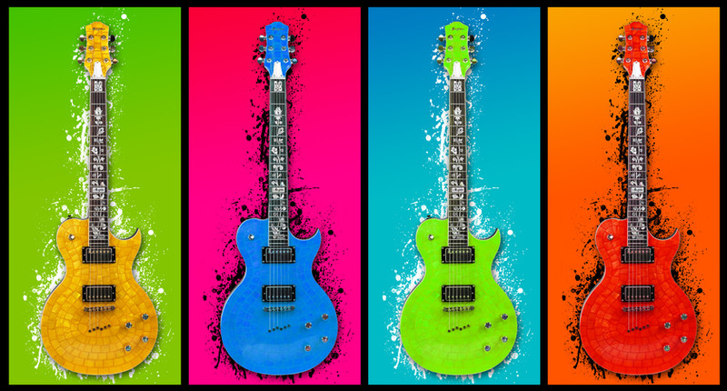
Part 2 to my Urban Typography project in the first year of my Graphic Design degree.The brief was to create a poster using only typography using movement of the urban city. It took me a long time settle on a colour scheme that really worked. I also decided against the idea of using text on horizontal and vertical axis, instead using rotations of 45 degrees for the layout.
Related content


Comments: 65

Well, congratulations! That's quite an accolade, there.
👍: 0 ⏩: 0

This image has been used in a blog post about typography. Hope you don't mind and keep up the great designs.
[link]
Dan.

👍: 0 ⏩: 1

Ofcourse not, I'm grateful that you've included my work.
You've included a lot of my favourite designers in there.
Keep up the good work, Ill keep tabs on your blog too!
Andy
👍: 0 ⏩: 1
Thanks for the interest, the blog is rather new.
We're currently searching for ways and ideas to involve our readers, an example is for the reader to mention their favourite designer and why, post it, and then we shall compile a big post with everybody's opinions.
If you have any suggestions of work, designers etc, or any work you yourself have completed and proud of, please feel free to send them my way and I can add them to a post.
Dan.
👍: 0 ⏩: 0

This is my basis of mine, its really nice.
If your looking for mine, here it is.
[link]
")
👍: 0 ⏩: 0

that is a sexy ass typeface..... what is it dude??
👍: 0 ⏩: 1
The lovely helvetica neue ofcourse
 (Smile)")
👍: 0 ⏩: 0


very nice design........keep it up.....
👍: 0 ⏩: 0

This definitely has an urban feeling to it. The white and green arrows in the upper left corner are a nice touch.
What I also love is that this piece makes you read at different angles, like you mentioned. Very creative, and it will certainly people's minds to new possibilities (i,e., looking at a problem from a different perspective, etc.)
Very nice. Keep up the good work! ^^
👍: 0 ⏩: 1
")
<= Prev |