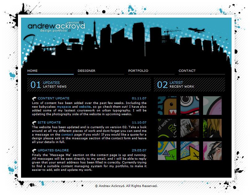
HOME | DD
 andrewackroyd — Urban Typography

Published: 2008-04-08 00:03:52 +0000 UTC; Views: 76576; Favourites: 512; Downloads: 11658
Redirect to original
Description
Part 2 to my Urban Typography project in the first year of my Graphic Design degree.The brief was to create a poster using only typography using movement of the urban city. It took me a long time settle on a colour scheme that really worked. I also decided against the idea of using text on horizontal and vertical axis, instead using rotations of 45 degrees for the layout.
Related content


Comments: 65


Perfect colours, intriguing layout, meticulous alignment... I love it!
👍: 0 ⏩: 0


This was shown to my class at the Kansas City Art Institute. My professor loves it.
👍: 0 ⏩: 0

Helvetica Neue has to be the most amazing font created. I know it when I see it.
👍: 0 ⏩: 0

Thats called sweet..awesome great work bro ...
font u used ???
👍: 0 ⏩: 1


awesome, i am a huge fan of this green, black and gray in general...i think they look great...i use that combo a lot on kuler
👍: 0 ⏩: 1

really nice design and concept, my friend
I like the movement, the color and the dispostion of the elements it does really convey that urban feeling ^^
👍: 0 ⏩: 1

Thanks dude. You gave me great inspiration for coursework
👍: 0 ⏩: 1

Love the movement and the feel of it. Not to mention the colour is great.
👍: 0 ⏩: 1

Thanks dude  (Wink)")
👍: 0 ⏩: 0

Looks really great, love the choice of colour...
👍: 0 ⏩: 0


Sorry* It was a book, that also folded out to be a poster.  (Smile) - :)")
👍: 0 ⏩: 0
I am currently doing a degree in Graphic Design too. (although I have no current work up) I had typed in 'Urban typography' into google as this is my next assignment.
👍: 0 ⏩: 1
I get a lot of hits on this piece of work, it must feature as a project in most college and university projects. Thanks for the kind words
👍: 0 ⏩: 1
I think it must too.
We were only allowed to use text in ours too, and in the another just images. Sorry for the late reply. xxx
👍: 0 ⏩: 0

I really dig the colours and the simple arrangement. Kinda looks like a poster.

👍: 0 ⏩: 1

*likes this*  - :D")
im doing something on typography too bleh i need ideas
👍: 0 ⏩: 1
 - :P")

this is pretty amazing! i actually find myself physically turning my head to read all of it ^^ Great Job!
👍: 0 ⏩: 1
No prob! i was actually researching typography art because I have this assignment in my adv graphics class where i have to use typography to represent a product or event. I found it really cool how you depicted a sense of movement with only letters! great job!
👍: 0 ⏩: 0


Saw this on Smashing Magazine's site today. This is really fantastic stuff! Inspiring use of type here. And this is from your first year? Damn, son. What school teaches you stuff like this?
👍: 0 ⏩: 1
Oh cool, I cant seem to find it on smashing magazines website. Could you link me to it? Yeah its from my first year, I was working with photoshop and stuff like that for about 5 years before I started though. lol
👍: 0 ⏩: 1
Sure thing. I looked back, and it's not actually in smashing, it was on another site. I just have them all together on google reader (oops). So yeah, here's the link to it http://www.webdesignerdepot.com/2009/09/30-typography-posters-that-youve-probably-never-seen-before/ . It's the third one down.
👍: 0 ⏩: 1
Thanks for linking. Web designer depot, I'm surprised I didn't see it to be honest, I read it quite a lot lol!
👍: 0 ⏩: 1
| Next =>