HOME | DD
 andrewk — Norm and Cory Cover 2

Published: 2004-04-21 03:00:20 +0000 UTC; Views: 1355; Favourites: 24; Downloads: 270
Redirect to original
Description
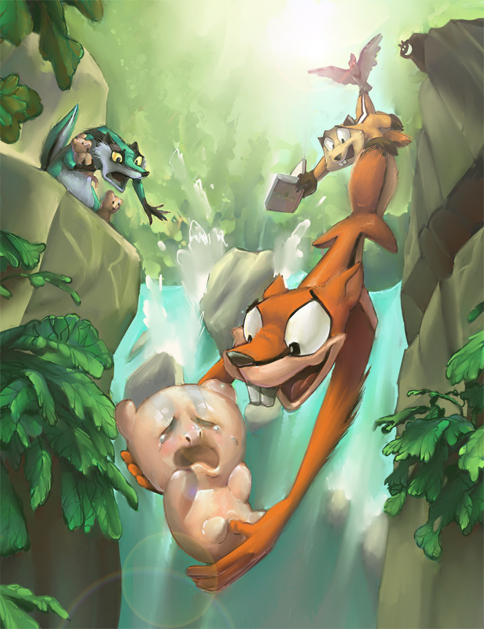
This is more like what I wanted for the cover of Norm and Cory if it gets published! More like a painting! Hope you like! Later, I may upload the same picture with the characters only.The first attempt is here [link]
Related content


Comments: 21


That's so awesome lookin!!! I love the poses and everything!
👍: 0 ⏩: 0

 (Wink)")

whoa that looks really cool. Very neat, and great charecter designs. This looks pretty funny and I'll look for the comic when it comes out in stores. keep up the great work.
👍: 0 ⏩: 1

It's online on there places already! Here, [link] and [link] !
👍: 0 ⏩: 0


I CAN'T SEE THIS ONE EITHER!!!! I WANNA SEE SOO BAD!!!
👍: 0 ⏩: 0

Very painterly indeed! (I wonder what they're running from?) Good luck getting published! I hope you do!
👍: 0 ⏩: 1
I'll start looking for publishers once I get the ENTIRE series done (whenever that will be).
👍: 0 ⏩: 0

holy mother of god!
this is the BEST cover design and style EVER!
I will worhsip you now:
:worhsip:
👍: 0 ⏩: 0

It looks really great, but I think the logo is taking up too much of the image. The guys are the stars, not the logo!
👍: 0 ⏩: 1
I'm not as good a graphic designer as an illustrator, but you do have a point. The logo and characters are competing. A version with a smaller title in text should do the trick.
👍: 0 ⏩: 0

")

It looks jawsome!
though, i must admit, the greyish blotches look weird. IT's okay though...I'm guessing you know what you're doing!

👍: 0 ⏩: 0

This is great, has the real Norm&Cory feel indeed. I love the background.
👍: 0 ⏩: 0


that looks exceptional. if that was at a bookstore I'd buy it X3~~
👍: 0 ⏩: 0

I love this! VERY eye catching too. Anyone would be able to spot this in a comic book store any day, any time. Great job ^_^
👍: 0 ⏩: 0


This is so damned irritating! I swear I just left a comment. Damn browser problems...
")
👍: 0 ⏩: 0
You can count on me to be the first in line if it does get published. I love these two. I love the style you used to color it. I think it works well with the lighting and the movement in Norm and Cory. I love your stuff... This is definitely a 
👍: 0 ⏩: 0