HOME | DD
 AndrewToPhotography — Re Energize Hong Kong
Published: 2009-12-11 23:07:15 +0000 UTC; Views: 6006; Favourites: 183; Downloads: 0
Redirect to original
Description
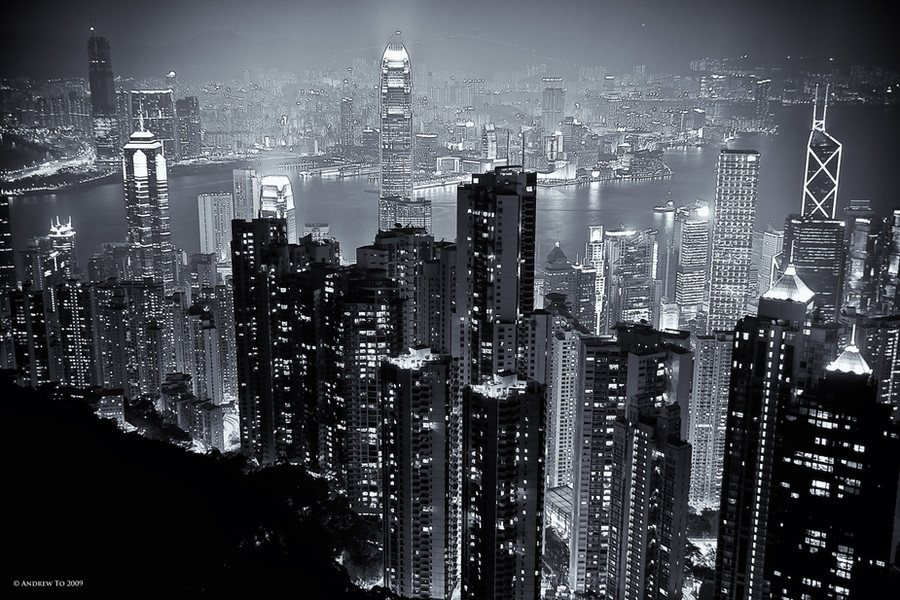
A more neutral monochrome version of my most popular deviation, Energize Hong Kong [link]In some cases a sequel is never better than the original. Not sure it has the same impact...what do you think?
© Andrew To. All rights reserved.
Thank you for looking. Any feedback is much appreciated.
 (Smile)")
If you do
 then I
  to you now as it's really difficult to thank everyone individually, though I do try
Related content


Comments: 36

👍: 0 ⏩: 0

👍: 0 ⏩: 0

👍: 0 ⏩: 0

This amazing piece was featured in my March Project Feature Journal: [link]
I am now collecting pieces for April.
If you have any deviation related to children feel free to link it to me and you'll see it featured next month
You can also suggest other artists' works.
Any contribution will be credit, of course!!
👍: 0 ⏩: 0

I"ve been there.
Kinda scary when you're going up. ^.^"
Very nice view up there though.
👍: 0 ⏩: 0


I really want the print but for now, it will have to just stay as my wallpaper. I love this piece.
👍: 0 ⏩: 0

I still like the original, but this is pretty sweet too
👍: 0 ⏩: 1

thanks...A lot of people prefer the original
👍: 0 ⏩: 0
Merci beaucoup mon ami!
👍: 0 ⏩: 1

It's sincere !
👍: 0 ⏩: 0

You are absolutely welcome...
👍: 0 ⏩: 0

I love the monochrome versions of all the cityscapes I see. I have a Chicago version as my desktop. Good job on this one. Any chance of a wallpaper from this? (a440x900)
👍: 0 ⏩: 1


Don't be silly Andrea. Thanks.
👍: 0 ⏩: 0

The black and white version appears sharper but the blue version gives it a more futuristic glow and feel to it.
👍: 0 ⏩: 1
Thank you. Yes, I agree with you. I might have to do a little work on the blue version.
Thanks for your comments. You're right the blue tone makes it more futuristic.
👍: 0 ⏩: 0

Well, I really love this, it has a lovely aura to it, and makes the city seem mystical. Great work
👍: 0 ⏩: 1
Thank you very much. I didn't think it would have as much of an impact as the original. Thanks for your positive comments. I like how you describe it as mystical.

👍: 0 ⏩: 1
Hehe, I think my brain is wired to see things that way
👍: 0 ⏩: 0

They def both hold their own,maybe you even pulled out some extra detail in this one Andrew,particularly in the background
Awesome viewpoint and image any way you look at it though

👍: 0 ⏩: 1
Cool Jonny - thanks mate. That's reassuring to know especially from an expert in the field.
👍: 0 ⏩: 0

beyond doubt Maestro! you're really good at creating monochrome images 
")
👍: 0 ⏩: 1
Thanks mate.
It's really reassuring to hear that I have improved with my B&W shots. It's all about getting the right contrast and balance between the shadows and the highlights.
Keep practising. The danger is having the monochrome being 'too grey' and flat and not enough contrast to crate depth.
👍: 0 ⏩: 1

👍: 0 ⏩: 1
don't knock yourself. It's all about learning. I remember my first B&W attempts were just a grey scale conversion of the colour one...like for like, which didn't work. They were flat as a pancake. ")
Try it Jeff!
👍: 0 ⏩: 1


👍: 0 ⏩: 0

Black and white can really make things more powerful.
👍: 0 ⏩: 1
Thanks bro. I know! I still favour B&W over colour.
👍: 0 ⏩: 1
Yep.  (Wink)")
👍: 0 ⏩: 1