HOME | DD
 andromacke — LIght Up--with video process!

Published: 2018-08-14 16:36:26 +0000 UTC; Views: 481; Favourites: 16; Downloads: 0
Redirect to original
Description
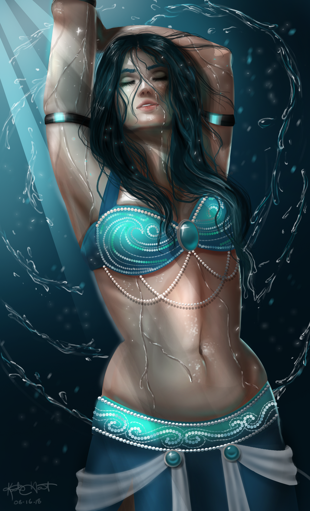
Just a piece I did to practice.Added a video process that can be seen here: youtu.be/Ye4zti8h5V8
Check it out and let me know what you think, everyone!
Related content


Comments: 5

Hey, I like the colors of a piece, they look very natural for the light environment u chose. I would definately work on edgework, try to define some edges instead of blurring them.There are few anatomical issues, this isvery hard angle to draw a face. The biggest problem I see is the jawline, it's really stretched, quick liquify would help to tuck it in. Also her neck is anatomically incorrect, I suggest u look at your own neck in that pose in the mirror.
👍: 0 ⏩: 0

Hi! I found your piece through 
This is stunning! From the soft lips to the beautiful eyes, all formed into a alluring expression. Absolutely beautiful work!
I have a few constructive notes for continual improvement, but they don't detract from the beauty of this image. The first is her lips themselves. While lusciously beautiful as is, adding just a touch of texture would add a little more realism to this picture, blurring the line between digital painting and a photograph. Little more than faint lines, polished over by the glossiness, would help add just a touch of texture.
The second thing I noticed is the gem on her head, which has conflicting lines following the distinct perimeter, with gem coloring extending above this line. Either perimeter line would work well in shape, but the line cutting the color apart looks unnatural. If this is meant to be light passing through the gem and illuminating her head, then it could be made to look more natural with probably a lighter tone to the colored light.
There are also some areas along the left side of her face (viewer right) where brush strokes belonging to the face overlap the hair. You have to look pretty closely to see them, but they disrupt the dimension of her face just that little bit. There are several options for this in final-touch up. If you make use of layers, ensuring these hiccups are hidden can help immerse the viewer without being distracted. If you don't use layers, touching up these details with a few final brush strokes can achieve a similar end result. As an aspiring writer, my final touch-up is that horrifying thing called 'proof-reading', so I know very well how hard it can be to spot these minor details after you've been staring at the art piece for hours on end. But, it's easy to become distracted by even the smallest mistakes, and the goal as a creator is to ensure the viewer doesn't have anything distracting them from the intent.
All in all, this is really well done. I personally like the lighting and sparkles you achieved in this. They really accentuate her expression. Beautiful work!
👍: 0 ⏩: 0


Thanks for being interested. *snuggles* XD
👍: 0 ⏩: 0