HOME | DD
 androsm — Wolverine

Published: 2009-11-24 13:15:08 +0000 UTC; Views: 2506; Favourites: 45; Downloads: 68
Redirect to original
Description
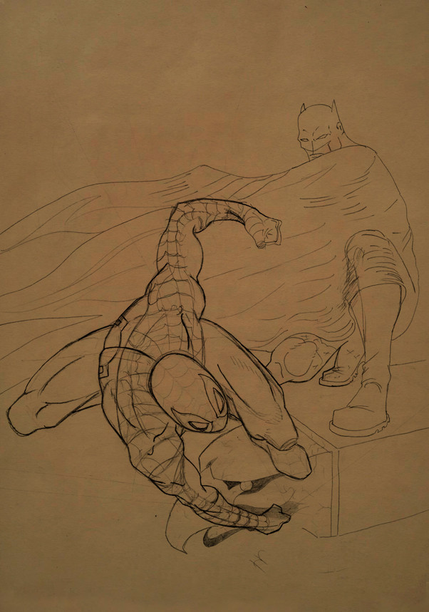
The pencils and inks, soon the colors, with classic costumeWolverine (c) MARVEL
Related content


Comments: 29

Como tiene que ser, con el traje clasico!
Me mola mucho, sobretodo la pose
")
👍: 0 ⏩: 1

si, jeje porque el dibujo no me salió muy allá, intentaré otro lobezno aunque con el traje clásico of course
👍: 0 ⏩: 0


The coolness of this drawing is beyond mortal comprehension, I am in awe.
👍: 0 ⏩: 1
heeh because you are younger
👍: 0 ⏩: 0

I share your hatred of inking......
But your penciling is AMAZING, and I'm sure that with a little bit of practice you'll get 'dem inks down!!!!
Awesome as always, man!!!!
👍: 0 ⏩: 1
yes i have to practice a lot with the inks, thanks friend
👍: 0 ⏩: 1
No problem, man!!!
Keep up the great work!!!

👍: 0 ⏩: 0

are those leaves falling? Nice classic wolverine. This is probably my favorite version of wolverine
👍: 0 ⏩: 1
yes a few leaves falling, And of course the best version the brown version (for me of course)
👍: 0 ⏩: 1
the brown one is definitely the coolest one.
👍: 0 ⏩: 0


hmmmm....i love all of your picture...and for this one....having a deeper character....and your inking is very nice.... i hope you'll coloring it and i can see the difference.
(sorry, i can't speak english fluently, i'm indonesian,thank you...)
👍: 0 ⏩: 0

yeah i remembered when i have muscles like that than my alarm clock when off.
ps great sketch
👍: 0 ⏩: 0

not bad homie! can't wait to see it colored. do you mean brown/tannish yellow classic colors?
👍: 0 ⏩: 1
of course i love this costume
👍: 0 ⏩: 0

Yeeeee...I can't wait to see this in color.Go Wolverine!!!
God Bless!
👍: 0 ⏩: 0

i like the penciles better than the ink , the inks have it too simplified , less styleand skews some features - i.e the details of the musculature on the legs and so on
👍: 0 ⏩: 0

Cooool ^_^ I would have helped to critqued but I'm not a premium member, so I'll just add here.
I really love how you got the angle and the pose down. Your attention to anatomy is enviable such as your ability and skill at (what's that word of making things smaller the further they are?) that many can work on themselves.
I don't know anything about inking (you can check my gallery with that) But on Wolverine's shoulder . . .They look . . buldgier. NOt buff, just, kinda huge. I wanted to take into account his pose, but that would have his abdomens press, not his shoulder. That's all I can really say.
I hope tis was a helpful review >_< Thanks for showing your artwork with us!
👍: 0 ⏩: 1
first of all thanks for the criticism, it helps me a lot, hehe in my defense i must say that i noticed the flaw of the shoulder when i was inking.
👍: 0 ⏩: 1
Yea! I helped! XD But I really enjoy looking at your artwork
 (Smile)")
👍: 0 ⏩: 0

genial, te quedo exelente, quiero dibujar asi xDD, pero una cosa el braso derecho se ve raro O.o ajaja, exelente trabajo amigo
")
👍: 0 ⏩: 1
si hay ciertas cosas del dibujo que no me quedaron muy bien, pero no me animé a retocarlas, gracias por comentar, un saludo
👍: 0 ⏩: 1

if i knew what you were saying, i would join in. ANYWAY nice piece man
👍: 0 ⏩: 0

I love the perspective and the character's stance. You have a really keen eye to draw characters without making them look boring. However... I prefer your pencils over your inks. You simply abused alot on the ink's thickness in places that doesn't deserve like the eyes while having less thick lines on places that should be thicker like the his knees, legs and boots
👍: 0 ⏩: 2
Yes, the issue of inking is something that right now I'll put much more care, I bought a book and I will practice a lot with brush and quill. Is very difficult with calibrated pens, all the lines are boring.
And of course thanks for the critique dude
👍: 0 ⏩: 1
 (Wink)")

i totally agree with you here
👍: 0 ⏩: 0