HOME | DD
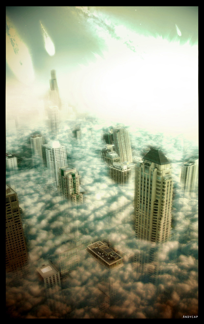
 Andycap — Meteor
Published: 2007-08-05 23:02:52 +0000 UTC; Views: 1912; Favourites: 18; Downloads: 66
Redirect to original
Description
had to try out sci-fi manipulation (Smile)") fullview!!
fullview!! stocks:
[link]
[link]
other version: [link]
Related content


Comments: 32

")

Wow! It seems was a hard work. The result is excellent ;]
👍: 0 ⏩: 0

Congratulations! Your deviation has been chosen to be part of my Friday Fotomanip Features! These features are picked for their quality, their obscurity, and for the credit the artist gives to the stock providers. If you do not wish to be featured, please let me know.
You can view the journal entry here: [link]
👍: 0 ⏩: 1


looks great except for the clouds. They look very flat.
👍: 0 ⏩: 1

yea :/ they are pretty transperant
👍: 0 ⏩: 0

I have submitted alot of devs lately ")
👍: 0 ⏩: 1

Oh yeah... i guess that was me
You're welcome!
👍: 0 ⏩: 0


")

Wow. This is awesome.
BTW: Maybe you could have darken the color of the meteors.
It still looks hot.
Good job!
👍: 0 ⏩: 1
thank you ")
👍: 0 ⏩: 1
No problem!
Eh! It still looks nice
👍: 0 ⏩: 0
thanks ;D which version do you like best ?
👍: 0 ⏩: 1

yeah..I like much more the colors of the other one
 (Wink)")
👍: 0 ⏩: 1
