HOME | DD
 andymorum — Re-Defined
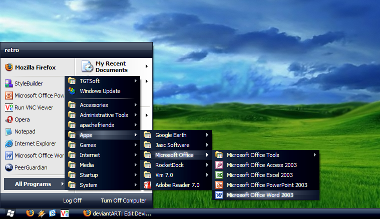

Published: 2004-05-13 12:42:16 +0000 UTC; Views: 14334; Favourites: 19; Downloads: 16696
Redirect to original
Description
Re-Defined - the visual style.1.0
Based on the design of [link]
Shellstyle using the brilliant smooth-metal icons with permission by Rokey ([link] )
Thanks to Loki, for sorting out the start menu
 (Smile)") & to Pulse & Chod for putting up with me
& to Pulse & Chod for putting up with me  (Wink)")
Andy
PS To get choose different start menu sizes, use the drop down list in the appearance tab of the display control panel where you normally choose normal, large or extra large fonts!
Related content


Comments: 35


This is very usable. I like the calm colors and simplicity.
👍: 0 ⏩: 0


I have (and will) always love your VS's but atm I'm desperately in love with Drift by cyc. But hey... I promise to get back to your skins!
👍: 0 ⏩: 0


Great work man... just wondering how this vs would come inverted?!
👍: 0 ⏩: 1

Not a bad idea actually! Maybe for version 2!
👍: 0 ⏩: 1


This is a really neat visualb style. I am gonna use it for sure when I get back my Style XP
You have done a really nice job pal 
ohhh..Those delicious Icons
I downloaded them before. But It woudn't work. I have no idea what's wrong with it


")
👍: 0 ⏩: 1
Thanks! Ads for the icons, try downloading them again, maybe it got corrupted on the way. I got them again the other day and they worked fine for me.
👍: 0 ⏩: 1
Yes, you were right...I went to that website and there was this other new set of icons..
They are called Smooth Metal Rising Dragon..really fancy stuff he got
But this one, It wouldn't work anyways...I'll just forget it
Thanx for help...I'll see you later pal


👍: 0 ⏩: 0


I like it ")
👍: 0 ⏩: 1
The reason the start menu is done like that is that it makes the file size much much smaller! If you have seperate substyles for each start menu, you also need a shellstyle and a copy of all the graphics included. By doing it this way you can make it so much smaller!
As for more colours, I'm open to suggestions for the next version. What I know already is that there will be a darker version
👍: 0 ⏩: 1
Looking forward to that then. Thanks
👍: 0 ⏩: 0

Oh, how did I miss this? It's simple and not much original (you know - there are plenty of grey themes

👍: 0 ⏩: 0
It has Normal, Compact & Classic start menus! You select them using button which usually sets wether you want normal, large or extra large fonts!
👍: 0 ⏩: 0

i downloaded it, but why is it compact start menu only?
👍: 0 ⏩: 0

If you could make a compact start menu version I would love it even more
👍: 0 ⏩: 0


wow, definitely going to use this, it is such a great theme and it goes so well with those icons, great job!
👍: 0 ⏩: 0

I love it, I've been using Rokey's smooth metal icons for a month now, and this VS matches them perfectly...
Nice work!
👍: 0 ⏩: 0


goddamit. this theme is soooo sweet. good job man!
👍: 0 ⏩: 0


ooh yeh, kewl icons, lol i downloaded them the other day.
👍: 0 ⏩: 0
")
Cheers, hope you think it is a good representation of your site's look!
👍: 0 ⏩: 1
yup i like it a lot. my new desktop, once i edit my objectbar/objectdock skins to match.
👍: 0 ⏩: 0