HOME | DD
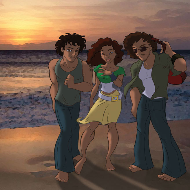
 animator — Commission: SoulJahz CD Cover
Published: 2004-12-07 23:45:42 +0000 UTC; Views: 4324; Favourites: 32; Downloads: 500
Redirect to original
Description
SoulJahz name and members (c) SoulJahz.This is a recent freelance job I did - it's a CD cover illustration for Hawaiin band SoulJahz. I had a very limited amount of time in which to do this, and the end result looks rushed to me.
Related content


Comments: 28

Awesome!! i can't believe you did the cover of their cd. Their a popular local band here... most of the concerts are in oahu though. I like how realistic it looks, but you style makes it rock all the same. I thought the background was a picture when i first saw is. XD craazy.
👍: 0 ⏩: 0

Man If I could rush like that I'd rush anyday of the week ..
but because I'm a forgetfull basterd
and would probably do everything wrong ..
I dont *sulk*
... I want your skills !
GNAR !
👍: 0 ⏩: 0


Looking at it from an aestetic point of view,
I think it looks very preety. You really matched the lightning of the
photo background with the characters, I think it looks quite great
and has a distinctive style to it.
Or maybe Im biased cuz the guys look so freaking hot.
Yeaaahh.

👍: 0 ⏩: 0

")

That's so funny, they also commissioned me to do their cover, and under the agreement I signed, I was not allowed to post my picture online at all, I wonder why that is, when you can? I really wanted to share what I did, but wasn't allowed to. Anyways, I think it turned out really cute, and it's awfully strange to have in front of me this comparison, in the sense that that we were working from the same reference, and outfits and idea, it's kinda cool to be able to see yours and see these two totally alike, yet different versions  (Smile)")
👍: 0 ⏩: 0

no, way!!!!! THIS IS AWSOME!!!!!
great work!!!!
--
Your mama’s ass is so big that when she sits down she’s 3 feet taller….jock….
👍: 0 ⏩: 0

I think it looks stunning! :] hehe... - wish my "rushed" stuffed looked so good! :] - I can really imagine very well these being the members of the band y'know? ... like you've caught a character in each one which I can imagine being a real person... - they sit well with the background and there's a great atmosphere and feeling to the piece. :] - good stuff :]

👍: 0 ⏩: 0

Love the lighting, really has that sunset feel
👍: 0 ⏩: 0

I realize you had limited time to work on this, but I think that if you would've drawn and colored the background, it would have been reasonably stronger.
I don't feel like the characters and the background are integrated...it just feels like the characters are cut out and placed on top of a photoshopped image (which I know that's what it is).
It's good I guess that you did it as a freelance job, but that's the only useful thing for this. Not a portfolio piece. Maybe you could take just the characters and present those, but take away the sunset. Don't mean to be too blunt, but it looks kinda cheesy.
Anyway, good drawing of the characters. As said above, though, I can hear the girl yelling for "LILO!!"
If that's what the client wanted, alrighty then.
Nice job.
👍: 0 ⏩: 1

*wryly* Yeah, the sunset is cheesy - unfortunately this is what the client requested, so I had no say. I think they wanted something that literally screamed Hawaii. Believe me, I'm not planning to use it as a portfolio piece. Freelance jobs very rarely give me time and opportunity to produce my best work, so very little of that sort of thing makes it into my portfolio.
*grins* Fortunately, they pay bloody well. That more than makes up for it. ^_^
👍: 0 ⏩: 0

..if thats rushed then someone would be hard pressed to show me detailed!! Awesome ness, lucky band!
👍: 0 ⏩: 0

I dunno, it doesn't look rushed to me.
I agree with one of the previous commentators, it DOES look like the lilo and stitch style, but hey, that comes easy for you!!
GREAT job! don't down yourself...as long as the client liked it (which I am sure they did) that's alll that matters.
And all your fans seem to like it as well!
 (Wink)")
👍: 0 ⏩: 0


There's a fine line between "rushed" and "stylized".
I think it's cool - much love for the curly poofy hair!
👍: 0 ⏩: 0

This makes me miss Hawaii SO bad!! 
👍: 0 ⏩: 0

eventhought it's very rush ork but it still looks great, lilo and stitch style
👍: 0 ⏩: 0

Wow. Very cool. Think it would look nice as a CD cover.
👍: 0 ⏩: 0

I like the character's design, and the lighting is great as well.
👍: 0 ⏩: 0

Purdy! I like the water and the style you did this in. Very kewl
👍: 0 ⏩: 0

Wow, it's awesome, though! Love the style for the background. And the chatacters look like the kind whose personalities I'd want to explore.
👍: 0 ⏩: 0

That's pretty cute ^__^ I like how you did the one holding the guitar
👍: 0 ⏩: 0

Lilo and Stitch style, no doubt. Or was that even intentional? They looks like Nani's friends when she was in her late teens.
This whole thing puts me in a relaxind mood!
👍: 0 ⏩: 0

The background blends to me, cause you've applied the watercolor/oil filter. Looks great!!!!! I'm sure SoulJahz would agree!
👍: 0 ⏩: 0

For some reason, the animated foreground clashes with the realistic background to me. That makes it seem rushed to me -- as if you put a beach background with the animation and didn't have time to make the two styles of art blend. The background is great, and the animated people are great, but the two don't connect. That might have something to do with the fact that I've never been a fan of real backgrounds (though this is watercolor-ified) and animation together, but this is all just my $0.02.
Also, the girl's calves bow out unnaturally...it just stuck out to me.
👍: 0 ⏩: 0

very nice, I really like your style, it has a lilo and stitch effect
👍: 0 ⏩: 0
