HOME | DD
 Anspire — KHR - Belphegor
Published: 2010-09-22 16:22:35 +0000 UTC; Views: 7717; Favourites: 119; Downloads: 71
Redirect to original
Description
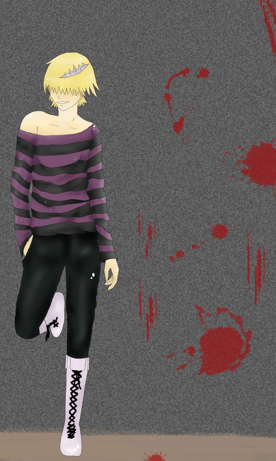
Belphegor from Katekyo Hitman Reborn.I've been submitting a lot of fanart lately, but what can I do? I love him.

Soo please leave feedback and browse my gallery!
Brushes from --> [link]
Umm.. a person said the pose really looks like [link] and I guess it does... So yeah, sorry about that, didn't really know.

:thumb166485100:
 WIN POINTS EASILY!!! ---->[link]
Related content


Comments: 63

The shading on the top and trousers looks really good. The top looks as though you've got the creases down pretty well. The rest of it, such as the hair and skin could do with some more depth to it though. A good starting point though
👍: 0 ⏩: 0

i like the shading on the shirt, it would had been nice if you had put that much effort into shading the rest of it but over all it still looks pretty nice
👍: 0 ⏩: 1

Wow, I really like the wrinkles on the clothes, those are so hard for me to do XD
👍: 0 ⏩: 1

Believe me, for me too
👍: 0 ⏩: 0

Nice pose on this one! ^^
Also I'd like to focus on the shading on the guy. The shirt is actually good, but the trousers, skin and hair could use some enhancement. Shading is one of the most difficult parts in something (for me as well ^^'). And in this case I can't really tell you a trick or something because I don't know xD And sticking with the sources of light is tricky. So... my advice is to use references when you can. And pay special attention to the shadows the light creates. Try to be bold with darker colors, and make some hair strands.
Besides that.. like I said good pose, nice hands and feet. I like the tiny white dots  (Smile)")

👍: 0 ⏩: 1
Yeah, that's true!
👍: 0 ⏩: 0

I've never seen KHR, so I can't really say anything about how well he resembles the original... well, actually, I just googled it, and he does resemble the original pretty well. He also looks like a character I would like
The drawing is reasonably good. The folds, shadows/highlights on his shirt look good, slightly less good on his trousers. There aren't any shadows/highlights on his shoes and hair, and traces of shading on his skin, so it looks a bit unfinished. It might also help if he cast a shadow on the wall/ground, because it looks off without a shadow.
Anatomy-wise, it looks pretty good. The only thing wrong with it is his right (on the left side) shoulder - its too large. His pose is good as well, he looks relaxed and natural. Makes the picture more interesting.
So really, you just have to work on shading and/or colouring and slightly adjust his arm!
I hope it helps
👍: 0 ⏩: 1
Thanks! I have trouble with shading, I find it difficult. ")
👍: 0 ⏩: 1
I find shading properly hard, too
Thanks
👍: 0 ⏩: 0


<= Prev |