HOME | DD
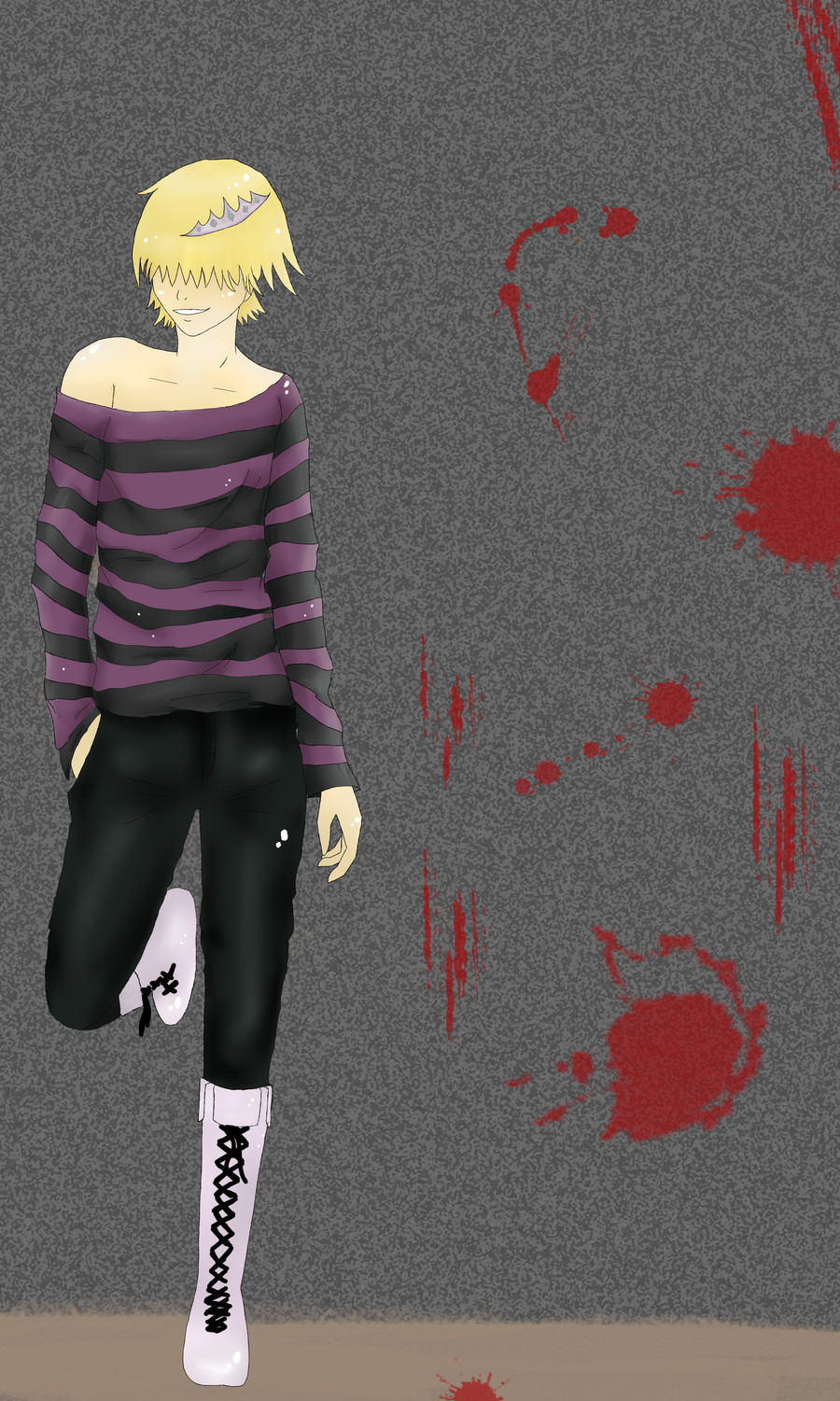
 Anspire — KHR - Belphegor
Published: 2010-09-22 16:22:35 +0000 UTC; Views: 7717; Favourites: 119; Downloads: 71
Redirect to original
Description
Belphegor from Katekyo Hitman Reborn.I've been submitting a lot of fanart lately, but what can I do? I love him.

Soo please leave feedback and browse my gallery!
Brushes from --> [link]
Umm.. a person said the pose really looks like [link] and I guess it does... So yeah, sorry about that, didn't really know.

:thumb166485100:
 WIN POINTS EASILY!!! ---->[link]
Related content


Comments: 63

Overall

Vision
Originality
Technique

I like it. It is a start and to be honest I scored it as best I could. Can't always give straight fives. e.deviantart.net/emoticons/let… " width="15" height="15" alt="
")
e.deviantart.net/emoticons/s/s… " width="15" height="15" alt="
 (Smile)")
e.deviantart.net/emoticons/s/s… " width="15" height="15" alt="
👍: 0 ⏩: 0

Overall
Vision
Originality
Technique
Impact
^^ i like it! umm.. as i said, i dont know the character, but the expression on his face is perfect, it goes with how the blood is smeared on the wall. the shading on his clothes/skin/hair is really good! the shadows and the highlights are all in the right places. the 3D effects are done really well.. the only thing that needs working on i guess is the shoulders, cause they are umm a little uneven, but thats ok! it kind of adds to his expresion! XD all in all its a really good picture! keep up the good work!
👍: 0 ⏩: 0

Overall
Vision
Originality
Technique
Impact
Hmm... this may be a little hard to critique! >w<
Okie, well I love the pose, and it looks good and proportioned well. The blood splatters are good as well! One thing though is that the only thing that really stands out to me is the hair because its the brightest color on there, so maybe next time add a mix of kinda bright and dark colors together to make more of the picture really pop! ^^
Also, maybe add some shadow on the ground too, that would really bring the picture out more too in my opinion.
Otherwise great job! This will defiantly by in my favorites! >w<
👍: 0 ⏩: 0


i think he looks really cool 
👍: 0 ⏩: 0

The pose is cool, and I like the blood spatter. It feels like the character isn't really part of the environment, though. I think you should include his shadow on the ground and against the wall so that he doesn't look like he's "floating" above the background you drew. I also rather like his expression. The smirk is great~
👍: 0 ⏩: 0

I really like macabre and dark artworks and this one is very well done!
The style of clothes is great too, by the way
I especially like the hair and the position (I hope this is the right word for what I want to say).
The colours are also well chosen. Overall a good piece

👍: 0 ⏩: 0


idk but maybe u didnt trace over it but it looked alot similar to this one. [link]
but it looks really good.
dude on the left.
👍: 0 ⏩: 1

I didn't really trace it over but I'll put it in the description as it may cause confusion.
👍: 0 ⏩: 1

its virtually nothing to say on this piece not clear why you want critique on this.....
👍: 0 ⏩: 1


shmexy!
I love the his left boot (our right) I love the lacing. But the other foot just looks off. XD I always have a hard time with suff like that to. I love the purpal and black striped top. The wrinkles are EPIC I wish I could draw like that it looks kida real.. I love the white highlights and the hair is sooo cool even though you didn't shade it. I usaly don't like hair thats not shaded but this really cought my eye. The crown thing is just kida strange. It doesn't have any effect on the hair witch isn't reallistic. If you had to fix on thing that would be it.
I saw you where taking free commsions do you think you could draw [link]
👍: 0 ⏩: 1
Thank you for the kind comment! 
About the second - please look at my journal, it is the third entry from top to bottom, and fill out the form there and please read the rules. [link] anyway, look here.
👍: 0 ⏩: 1
1.Mica/KAmma
2.Spirt
3. Paleish black hair with yellow in thr frount. long ponltail like hair on the side. Short hair in the back and chin lanth in the frount. Yellow eyes.
or black red Wolf with yellow eyes, and wings and swirls on the left side.
4. the wolf has swirls along the left side of the face and wing.
5. She's the kinda a person who helps others no matter the personal cost. Her life is messed up. but she wouldn't killer her self.
6. Student
7.
8. forest place or in a dark mantion with floor to celing windows
9. baggy, big like XXXL hoodie.and glove loves black and yellow but reds cool to.
10. [link]
👍: 0 ⏩: 1
Um well not here .. but anyway I'll consider it, I'm closing the whole Free stuff in a few days either way.
👍: 0 ⏩: 1

I don't know if it's just me, but the character there appears to have some great attitude.
I like how the colours work together and how you've shaded it in as well. The background doesn't quite work with the main subject matter, but that might be because of the different painting styles.
Not so bad, overall.
👍: 0 ⏩: 1
He indeed has an attitude ")
👍: 0 ⏩: 0

Woo, woo! Bel~
I really like the way you drew and colored the shirt.
👍: 0 ⏩: 1

I love Bel! Too bad I don't really watch KHR anymore. D:
👍: 0 ⏩: 0

OMIGASH BELLLL!!!! <333333333333 *loves him* HES MY FAVORITE!!! <3333
👍: 0 ⏩: 0

The folds on the shirt are very well done, and I like the pose
The background is a little off for me, as the red blood splotches don't seem to fit with the rest of the drawing. I do really like the gray color choice though, I think it looks good with the colors of your character and sets it off nicely.
Hope this helps!
👍: 0 ⏩: 1

I think it looks great, i really love the folds.
For the Background I would try something differennt,
if he santds at a wall i would draw bricks, only to show better that it is a wall.
[link] here is a brick wall tutorial with those techniques i think you used^^
and i would try to out a shadow under his feet/behind him, otherwise people can easily look like floating^^
👍: 0 ⏩: 1
Thanks for the ideas! I appreciate it!
👍: 0 ⏩: 0

The posing and outfit are both very well done but I think the shading on the skin and hair could use a bit of work; maybe darker shadows like you did for his clothing.
👍: 0 ⏩: 1
I am always so hesitant with hair - it's a hard thing for me to do draw!
👍: 0 ⏩: 1
I know what you mean. It generally takes me 2 or 3 attempts before I'm happy with what I've done
👍: 0 ⏩: 0

i like this, i love his pose!
work on shading his face and neck a little though
👍: 0 ⏩: 0

Hmm I don't know this particular anime actually. But I find a few things about him strange. It seems more like he's a she. Now that could just be the character and not your art but the way the shirt sits on his body is something that woman tend to do more often as a style (my friend thinks it's because there trying to seduce us all the time but I think that's a little to cynical) anyways it does seem like he's trying to be seductive. But I think that men would find this more attractive then woman would. At least I'm man enough to admit that this pose is attractive in an oddly feminine way.
Anyways the violence is almost in the background like a passing phase or something. It doesn't really seem to have any relevance to the character. Hmm maybe I'm thinking about it so much.
Anyways keep working on this sort of a thing and I think you'll improve quite a bit. This is well done.
👍: 0 ⏩: 1
Well it is fanart and he is feminine as for the blood - he like killing people.
👍: 0 ⏩: 0

ah, this is very nicely done..
I love the composition on this picture..it looks very nice and pretty mysterious..
I think the anatomy of this guy is also pretty good..but maybe you could fix a bit his shoulder near the neck to make the whole body look more balanced..
the pose, the shadings, the fold..and everything else are very good..
and over all, very nice picture! keep up the good work!


👍: 0 ⏩: 1

:icon-hya-group-plz: (=
I love the simplicity of his design. Most of the shading looks good - especially on his shirt. I actually like the tones on his skin/hair; they almost look like flat colors, which fits with the simplicity of his design. The random white dots look cool, tool - though I'm not sure what they're supposed to be.
Good job in choosing an interesting, natural looking pose. Your anatomy looks mostly right, though the left shoulder is too wide, and the left foot looks a bit wonky. I like how his shirt bares one shoulder, and how you varied the stripe widths to show where the folds are. I think you could improve the shading on his pants. Since you didn't vary your light/dark tones much in other areas, the higher contrast in the shading there looks out of place. Also, the blurriness looks a bit odd. It might be better for you to either vary your tones more in other areas, or to stick to nearly flat coloring for his pants - just to keep the picture consistent.
I like the idea of the blood in the background, but overall, the busy pattern in the background doesn't seem to match the simpleness of the character. Other than that, nice picture!
👍: 0 ⏩: 2

| Next =>