HOME | DD
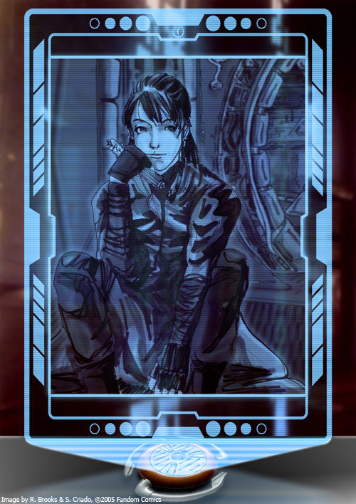
 Anstrona — Holo-Projector Frame
Published: 2005-08-08 06:19:58 +0000 UTC; Views: 935; Favourites: 7; Downloads: 33
Redirect to original
Description
This is actually a mixture. I'm posting this to show off the "frame" to the picture. One of my friends who I work on our Star Wars web-comic [link] "Cracken's Crew: The Invisible War" with wanted a place to show off some of his EU fan art so I made him a sketchbook area on our site to which he has tons of excellent pictures he's done. He then asked me if I could make him some kind of frame to put around his pictures to make them look a little cooler and we both agreed on some kind of holo-projector. I sat down, made up a nice looking interface in Illustrator, then took it into Photoshop and created the rest of the picture and the hologram effect. The artwork in the hologram was a Star Wars character created and drawn by , who is an unbelievable talent and a breeze to work with. The "frame" of the picture along with the interface in the hologram and all the effects were done by myself...which is what I'm attempting to show off here...heh.Related content


Comments: 13

I'm interested in the recreation of a frame within some of your group's PDFs- normally I'd suggest that there was some kind of mask overimposed on the images, to turn some of the image transparent to the background... because the Clipping Path isn't very good or as exact for Adobe's Indesign 2 or CS. How was that done? I understand you're using Illustrator here- but I'm curious how the other frames were created.
👍: 0 ⏩: 2
Maybe I need to learn more about Matte layers and Illustrator... *hmmm*
Would you be willing to create a basic tutorial on this method? I'm not very knowledgeable about Illustrator- my two main tools are Indesign and Photoshop, but i'm tired of bland borders for art images. Anyway, your explanation would probably make sense if I had even an hour worth of knowledge in Illustrator...
Did you figure that out for yourself? I always wondered what the illustrators at WotC were using to create their layouts... I'd be considered a "shade tree illustrator." Never took an actual class but picked things up as I found a need for them.
btw- Have you been collecting the second season for 2nd Gig yet? I'm amazed at the original Ghost in the Shell concept, but even more happy with the tv series (referring to your Laughing Man Avatar).
👍: 0 ⏩: 1

Wow, I'm really sorry. Deviantart didn't alert me to your reply for some reason and I didn't think to come look for one ")
If you haven't already seen, I run a fan site with my friends Keith Kappel, , and TJ Colligan making fan comics, short fiction, and RPG material among other things. My big focus right now is a Clone Wars Sourcebook using the WotC d20 system. Keith and I have done all the writing, I've done all the Illustrator work, and we've been using pictures either from the movies/comics/video games, or original artwork from a group of contributors we have for the characters that have no existing images. So far we've had some wonderful pieces drawn by , , TJ Colligan, and Tim Sullivan. All in all I'm very proud of the project so far. We've gotten some pretty decent exposure on the bigger Star Wars fan sites like TheForce.net [link] , SWRPGNetwork [link] , Lightsabre [link] and such. I've even got an interview coming up with Fanboy Radio...heh. We're pretty excited about the whole thing.
As for GitS, yeah I've gotten ahold of all of the episodes of seasons one and two. I really liked the TV series better than the movies too. I don't want to spoil anything in case you haven't seen it all but...I liked 2nd GIG way better than SAC starting out, but the ending was a little disappointing for me. It was...anticlimactic I suppose. That's just my opinion anyway, most people will probably disagree with me
 (Smile)")
👍: 0 ⏩: 2
Yup. I was well aware of your presence on the Holonet, and found your DA account through the links section of your friends website. While I'd be curious to know wow you guys got a hold of a LucasArts canon key (what you call a holocron), I'm even more curious how WotC and you guys did the framing for the art in official and fan publications. While I don't copy their format verbatim for my own projects, it's nice to give people a familiar typeset and predictable organization principles.
👍: 0 ⏩: 1
Yeah, Fandom Comics is the site I designed, built and maintain. I don't know if I follow you about the canon key/holocron thing, but for the framing bit - everything except for the pictures are actually shapes and layers made in Illustrator. The actual shapes used to frame each picture is a series of basic shapes and compound shapes. Illustrator has a publish to PDF option when you save, then I use Acrobat Professional to combine them all into one PDF and do things like add bookmarks to the document. The only thing I won't take any credit for in the design of those documents is the little graphic that's down the side of each page. I got about 80% done recreating it, and came to find I could extract it from the official web enhancements. Mine didn't look bad, in fact it looked quite good...but it wasn't anywhere near as dead-on as I would've liked. But really, once you start getting into Illustrator I'm sure it'll become much clearer as to how I went about making the whole document.
On a side note, we WERE going to create a completely new template for the documents. Kind of our "third edition" design, but we all sat down and talked about it and decided to stick with the official design. We're still probably going to use our own design later on, but it'll more than likely be after we've established ourselves with a better foothold in the fan community, then we can make something that is recognizable only to us and people won't mind so much. That's the idea anyway.
👍: 0 ⏩: 1
I was concerned at first for your group's efforts because the sidebar design was lifted directly from the WotC pdf. I'm not a copyright lawyer, but I think lifting the wotc design was more dangerous than just making a lucasarts fan project (which is dangerous in the area that whatever we do in the LucasArts universe and we don't have their copyright agreement, they could litigate if they wanted).
That's really interesting about how you combined those images. While I know that WotC uses colored paper and that they're just using white (or no ink) areas while the actual image is considered 'transparent,' I didn't think that you'd have to use Acrobat itself to create that effect. I figured there was some way to do so Indesign or Illustrator itself... but you've got me able to grasp the idea, which is good (for me anyway, lol). It means that if I wanted to, I could change PDFs I've already created and update them... but I'm assuming that you and WotC are using preset image size/ratios otherwise you're making new Illustrator images for each effect... hmm....
Actually, I think you'd be better off in the Fan community to develop your own style that is unique. As it is now, fans need to be "know" that this isn't an official document, but you can still shine through as a professional quality work. While so many people cite the Kotor fan PDF, I cringe at their layout and wish thoroughly that they had access to some different fonts...
I finally figured out the three fonts WotC used for SW- agency, rotisemiserif and formata (I've been subsituting this one with Tahoma). Anyway, it's good to know some SW RPGers are more organized than the previous bunch of fan inspired project groups (starwars-rpg.net basically imploded due to site administrator mysteries, which is where a number of my projects were hosted)
👍: 0 ⏩: 1
Yeah, it was obviously in the back of our minds that anyone associated with LFL could step in and give us a C&D at any time but really, why would they? Who are we? Why would they bother wasting their time with us? We're not profiting off of their intellectual property, and we're obviously not taking away any of their profits (they're not making RPG products anymore). Keith and I both are pretty well versed in copyright law and fair use so we knew we were taking a reasonable risk. That's the approach we used when going into it. But now it's an even smaller concern considering we have endorsements from all kinds of official Star Wars writers and artists. Tom Hodges (Reversal of Fortune), Jan Duursema, Joe Corroney, Doug Shuler...the list goes on and on. Keith actually even sat down and discussed the Kai Justiss character with Joe Corroney. Karen Traviss actually saw Etain's picture that TJ drew and went completely ga-ga over it. Now she keeps referring people to us when they ask what Etain looks like. We've been met with enormous support both from the fan community and the official. So...yeah, I think we're OK for the time being. *crosses fingers*
As far as how I put the document together. I made all the "picture borders" in Illustrator using a mixture of lines and shapes (called vector graphics) either whole or cut-out (Illustrator calls them "compound paths") to create a frame of sorts. Since it's a vector graphic (made mathematically instead of with pixels), and a bunch of different pieces, I can scale it into any size I want, as a whole or in individual pieces to create a frame of proper size. I've got about 20 different frames that I use of all different styles that came from the revised core book. I don't use Acrobat for anything other than combining all the individual pages (exported to PDF in Illustrator) into a single document. It's kind of hard to explain to somebody who's never used Illustrator before, but then again I've never used InDesign so I don't know if they use similar concepts. But yeah, aside from the graphic that's down the side gutter of every page, and the company logos (aside from ours obviously), I made everything from scratch using Illustrator. Even the "chapter" pages and the art decco design.
In terms of our own unique style, yes it's true we'd be able to be identified more easily that way, but we felt it was more important to establish ourselves in the community as a group that does high-quality work. Making our own unique format just wouldn't have made as big of an impact. With recreating the original style, people can identify with that and even compare it to official documents to see how painstaking the detail has been recreated. In truth, we haven't had a single person mistake us for an official group and I think that's mostly due to our heavily promoting our site, not allowing anyone to download our material from anywhere other than our site, and making it abundantly clear on our site that we're not affiliated with any of the Lucas divisions. Oh and in case you're wondering, the fonts they use for the WotC documents are: Agency-FB Roman, Bold, Bold-wide, and Regular Extended, BankGothic MT Medium, Formatta-Regular and Bold, RotisSemiSans, RotisSemiSerif, bold and italic.
 (Wink)")
👍: 0 ⏩: 1
Ah, I'm curious as to how your group sat down with Corroney et al? Convention? Happen to be neighbors?
BankGothic was in their OCR format, right? Or am I mistaking its use as Agency? And where are they using RotisSemiSans? I've picked up the Agency and RotisSemiSerif font families (although I use a simple 15% text angle for my italics)- haha, and I thought I'd pegged their format style pretty well already. lol Anyway, I'm still happy with my own hobby use of InDesign (you'll find my latest creation at my Devart gallery).
InDesign is much easier to edit text and it's similar to PageMaker and Quark (what I used to learn in college, although I never bothered to check out Illustrator because I thought was just all vector art). I, too, only use Acrobat to add or change pages to a PDF, and to add invisible html links in the credits section to artists and writers. I've also found Acrobat is useful to create fields and perform calculations. I was pissed off at someone else's autocalculating PDF character sheet that didn't work right, so I made my own simple sheet with Acrobat. I hate writing anything down- type looks so much better...
👍: 0 ⏩: 1
Figure of speech really. It was either telephone or email correspondance, or both. We've actually known Joe Corroney for years so he's really the only one we didn't get to know because of the Fandom Comics endevour.
BankGothic is used for the credits, and the image captions.
👍: 0 ⏩: 0
Oh, duh...the fan site we run is called Fandom Comics [link] hehe..
👍: 0 ⏩: 0
Well, let's see here. The actual frame "design" I created in Illustrator CS2 just through your standard clipping masks/compound paths, etc. Afterwards I brought the object into Photoshop CS2 as a smart object and sized it properly. Then behind the smart object I placed a blue matte masked to the shape of the frame and set to screen, and another layer filled with an "interlacing" pattern I made, also masked to the shape of the frame but set to overlay. Also behind the frame I placed the background, holoprojector, table surface, reflection, and projection beam. All these things are stored in a folder/group. I made another folder/group where the actual picture is supposed to go labeled "Picture Goes Here" for Steve or anyone else on our team who makes a picture using that frame - all they'd have to do is drop the picture in and size it. Then in another folder/group above the picture I place the smart objects themselves, another blue matte layer, interlace layer, and a black matte masked to the OUTSIDE shape of the frame. And that's about it. It's actually kind of simple if you think about it...I think
👍: 0 ⏩: 0

i love the frame looks awesome. Great concept. Tell you're friend i like the pic.
hope you'll keep posting things like this. good luck..
👍: 0 ⏩: 1
Thanks! I plan to keep posting things if I can help it
👍: 0 ⏩: 0