HOME | DD
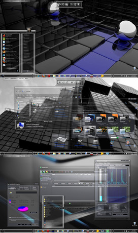
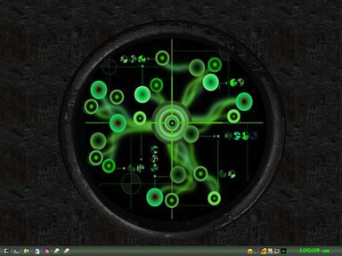
 antisleeper — VUEabstract Series v1

Published: 2001-12-25 17:30:52 +0000 UTC; Views: 417; Favourites: 3; Downloads: 124
Redirect to original
Description
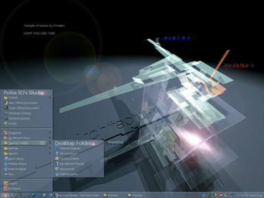
Decided to finish off the first 2 in this Series. Expect more in the future.Related content
Comments: 8

Very smooth there so cosy.
the
will bite your toe whahahahahah
Norske Nisse
👍: 0 ⏩: 0

This is phat! It's abstract, I know, but it looks like glass to me. Really awesome.
👍: 0 ⏩: 0

no doubt about it: you are brilliant!!
it looks soooo cool!
-tHra N-
👍: 0 ⏩: 0

great work...I really like this stuff...although havnt I seen something like this b4?
-- Dredwerk
MSN IM: Dredwerk
AIM : dredwerk123
👍: 0 ⏩: 0

Ooh cool.. love that colour. I like the mix of blurry bits and hard edged bits. I hafta say that green dot near the bottom right irks me a little.. but apart from that, it's really nice.
:: fuzzydemon :: https://fuzzydemon.deviantart.com ::
fuzzy by name, fuzzy by nature
👍: 0 ⏩: 0

mmm.. I got 1 sugg, what if the title thing would be like this:
VUE.abst ract | logo
would look really funky.
¤-[Kwan Studios Finland]- http://www.kwanstudios.com
👍: 0 ⏩: 0

I like this a bit better than your second version. It's all smooth. The top again is a bit too blurry. Ah and nice colors
👍: 0 ⏩: 0

