HOME | DD
 antisleeper — VUEabstract Series v4
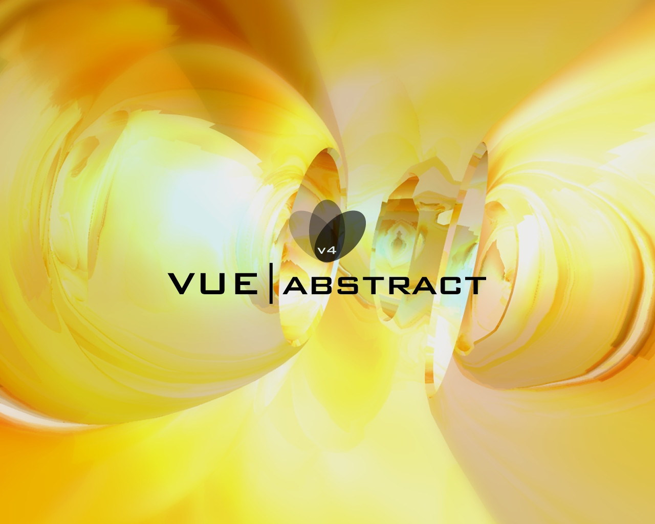
Published: 2001-12-26 15:24:59 +0000 UTC; Views: 381; Favourites: 2; Downloads: 108
Redirect to original
Description
number 4. i think i will finish at 5. took ages to render but i like it (do you?) any way enjoyRelated content


Comments: 13

Looks like alot of vases in a dream or something... hell i dont know what im talking about.
the
will bite your toe whahahahahah
Norske Nisse
👍: 0 ⏩: 0

mmm... fantastic!
But do the logo how I suggested it
¤-[Kwan Studios Finland]- http://www.kwanstudios.com
👍: 0 ⏩: 0

what could i say??!? absolutely amazing..... again!
you like to create eye-catchin things, eh?!
-tHra N-
👍: 0 ⏩: 0

sweet ass work James...I like this the best..I dont see much yellow stuff..man its nice!
-- Dredwerk
MSN IM: Dredwerk
AIM : dredwerk123
👍: 0 ⏩: 0

Hmm absolutely stunning, i luv this
Yellow is my fav colour
Good job
||Mousty||
https://mousty.deviantart.com //optic candy//
👍: 0 ⏩: 0

wow! Awesome! It`s worth every second of rendering time Only thing I`d "complain" about is the desaturated colors here and there.. I mean, the grey stuff is great, but some places the yellow an orange is a bit desaturated.. it`s nothing big, but it`s enough to catch my eye
great work!
:frown: rock on
Band of the month:LOK http://www.lokpest.nu/
👍: 0 ⏩: 0

Heh, I agree with redbird.. it does look edible
Wonderful choice of colour.. yellow seems to be an underused colour. Glad you're giving it some attention
Very cool piece
:: fuzzydemon :: https://fuzzydemon.deviantart.com ::
fuzzy by name, fuzzy by nature
👍: 0 ⏩: 0

wow, i can tell the amount of work put into this. looking forward to the final version of this series
rockified http://khoa.hypermart.net
👍: 0 ⏩: 0

I love it too, looks very edible.
Just because youre lost doesnt mean your compass is broken.
The Edge
👍: 0 ⏩: 0

Ooh it's awesome. I love the contrast between the yellow and the black. You've definitely got an unique style
👍: 0 ⏩: 0

Very VERY cool! I love it! Nice bright colors and effects. Great work, dude!
[.vichy.]
👍: 0 ⏩: 0


wow!!! thats great man
---------------------------------------
UNIX THE WAY WE FEEL SECURE
---------------------------------------
LINUX THE WAY ALL OF US SHOULD LIVE
---------------------------------------
👍: 0 ⏩: 0