HOME | DD
 antitianvs — comet
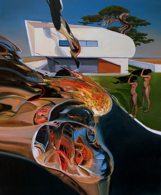
Published: 2011-07-20 21:02:09 +0000 UTC; Views: 1894; Favourites: 60; Downloads: 9
Redirect to original
Description
100x120 oilRelated content


Comments: 16

I can see how Picasso's work may have been more important to you than Dali's. I love the use of the old to make something new, and before I saw your gallery I had seen nothing like it besides maybe cubism and obviously surrealism and it's truly amazing stuff. Do u use a straight-edge to make those perfect geometric lines while u paint or do u just do it freehand?
👍: 0 ⏩: 0

i can hardly concieve that these are real paintings! it looks like it is modified on computer. your technique is amazing! many portraits of yours remind me of the distorded faces by francis bacon, shapes feel... uncomfortable. and evil. also the composition remind me of dali for some (ex: porn kings). are there artists that inspire you?
👍: 0 ⏩: 1

I can not make modifications to the computer, formerly I was indeed inspired by Bacon, but now I try to think up motives, I use my experience in the technique of painting
p.s Dali for me less important than Picasso
👍: 0 ⏩: 0

so awe inspiring, wish i could take a trip inside your mind
👍: 0 ⏩: 0


I'm really impressed with this style. It's like Francis Bacon meets Rockwell Kent. Bacon would never do a tree like that, and THAT tree is really cool.
👍: 0 ⏩: 0


I was immediately attracted to this piece based on the positioning of intense color. I have had it open now for a good 5 minutes, trying to form impressions. A reality warp. A breakdown in the cosmic fabric. An intense energy suck (the ladies hair being pulled), Very cool piece of art
👍: 0 ⏩: 1
In real, the colors are a slightly less inensive.Its the first version of this picture.
👍: 0 ⏩: 0


Holy Hell... this... is... awesome-sauce... beautiful color and blending

👍: 0 ⏩: 0

This is outstanding! I love the futuristic look about it. I also like the preciseness of the painting. It has very sharp edges about it, lending itself to the very modernist feel of the piece. You did a great job on the skin tones of the figures, and I like the way the hair is blowing in the wind.
This is an excellent deviation!
👍: 0 ⏩: 0

 (Smile)")