HOME | DD
 aoao2 — You and I ...
Published: 2011-07-20 11:13:33 +0000 UTC; Views: 32698; Favourites: 2048; Downloads: 716
Redirect to original
Description
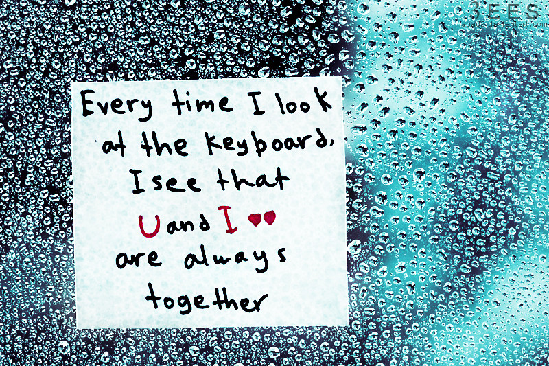
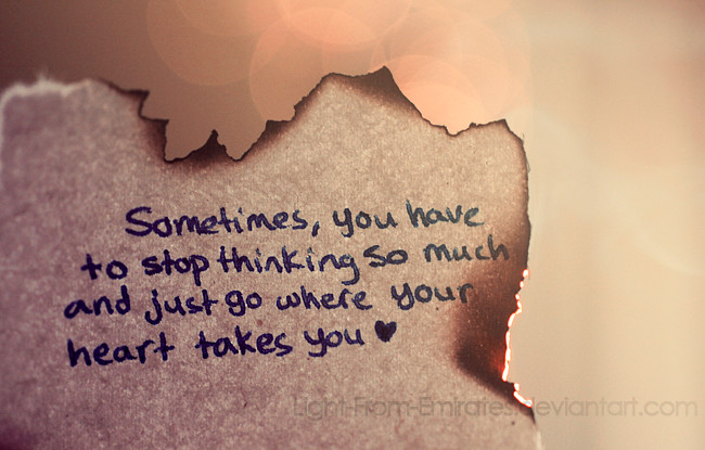
Hope u like it

If you like my work please "like" my new facebook page [link]


Related content


Comments: 5

Overall
Vision
Originality
Technique
Impact
Although the photograph is beautifully taken, the quote and concept are so, incredibly over-used. It's baffling how many things like this make their way to the front page of DA. It's just a massive cliche.
My advice to improve is maybe to try and come up with your own sayings to write on the cards instead of relying on things that other people wrote. Also, maybe try to not saturate the image as much. It looks a bit odd and throws off the composition.
I'm sorry that this isn't one of those "wow it's soooo great" comments and it may be a bit harsh, but I only want you to improve, hence why this is a critique.
👍: 0 ⏩: 0


Originality

This is really beautiful. I've always loved hearing the phrase.
Vision: I love the backdrop, the water droplets make the piece complete. The way you put the U and I in red really makes the real point of the picture stand out.
Originality: I've heard this phrase and seen it a lot of times before. The way you have this picture, with the droplets and writing on the note was a very smart idea, which is why this deviation is different from the others.
Technique: I love the water drop background, and again, love the way you put it on a piece of paper to show. I agree with Eiravati's critique though, the hand writing is a bit sloppy and another font would've been a bit better with the water droplet background. The hearts next to the I also kind of bother me. Sometimes symbols can mess up the picture, and I don't use them often.
Impact: I was touched reading this, and it had a very strong impact on me as well. These words really mean something to me and many others, which is why this had a full impact on me. Truly, its beautiful.
Keep up the great work! e.deviantart.net/emoticons/h/h… " width="38" height="15" alt="

👍: 0 ⏩: 0

Originality
The composition of this deviation is striking. It's simple, yet stands out among a sea of other deviations. The blue colors really enhance the droplets of water, and the variation of color is pleasing on the eye. Highlighting the U and I in red is a nice touch as well that really draws the focus to the letters. The two hearts are perfect companions, as a virtual representation of the two of you in love that extends beyond the keyboard.
The quote itself isn't original, which draws away from the deviation slightly. I would love to have seen something simple and deeply personal instead. However, I can feel your passion about this quote, and it's really touching.
Bravo.
👍: 0 ⏩: 0

Originality
this is sooo beautiful. and i will always look at it and remember it when i go to type on the keyboard. i think that you have done an amazing job to make people realize that love is in anything we look at. including the computer!
and i also adore the backround! i think that rain is a big part in "love" like in love songs they will always mencion the rain, and i really like it!
thank you for posting this, i enjoy looking at it and will defanetly look for more!
have a great day! i hope to see more! goodbye!
👍: 0 ⏩: 0

Overall
Vision
Originality
This is a very touching phrase, in my opinion. The fact that it's true makes it extra special in it's own way.
Vision:
I really do love the way this looks. You were able to make it very beautiful with the water drops and the way the back round starts very dark at the left and gets lighter as you move away from the note. I also admire the way you put "U" and "I" in red. It really stands out and emphasizes the whole point of this deviation.
Unfortunately, I question the two little hearts next to the "I", if that's what they are. They take a little away from the note.
Originality:
I actually have seen this phrase or similar phrases before, so this isn't the most original piece. But the way you may the back round did make it quite unique and special.
Technique:
I love the technique you used for this picture. The way the water drops show through the paper is brilliant! And again, I love how the back round changes from dark to light. It really makes the water drops sparkle and stand out.
On the other hand, the writing style isn't the best choice for this type of picture. It's a little sloppy and spaced out, and it's stacked very uneven. I believe that more bubbly letters probably would have gone well with the drops of water.
Impact:
This deviation has a very strong impact on me, as I'm sure it does on others as well. It's not just the beauty of the back round but the words themselves. They're very meaningful and make this piece very special.
I hope you find my critique fair and useful in the future e.deviantart.net/emoticons/s/s… " width="15" height="15" alt="
 (Smile)")
👍: 0 ⏩: 0