HOME | DD
 aora — Final Fantasy VI-Vector Sunset

Published: 2008-07-16 10:10:54 +0000 UTC; Views: 5946; Favourites: 91; Downloads: 258
Redirect to original
Description
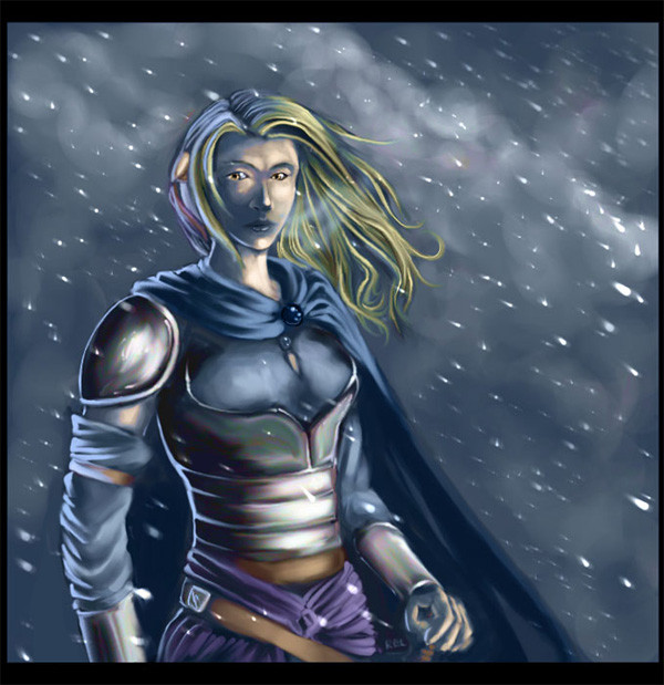
Ah, I knew I forgot something. *r51 sent me a note a while back asking if I'd help test the new fanart submission system over at Caves of Narshe by re-uploading some of my old Final Fantasy VI fanart. Needless to say, I was mortified at the idea of digging up my old art, so I drew up something new instead. My first submission to CoN was a picture of Celes posing in front of a screenshot of Vector, so I opted simply to make a new version of it. (Smile)")
Unfortunately, having been sitting on it for a month I'm tempted to redo it. Again. Her eyes are too far up her head, the inking's sort of sloppy, and so's the background. But I guess I can live with the issues it has right now. Some day I'll draw a picture of Celes I'm happy with. Some day!
Related content


Comments: 12


Celes looks so determined and strong in this. Love it.
👍: 0 ⏩: 0

Fantastic angle, lighting, composition... and of course, fantastic game. I especially like the Mucha-esque style of her hair!
👍: 0 ⏩: 0


The actual line art looks fine to me. It has fairly good anatomy, structure and style to it. The nice lighting is great on Celes herself and the sword. But I have to agree with ~BrendanKeeley a little. The far right building competes for interest through the fact that it's so dark and foreboding.
Random thought: A friend of mine said, "yeah, celes looks like yoko ono". Take that as you will.
👍: 0 ⏩: 0

For me, I'm not sure about the shading in this picture. The buildings have very heavy shadows on them, and theirs obviously a strong singular light souce, yet the shadows on the actual person do not seem in-keeping with this, being as they are very light. Given the rest of the picture, I would have imamgined the shadows on the charcter to be much darker and more pronounced.
Furthermore, we now have a lightly coloured character over a darkly coloured background, which brings the background buildings up very close, instead of them just fading into the background, they leap out and clash with the charcter.
Perhaps if instead of essentially using two colours for your shading, a base and a shadow, you added a third, darker shade for areas where the light really wouldn't reach, you could add more depth to the charcter and make her stand out? Bit's like the hair might look better with darker shadows in places, such as the shadows that would be cast by her neck or sholder? Also, adding shadows in places on the clothes, such as having the jacket throwing a shadow onto the top beneath it, might prove effective?
One thing I do really like about this though, is the sword. The shading there is very good, particularly on the actual blade. That's a very good, very natural looking metal effect.
👍: 0 ⏩: 0

Well, I like it, so poo on your negativity about it.
👍: 0 ⏩: 0

It's in my queue for approval right now!
Did you see my journal yesterday?
👍: 0 ⏩: 1

Woohoo!
And yes, I did! In fact, I think I even left you a comment. Though most of it was just me babbling about Rock Band.
")
👍: 0 ⏩: 1